mirror of
https://github.com/flutter/flutter.git
synced 2025-06-03 00:51:18 +00:00
a49ee534c6
10 Commits
| Author | SHA1 | Message | Date | |
|---|---|---|---|---|
 Qun Cheng
|
c7d4b32fdd
|
Update the default outline color for OutlinedButton (#138768)
Fix b/311343182 This is to update the default outline for `OutlinedButton`. When the button is focused, the outline color should be primary color. |
||
|
Qun Cheng
|
4a0f261b4e
|
Add Card.filled and Card.outlined factory methods (#136229)
Fixes #119401 This PR is to: * add `Card.filled` and `Card.outlined` factory methods so that we can use tokens for these two types of cards to generate default theme instead of providing hard-corded values in example. * update card.2.dart example. * add test file for card.2.dart example. * fix some mismatch caused by editing the auto-generated defaults by hand in navigation_bar.dart and navigation_drawer.dart. |
||
|
Taha Tesser
|
2c71881f50
|
Fix Scrollable TabBar for Material 3 (#131409)
fixes [Material 3 `TabBar` does not take full width when `isScrollable: true`](https://github.com/flutter/flutter/issues/117722) ### Description 1. Fixed the divider doesn't stretch to take all the available width in the scrollable tab bar in M3 2. Added `dividerHeight` property. ### Code sample <details> <summary>expand to view the code sample</summary> ```dart import 'package:flutter/material.dart'; /// Flutter code sample for [TabBar]. void main() => runApp(const TabBarApp()); class TabBarApp extends StatelessWidget { const TabBarApp({super.key}); @override Widget build(BuildContext context) { return const MaterialApp( debugShowCheckedModeBanner: false, home: TabBarExample(), ); } } class TabBarExample extends StatefulWidget { const TabBarExample({super.key}); @override State<TabBarExample> createState() => _TabBarExampleState(); } class _TabBarExampleState extends State<TabBarExample> { bool rtl = false; bool customColors = false; bool removeDivider = false; Color dividerColor = Colors.amber; Color indicatorColor = Colors.red; @override Widget build(BuildContext context) { return DefaultTabController( initialIndex: 1, length: 3, child: Directionality( textDirection: rtl ? TextDirection.rtl : TextDirection.ltr, child: Scaffold( appBar: AppBar( title: const Text('TabBar Sample'), actions: <Widget>[ IconButton.filledTonal( tooltip: 'Switch direction', icon: const Icon(Icons.swap_horiz), onPressed: () { setState(() { rtl = !rtl; }); }, ), IconButton.filledTonal( tooltip: 'Use custom colors', icon: const Icon(Icons.color_lens), onPressed: () { setState(() { customColors = !customColors; }); }, ), IconButton.filledTonal( tooltip: 'Show/hide divider', icon: const Icon(Icons.remove_rounded), onPressed: () { setState(() { removeDivider = !removeDivider; }); }, ), ], ), body: Column( children: <Widget>[ const Spacer(), const Text('Scrollable - TabAlignment.start'), TabBar( isScrollable: true, tabAlignment: TabAlignment.start, dividerColor: customColors ? dividerColor : null, indicatorColor: customColors ? indicatorColor : null, dividerHeight: removeDivider ? 0 : null, tabs: const <Widget>[ Tab( icon: Icon(Icons.cloud_outlined), ), Tab( icon: Icon(Icons.beach_access_sharp), ), Tab( icon: Icon(Icons.brightness_5_sharp), ), ], ), const Text('Scrollable - TabAlignment.startOffset'), TabBar( isScrollable: true, tabAlignment: TabAlignment.startOffset, dividerColor: customColors ? dividerColor : null, indicatorColor: customColors ? indicatorColor : null, dividerHeight: removeDivider ? 0 : null, tabs: const <Widget>[ Tab( icon: Icon(Icons.cloud_outlined), ), Tab( icon: Icon(Icons.beach_access_sharp), ), Tab( icon: Icon(Icons.brightness_5_sharp), ), ], ), const Text('Scrollable - TabAlignment.center'), TabBar( isScrollable: true, tabAlignment: TabAlignment.center, dividerColor: customColors ? dividerColor : null, indicatorColor: customColors ? indicatorColor : null, dividerHeight: removeDivider ? 0 : null, tabs: const <Widget>[ Tab( icon: Icon(Icons.cloud_outlined), ), Tab( icon: Icon(Icons.beach_access_sharp), ), Tab( icon: Icon(Icons.brightness_5_sharp), ), ], ), const Spacer(), const Text('Non-scrollable - TabAlignment.fill'), TabBar( tabAlignment: TabAlignment.fill, dividerColor: customColors ? dividerColor : null, indicatorColor: customColors ? indicatorColor : null, dividerHeight: removeDivider ? 0 : null, tabs: const <Widget>[ Tab( icon: Icon(Icons.cloud_outlined), ), Tab( icon: Icon(Icons.beach_access_sharp), ), Tab( icon: Icon(Icons.brightness_5_sharp), ), ], ), const Text('Non-scrollable - TabAlignment.center'), TabBar( tabAlignment: TabAlignment.center, dividerColor: customColors ? dividerColor : null, indicatorColor: customColors ? indicatorColor : null, dividerHeight: removeDivider ? 0 : null, tabs: const <Widget>[ Tab( icon: Icon(Icons.cloud_outlined), ), Tab( icon: Icon(Icons.beach_access_sharp), ), Tab( icon: Icon(Icons.brightness_5_sharp), ), ], ), const Spacer(), const Text('Secondary - TabAlignment.fill'), TabBar.secondary( tabAlignment: TabAlignment.fill, dividerColor: customColors ? dividerColor : null, indicatorColor: customColors ? indicatorColor : null, dividerHeight: removeDivider ? 0 : null, tabs: const <Widget>[ Tab( icon: Icon(Icons.cloud_outlined), ), Tab( icon: Icon(Icons.beach_access_sharp), ), Tab( icon: Icon(Icons.brightness_5_sharp), ), ], ), const Text('Secondary - TabAlignment.center'), TabBar.secondary( tabAlignment: TabAlignment.center, dividerColor: customColors ? dividerColor : null, indicatorColor: customColors ? indicatorColor : null, dividerHeight: removeDivider ? 0 : null, tabs: const <Widget>[ Tab( icon: Icon(Icons.cloud_outlined), ), Tab( icon: Icon(Icons.beach_access_sharp), ), Tab( icon: Icon(Icons.brightness_5_sharp), ), ], ), const Spacer(), ], ), ), ), ); } } ``` </details> ### Before  ### After  This also contains regression test for https://github.com/flutter/flutter/pull/125974#discussion_r1239089151 ```dart // This is a regression test for https://github.com/flutter/flutter/pull/125974#discussion_r1239089151. testWidgets('Divider can be constrained', (WidgetTester tester) async { ```  |
||
|
Taha Tesser
|
7d89617a92
|
Fix TimePicker defaults for hourMinuteTextStyle and dayPeriodTextColor for Material 3 (#131253)
fixes [`TimePicker` color and visual issues](https://github.com/flutter/flutter/issues/127035) ## Description - fixes default text style for `TimePicker`s `hourMinuteTextStyle` and added a todo for https://github.com/flutter/flutter/issues/131247 - fixes correct default color not being accessed for `dayPeriodTextColor` - Updates tests ### Code sample <details> <summary>expand to view the code sample</summary> ```dart import 'package:flutter/material.dart'; void main() => runApp(const MyApp()); class MyApp extends StatelessWidget { const MyApp({super.key}); @override Widget build(BuildContext context) { return MaterialApp( debugShowCheckedModeBanner: false, theme: ThemeData(useMaterial3: true), home: const Example(), ); } } class Example extends StatelessWidget { const Example({super.key}); @override Widget build(BuildContext context) { return Scaffold( appBar: AppBar( title: const Text('Sample'), ), body: Center( child: ElevatedButton( onPressed: () { showTimePicker( context: context, orientation: Orientation.portrait, initialEntryMode: TimePickerEntryMode.input, initialTime: TimeOfDay.now(), builder: (BuildContext context, Widget? child) { return MediaQuery( data: MediaQuery.of(context) .copyWith(alwaysUse24HourFormat: true), child: child!, ); }, ); }, child: const Text('Open Time Picker'), ), ), ); } } ``` </details> ### Before 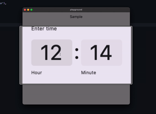 ### After  |
||
|
Pierre-Louis
|
0830a362d5
|
Add support for M3 motion (#129942)
## Description This adds support for M3 easing and duration tokens. This PR includes these changes: * Generation of duration and easing constants, in `Durations` and `Easing`, respectively (`Curves` is already taken in the `animation` library) * Add 3 Dart fixes Once this is merged, I'll migrate packages/plugins/customers and then uncomment the deprecation notices for the 3 M2 curves, all of which have 1:1 replacements. ## Related Issues - Fixes https://github.com/flutter/flutter/issues/116525 ## Tests - Added Dart fix tests ## Pre-launch Checklist - [x] I read the [Contributor Guide] and followed the process outlined there for submitting PRs. - [x] I read the [Tree Hygiene] wiki page, which explains my responsibilities. - [x] I read and followed the [Flutter Style Guide], including [Features we expect every widget to implement]. - [x] I signed the [CLA]. - [x] I listed at least one issue that this PR fixes in the description above. - [x] I updated/added relevant documentation (doc comments with `///`). - [x] I added new tests to check the change I am making, or this PR is [test-exempt]. - [x] All existing and new tests are passing. If you need help, consider asking for advice on the #hackers-new channel on [Discord]. <!-- Links --> [Contributor Guide]: https://github.com/flutter/flutter/wiki/Tree-hygiene#overview [Tree Hygiene]: https://github.com/flutter/flutter/wiki/Tree-hygiene [test-exempt]: https://github.com/flutter/flutter/wiki/Tree-hygiene#tests [Flutter Style Guide]: https://github.com/flutter/flutter/wiki/Style-guide-for-Flutter-repo [Features we expect every widget to implement]: https://github.com/flutter/flutter/wiki/Style-guide-for-Flutter-repo#features-we-expect-every-widget-to-implement [CLA]: https://cla.developers.google.com/ [flutter/tests]: https://github.com/flutter/tests [breaking change policy]: https://github.com/flutter/flutter/wiki/Tree-hygiene#handling-breaking-changes [Discord]: https://github.com/flutter/flutter/wiki/Chat |
||
|
Taha Tesser
|
7cef966147
|
Fix NavigationDrawer selected item has wrong icon color (#129625)
fixes [NavigationDrawer selected item has wrong icon color [Material3 spec]](https://github.com/flutter/flutter/issues/129572) ### Description This PR fixes a mistake in the `NavigationDrawer` defaults, where generated token value returns a `null`. This issue can be detected when you want to customize the selected icon color for `NavigationDrawerDestination` using a custom color scheme. ### Code sample <details> <summary>expanded to view the code sample</summary> ```dart import 'package:flutter/material.dart'; void main() => runApp(const MyApp()); class MyApp extends StatelessWidget { const MyApp({super.key}); @override Widget build(BuildContext context) { return MaterialApp( debugShowCheckedModeBanner: false, themeMode: ThemeMode.light, theme: ThemeData( colorScheme: ColorScheme.fromSeed(seedColor: Colors.blue).copyWith( onSecondaryContainer: Colors.red, ), useMaterial3: true, ), home: const Example(), ); } } class Example extends StatelessWidget { const Example({super.key}); @override Widget build(BuildContext context) { return Scaffold( appBar: AppBar( title: const Text('NavigationDrawer Sample'), ), drawer: const NavigationDrawer( children: <Widget>[ NavigationDrawerDestination( icon: Icon(Icons.favorite_outline_rounded), label: Text('Favorite'), selectedIcon: Icon(Icons.favorite_rounded), ), NavigationDrawerDestination( icon: Icon(Icons.favorite_outline_rounded), label: Text('Favorite'), ), ], ), ); } } ``` </details> ### Before <img width="1053" alt="Screenshot 2023-06-27 at 13 24 38" src="https://github.com/flutter/flutter/assets/48603081/18c13a73-688f-4586-bb60-bddef45d173f"> ### After <img width="1053" alt="Screenshot 2023-06-27 at 13 24 25" src="https://github.com/flutter/flutter/assets/48603081/8a1427c6-517f-424a-b0bd-24bad7c5fbb0"> |
||
|
Kate Lovett
|
087377ea2f
|
Revert "Fix Material 3 Scrollable TabBar" (#129383)
Reverts flutter/flutter#125974 |
||
|
Taha Tesser
|
32fde139bc
|
Fix Material 3 Scrollable TabBar (#125974)
fix https://github.com/flutter/flutter/issues/117722 ### Description 1. Fix the divider doesn't stretch to take all the available width in the scrollable tab bar in M3 2. Add `dividerHeight` property. 3. Update the default tab alignment for the scrollable tab bar to match the specs (this is backward compatible for M2 with the new `tabAlignment` property). ### Bug (default tab alignment) 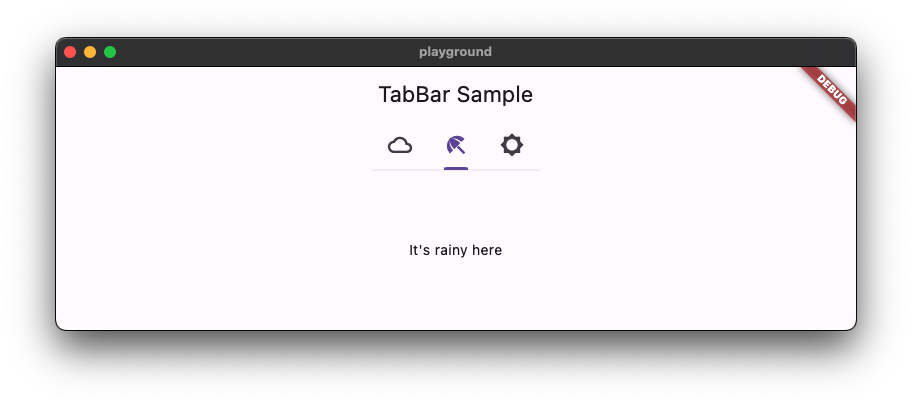 ### Fix (default tab alignment) 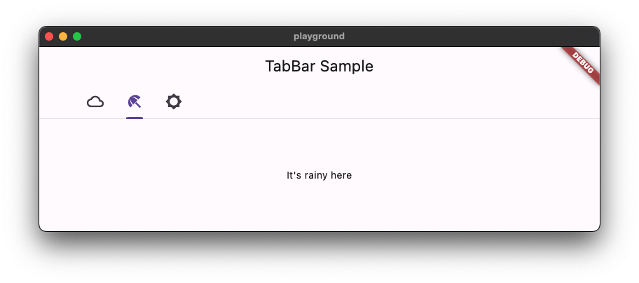 ### Code sample <details> <summary>code sample</summary> ```dart import 'package:flutter/material.dart'; /// Flutter code sample for [TabBar]. void main() => runApp(const TabBarApp()); class TabBarApp extends StatelessWidget { const TabBarApp({super.key}); @override Widget build(BuildContext context) { return MaterialApp( theme: ThemeData( // tabBarTheme: const TabBarTheme(tabAlignment: TabAlignment.start), useMaterial3: true, ), home: const TabBarExample(), ); } } class TabBarExample extends StatefulWidget { const TabBarExample({super.key}); @override State<TabBarExample> createState() => _TabBarExampleState(); } class _TabBarExampleState extends State<TabBarExample> { bool rtl = false; @override Widget build(BuildContext context) { return DefaultTabController( initialIndex: 1, length: 3, child: Directionality( textDirection: rtl ? TextDirection.rtl : TextDirection.ltr, child: Scaffold( appBar: AppBar( title: const Text('TabBar Sample'), ), body: const Column( children: <Widget>[ Text('Scrollable-TabAlignment.start'), TabBar( isScrollable: true, tabAlignment: TabAlignment.start, tabs: <Widget>[ Tab( icon: Icon(Icons.cloud_outlined), ), Tab( icon: Icon(Icons.beach_access_sharp), ), Tab( icon: Icon(Icons.brightness_5_sharp), ), ], ), Text('Scrollable-TabAlignment.startOffset'), TabBar( isScrollable: true, tabAlignment: TabAlignment.startOffset, tabs: <Widget>[ Tab( icon: Icon(Icons.cloud_outlined), ), Tab( icon: Icon(Icons.beach_access_sharp), ), Tab( icon: Icon(Icons.brightness_5_sharp), ), ], ), Text('Scrollable-TabAlignment.center'), TabBar( isScrollable: true, tabAlignment: TabAlignment.center, tabs: <Widget>[ Tab( icon: Icon(Icons.cloud_outlined), ), Tab( icon: Icon(Icons.beach_access_sharp), ), Tab( icon: Icon(Icons.brightness_5_sharp), ), ], ), Spacer(), Text('Non-scrollable-TabAlignment.fill'), TabBar( tabAlignment: TabAlignment.fill, tabs: <Widget>[ Tab( icon: Icon(Icons.cloud_outlined), ), Tab( icon: Icon(Icons.beach_access_sharp), ), Tab( icon: Icon(Icons.brightness_5_sharp), ), ], ), Text('Non-scrollable-TabAlignment.center'), TabBar( tabAlignment: TabAlignment.center, tabs: <Widget>[ Tab( icon: Icon(Icons.cloud_outlined), ), Tab( icon: Icon(Icons.beach_access_sharp), ), Tab( icon: Icon(Icons.brightness_5_sharp), ), ], ), Spacer(), ], ), floatingActionButton: FloatingActionButton.extended( onPressed: () { setState(() { rtl = !rtl; }); }, label: const Text('Switch Direction'), icon: const Icon(Icons.swap_horiz), ), ), ), ); } } ``` </details>  |
||
|
Taha Tesser
|
ca5aa2329a
|
Update ListTile text defaults to use ColorScheme (#128581)
fixes https://github.com/flutter/flutter/issues/128569 <details> <summary>code sample</summary> ```dart import 'package:flutter/material.dart'; void main() { runApp(const ListTileApp()); } class ListTileApp extends StatelessWidget { const ListTileApp({super.key}); @override Widget build(BuildContext context) { return MaterialApp( title: 'Flutter Demo', theme: ThemeData( useMaterial3: true, colorScheme: ColorScheme.fromSeed(seedColor: Colors.red).copyWith( onSurface: Colors.yellow, onSurfaceVariant: Colors.green, ), ), home: const Scaffold( body: Center( child: ListTile( title: Text('title'), subtitle: Text('subtitle'), ), ), ), ); } } ``` </details> # Description M3 ListTile couldn't be customized using `ColorScheme` colors. - This PR updates the list tile text defaults to `ColorScheme` text color tokens. - Improved the `ListTile` template to use the token group. - Update docs and tests. ```dart colorScheme: ColorScheme.fromSeed(seedColor: Colors.red).copyWith( onSurface: Colors.yellow, onSurfaceVariant: Colors.green, ), ``` ### Before  ### After  |
||
|
Pierre-Louis
|
66cda5917d
|
Improve defaults generation with logging, stats, and token validation (#128244)
## Description This improves defaults generation with logging, stats, and token validation. This PR includes these changes: * introduce `TokenLogger`, with a verbose mode * prints versions and tokens usage to the console * outputs `generated/used_tokens.csv`, a list of all used tokens, for use by Google * find token files in `data` automatically * hide tokens `Map` * tokens can be obtained using existing resolvers (e.g. `color`, `shape`), or directly through `getToken`. * tokens can be checked for existence with `tokenAvailable` * remove version from template, since the tokens are aggregated and multiple versions are possible (as is the case currently), it does not make sense to attribute a single version * improve documentation ## Related Issues - Fixes https://github.com/flutter/flutter/issues/122602 ## Tests - Added tests for `TokenLogger` - Regenerated tokens, no-op except version removal ## Future work A future PR should replace or remove the following invalid tokens usages <img width="578" alt="image" src="https://github.com/flutter/flutter/assets/6655696/b6f9e5a7-523f-4f72-94f9-1b0bf4cc9f00"> |