Commit Graph

13 Commits

Author SHA1 Message Date
Taha Tesser
2c71881f50
Fix Scrollable TabBar for Material 3 (#131409)
fixes [Material 3 `TabBar` does not take full width when `isScrollable: true`](https://github.com/flutter/flutter/issues/117722)

### Description
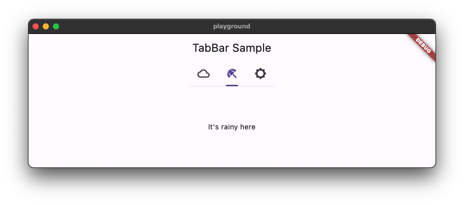
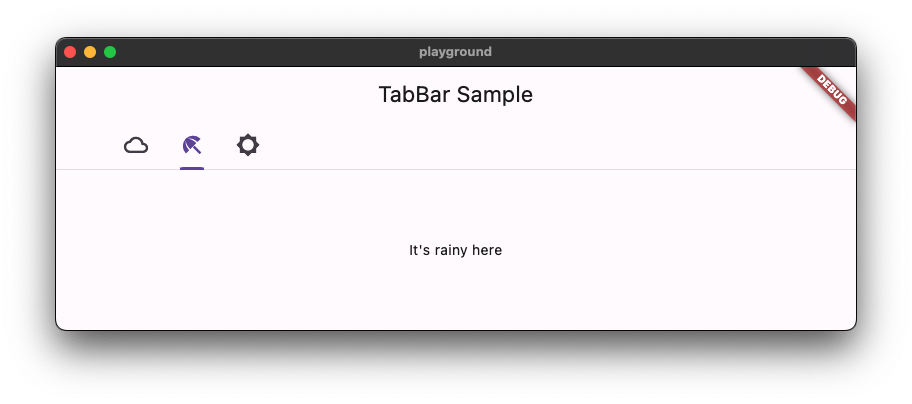
1. Fixed the divider doesn't stretch to take all the available width in the scrollable tab bar in M3
2. Added `dividerHeight` property.

### Code sample

<details> 
<summary>expand to view the code sample</summary> 

```dart
import 'package:flutter/material.dart';

/// Flutter code sample for [TabBar].

void main() => runApp(const TabBarApp());

class TabBarApp extends StatelessWidget {
  const TabBarApp({super.key});

  @override
  Widget build(BuildContext context) {
    return const MaterialApp(
      debugShowCheckedModeBanner: false,
      home: TabBarExample(),
    );
  }
}

class TabBarExample extends StatefulWidget {
  const TabBarExample({super.key});

  @override
  State<TabBarExample> createState() => _TabBarExampleState();
}

class _TabBarExampleState extends State<TabBarExample> {
  bool rtl = false;
  bool customColors = false;
  bool removeDivider = false;
  Color dividerColor = Colors.amber;
  Color indicatorColor = Colors.red;

  @override
  Widget build(BuildContext context) {
    return DefaultTabController(
      initialIndex: 1,
      length: 3,
      child: Directionality(
        textDirection: rtl ? TextDirection.rtl : TextDirection.ltr,
        child: Scaffold(
          appBar: AppBar(
            title: const Text('TabBar Sample'),
            actions: <Widget>[
              IconButton.filledTonal(
                tooltip: 'Switch direction',
                icon: const Icon(Icons.swap_horiz),
                onPressed: () {
                  setState(() {
                    rtl = !rtl;
                  });
                },
              ),
              IconButton.filledTonal(
                tooltip: 'Use custom colors',
                icon: const Icon(Icons.color_lens),
                onPressed: () {
                  setState(() {
                    customColors = !customColors;
                  });
                },
              ),
              IconButton.filledTonal(
                tooltip: 'Show/hide divider',
                icon: const Icon(Icons.remove_rounded),
                onPressed: () {
                  setState(() {
                    removeDivider = !removeDivider;
                  });
                },
              ),
            ],
          ),
          body: Column(
            children: <Widget>[
              const Spacer(),
              const Text('Scrollable - TabAlignment.start'),
              TabBar(
                isScrollable: true,
                tabAlignment: TabAlignment.start,
                dividerColor: customColors ? dividerColor : null,
                indicatorColor: customColors ? indicatorColor : null,
                dividerHeight: removeDivider ? 0 : null,
                tabs: const <Widget>[
                  Tab(
                    icon: Icon(Icons.cloud_outlined),
                  ),
                  Tab(
                    icon: Icon(Icons.beach_access_sharp),
                  ),
                  Tab(
                    icon: Icon(Icons.brightness_5_sharp),
                  ),
                ],
              ),
              const Text('Scrollable - TabAlignment.startOffset'),
              TabBar(
                isScrollable: true,
                tabAlignment: TabAlignment.startOffset,
                dividerColor: customColors ? dividerColor : null,
                indicatorColor: customColors ? indicatorColor : null,
                dividerHeight: removeDivider ? 0 : null,
                tabs: const <Widget>[
                  Tab(
                    icon: Icon(Icons.cloud_outlined),
                  ),
                  Tab(
                    icon: Icon(Icons.beach_access_sharp),
                  ),
                  Tab(
                    icon: Icon(Icons.brightness_5_sharp),
                  ),
                ],
              ),
              const Text('Scrollable - TabAlignment.center'),
              TabBar(
                isScrollable: true,
                tabAlignment: TabAlignment.center,
                dividerColor: customColors ? dividerColor : null,
                indicatorColor: customColors ? indicatorColor : null,
                dividerHeight: removeDivider ? 0 : null,
                tabs: const <Widget>[
                  Tab(
                    icon: Icon(Icons.cloud_outlined),
                  ),
                  Tab(
                    icon: Icon(Icons.beach_access_sharp),
                  ),
                  Tab(
                    icon: Icon(Icons.brightness_5_sharp),
                  ),
                ],
              ),
              const Spacer(),
              const Text('Non-scrollable - TabAlignment.fill'),
              TabBar(
                tabAlignment: TabAlignment.fill,
                dividerColor: customColors ? dividerColor : null,
                indicatorColor: customColors ? indicatorColor : null,
                dividerHeight: removeDivider ? 0 : null,
                tabs: const <Widget>[
                  Tab(
                    icon: Icon(Icons.cloud_outlined),
                  ),
                  Tab(
                    icon: Icon(Icons.beach_access_sharp),
                  ),
                  Tab(
                    icon: Icon(Icons.brightness_5_sharp),
                  ),
                ],
              ),
              const Text('Non-scrollable - TabAlignment.center'),
              TabBar(
                tabAlignment: TabAlignment.center,
                dividerColor: customColors ? dividerColor : null,
                indicatorColor: customColors ? indicatorColor : null,
                dividerHeight: removeDivider ? 0 : null,
                tabs: const <Widget>[
                  Tab(
                    icon: Icon(Icons.cloud_outlined),
                  ),
                  Tab(
                    icon: Icon(Icons.beach_access_sharp),
                  ),
                  Tab(
                    icon: Icon(Icons.brightness_5_sharp),
                  ),
                ],
              ),
              const Spacer(),
              const Text('Secondary - TabAlignment.fill'),
              TabBar.secondary(
                tabAlignment: TabAlignment.fill,
                dividerColor: customColors ? dividerColor : null,
                indicatorColor: customColors ? indicatorColor : null,
                dividerHeight: removeDivider ? 0 : null,
                tabs: const <Widget>[
                  Tab(
                    icon: Icon(Icons.cloud_outlined),
                  ),
                  Tab(
                    icon: Icon(Icons.beach_access_sharp),
                  ),
                  Tab(
                    icon: Icon(Icons.brightness_5_sharp),
                  ),
                ],
              ),
              const Text('Secondary - TabAlignment.center'),
              TabBar.secondary(
                tabAlignment: TabAlignment.center,
                dividerColor: customColors ? dividerColor : null,
                indicatorColor: customColors ? indicatorColor : null,
                dividerHeight: removeDivider ? 0 : null,
                tabs: const <Widget>[
                  Tab(
                    icon: Icon(Icons.cloud_outlined),
                  ),
                  Tab(
                    icon: Icon(Icons.beach_access_sharp),
                  ),
                  Tab(
                    icon: Icon(Icons.brightness_5_sharp),
                  ),
                ],
              ),
              const Spacer(),
            ],
          ),
        ),
      ),
    );
  }
}
``` 
	
</details>

### Before

![Screenshot 2023-07-27 at 14 12 36](https://github.com/flutter/flutter/assets/48603081/1c08a9d2-ac15-4d33-8fa1-c765b4b10f92)

### After 

![Screenshot 2023-07-27 at 14 13 12](https://github.com/flutter/flutter/assets/48603081/7e662dfe-9f32-46c9-a128-3024a4782882)

This also contains regression test for https://github.com/flutter/flutter/pull/125974#discussion_r1239089151

```dart
  // This is a regression test for https://github.com/flutter/flutter/pull/125974#discussion_r1239089151.
  testWidgets('Divider can be constrained', (WidgetTester tester) async {
```

![Screenshot 2023-07-27 at 14 16 37](https://github.com/flutter/flutter/assets/48603081/ac2ef49b-2410-46d0-8ae2-d9b77236abba)
2023-08-02 00:48:06 +00:00
Kate Lovett
087377ea2f
Revert "Fix Material 3 Scrollable TabBar" (#129383)
Reverts flutter/flutter#125974
2023-06-22 22:34:06 +00:00
Taha Tesser
32fde139bc
Fix Material 3 Scrollable TabBar (#125974)
fix https://github.com/flutter/flutter/issues/117722

### Description
1. Fix the divider doesn't stretch to take all the available width in the scrollable tab bar in M3
2. Add `dividerHeight` property.
3. Update the default tab alignment for the scrollable tab bar to match the specs (this is backward compatible for M2 with the new `tabAlignment` property).

### Bug (default tab alignment)

![Screenshot 2023-05-05 at 19 04 40](https://user-images.githubusercontent.com/48603081/236509483-1d03af21-a764-4776-acef-2126560f0d51.png)

### Fix (default tab alignment)

![Screenshot 2023-05-05 at 19 04 15](https://user-images.githubusercontent.com/48603081/236509513-2426d456-c54f-42bd-9545-a14dc6ee7e69.png)

### Code sample

<details> 
<summary>code sample</summary> 

```dart
import 'package:flutter/material.dart';

/// Flutter code sample for [TabBar].

void main() => runApp(const TabBarApp());

class TabBarApp extends StatelessWidget {
  const TabBarApp({super.key});

  @override
  Widget build(BuildContext context) {
    return MaterialApp(
      theme: ThemeData(
        //  tabBarTheme: const TabBarTheme(tabAlignment: TabAlignment.start),
          useMaterial3: true,
      ),
      home: const TabBarExample(),
    );
  }
}

class TabBarExample extends StatefulWidget {
  const TabBarExample({super.key});

  @override
  State<TabBarExample> createState() => _TabBarExampleState();
}

class _TabBarExampleState extends State<TabBarExample> {
  bool rtl = false;

  @override
  Widget build(BuildContext context) {
    return DefaultTabController(
      initialIndex: 1,
      length: 3,
      child: Directionality(
        textDirection:  rtl ? TextDirection.rtl : TextDirection.ltr,
        child: Scaffold(
          appBar: AppBar(
            title: const Text('TabBar Sample'),
          ),
          body: const Column(
            children: <Widget>[
              Text('Scrollable-TabAlignment.start'),
              TabBar(
                isScrollable: true,
                tabAlignment: TabAlignment.start,
                tabs: <Widget>[
                  Tab(
                    icon: Icon(Icons.cloud_outlined),
                  ),
                  Tab(
                    icon: Icon(Icons.beach_access_sharp),
                  ),
                  Tab(
                    icon: Icon(Icons.brightness_5_sharp),
                  ),
                ],
              ),
              Text('Scrollable-TabAlignment.startOffset'),
              TabBar(
                isScrollable: true,
                tabAlignment: TabAlignment.startOffset,
                tabs: <Widget>[
                  Tab(
                    icon: Icon(Icons.cloud_outlined),
                  ),
                  Tab(
                    icon: Icon(Icons.beach_access_sharp),
                  ),
                  Tab(
                    icon: Icon(Icons.brightness_5_sharp),
                  ),
                ],
              ),
              Text('Scrollable-TabAlignment.center'),
              TabBar(
                isScrollable: true,
                tabAlignment: TabAlignment.center,
                tabs: <Widget>[
                  Tab(
                    icon: Icon(Icons.cloud_outlined),
                  ),
                  Tab(
                    icon: Icon(Icons.beach_access_sharp),
                  ),
                  Tab(
                    icon: Icon(Icons.brightness_5_sharp),
                  ),
                ],
              ),
              Spacer(),
              Text('Non-scrollable-TabAlignment.fill'),
              TabBar(
                tabAlignment: TabAlignment.fill,
                tabs: <Widget>[
                  Tab(
                    icon: Icon(Icons.cloud_outlined),
                  ),
                  Tab(
                    icon: Icon(Icons.beach_access_sharp),
                  ),
                  Tab(
                    icon: Icon(Icons.brightness_5_sharp),
                  ),
                ],
              ),
              Text('Non-scrollable-TabAlignment.center'),
              TabBar(
                tabAlignment: TabAlignment.center,
                tabs: <Widget>[
                  Tab(
                    icon: Icon(Icons.cloud_outlined),
                  ),
                  Tab(
                    icon: Icon(Icons.beach_access_sharp),
                  ),
                  Tab(
                    icon: Icon(Icons.brightness_5_sharp),
                  ),
                ],
              ),
              Spacer(),
            ],
          ),
          floatingActionButton: FloatingActionButton.extended(
            onPressed: () {
              setState(() {
                rtl = !rtl;
              });
            },
            label: const Text('Switch Direction'),
            icon: const Icon(Icons.swap_horiz),
          ),
        ),
      ),
    );
  }
}
``` 
	
</details>

![Screenshot 2023-06-06 at 18 06 12](https://github.com/flutter/flutter/assets/48603081/5ee5386d-cc64-4025-a020-ed2222cb6031)
2023-06-22 17:30:46 +00:00
Pierre-Louis
66cda5917d
Improve defaults generation with logging, stats, and token validation (#128244)
## Description

This improves defaults generation with logging, stats, and token validation. 

This PR includes these changes:
* introduce `TokenLogger`, with a verbose mode
  * prints versions and tokens usage to the console
  * outputs `generated/used_tokens.csv`, a list of all used tokens, for use by Google
* find token files in `data` automatically
* hide tokens `Map`
  * tokens can be obtained using existing resolvers (e.g. `color`, `shape`), or directly through `getToken`.
  * tokens can be checked for existence with `tokenAvailable`
* remove version from template, since the tokens are aggregated and multiple versions are possible (as is the case currently), it does not make sense to attribute a single version
* improve documentation

## Related Issues
 - Fixes https://github.com/flutter/flutter/issues/122602

## Tests
 - Added tests for `TokenLogger`
 - Regenerated tokens, no-op except version removal

## Future work
A future PR should replace or remove the following invalid tokens usages

<img width="578" alt="image" src="https://github.com/flutter/flutter/assets/6655696/b6f9e5a7-523f-4f72-94f9-1b0bf4cc9f00">
2023-06-09 11:28:18 +00:00
Qun Cheng
4e7e4512b6
Reorder materialStateProperty defaults (#125905)
Fixes #122250. This PR is to make sure all the MaterialStateProperty defaults are able to correctly resolve different states. 
* When a widget is pressed, it is also hovered, so we need to put the `MaterialState.pressed` check before `MaterialState.hovered`. 
* When a widget is focused, the widget should still be able to be hovered, so we should check `MaterialState.hovered` before `MaterialState.focused`.
* There are also cases like in _InputDecoratorDefaultsM3, the `MaterialState.disabled` should be checked before `MaterialState.error`.

 the order should be disabled, (error), pressed, hovered, focused.
2023-05-11 00:03:09 +00:00
Taha Tesser
ad009fb7ac
Fix Material 3 tab indicator weight and position (#125883)
fixes https://github.com/flutter/flutter/issues/123112

### Description
1. Add proper M3 indicator height aka`IndictorWeight` from the M3 specs for the primary tab bar with label indicator size.
db6074ade4/dev/tools/gen_defaults/data/navigation_tab_primary.json (L9)
(this was held due to `indicatorWeight` having a hard-coded value) 

and added a secondary tab bar indicator height.
2. Set a minimum value for the rounded indicator to maintain the indicator shape.
3. With proper indicator height, the rounded indicator position is also fixed.
4. Fix round indicator is shown for the primary tab bar with tab indicator size.
5. Above changes fix https://github.com/flutter/flutter/issues/123112.
6. Fix the `startOffset` const value from https://github.com/flutter/flutter/pull/125036  to match docs and move it to a variable.
2023-05-05 14:09:18 +00:00
Taha Tesser
a732a74888
Introduce TabBar.tabAlignment (#125036)
fixes https://github.com/flutter/flutter/issues/124195

This introduces `TabBar.tabAlignment` while keeping the default alignment for both M2 and M3.
2023-05-01 16:59:55 +00:00
Kate Lovett
3dfc60c0d1
Revert "Fix divider width in scrollable TabBar for Material 3 and add dividerHeight parameter (#123127)" (#123616)
Revert "Fix divider width in scrollable `TabBar` for  Material 3 and add `dividerHeight` parameter"
2023-03-28 16:45:15 +00:00
Taha Tesser
3512c2cd76
Fix divider width in scrollable TabBar for Material 3 and add dividerHeight parameter (#123127)
Fix divider width in scrollable `TabBar` for  Material 3 and add `dividerHeight` parameter
2023-03-27 22:52:59 +00:00
Pierre-Louis
02d5c7595b
Add support for secondary tab bar (#122756)
Add support for secondary tab bar
2023-03-23 22:49:59 +00:00
Taha Tesser
a52293843c
[Reland] Add Material 3 support for TabBar (#116283)
* Add Material 3 support for `TabBar`

* M3 `TabBar` revert fix and tests
2022-11-30 17:58:07 +00:00
Pierre-Louis
b2672fe835
Revert "Add Material 3 support for TabBar (#116110)" (#116273)
This reverts commit 900b395451.
2022-11-30 13:20:19 +00:00
Taha Tesser
900b395451
Add Material 3 support for TabBar (#116110) 2022-11-29 22:36:37 +00:00