Elliott Brooks
01eef7ca13
Upgrade Flutter deps to pull in latest vm_service and dwds ( #136734 )
...
Generated by running `flutter update-packages --force-upgrade`
Updates vm_service to [12.0.0](https://pub.dev/packages/vm_service/versions/12.0.0 ) and dwds to [22.0.0](https://pub.dev/packages/dwds/versions/22.0.0 )
The changes to `packages/flutter_tools/lib/src/isolated/devfs_web.dart` are for the new interface of DWDS introduced in https://github.com/dart-lang/webdev/pull/2243
FYI @bkonyi
2023-10-19 18:29:02 +00:00
Michael Goderbauer
437361321a
Bump file,process,process_runner ( #136418 )
2023-10-12 13:05:24 -07:00
Kevin Moore
3e60999b11
Allow latest pkg:material_color_utilities ( #132445 )
...
* Allow latest pkg:material_color_utilities
* Bump other dependencies to their latest - including pkg:web
2023-10-11 23:57:16 +00:00
Gray Mackall
f4b5fc1803
Unpin url launcher (remake) ( #134958 )
...
More up to date version of https://github.com/flutter/flutter/pull/133786 .
Fixes https://github.com/flutter/flutter/issues/111304
2023-09-20 02:43:57 +00:00
Michael Goderbauer
b966b2beee
Enable private field promotion for dev ( #134480 )
...
New feature in upcoming Dart 3.2. See https://github.com/dart-lang/language/issues/2020 . Feature is enabled by bumping the min SDK version to 3.2.
Part of https://github.com/flutter/flutter/issues/134476 .
2023-09-12 18:29:00 +00:00
Taha Tesser
1e770c3808
Add cancelButtonStyle & confirmButtonStyle to the DatePickerThemeData ( #132847 )
...
fixes [Unable to adjust the color for "Cancel" and "Ok" button in datePicker dialog](https://github.com/flutter/flutter/issues/127739 )
### Code sample
<details>
<summary>expand to view the code sample</summary>
```dart
import 'package:flutter/material.dart';
void main() => runApp(const MyApp());
class MyApp extends StatelessWidget {
const MyApp({super.key});
@override
Widget build(BuildContext context) {
return MaterialApp(
debugShowCheckedModeBanner: false,
theme: ThemeData(
useMaterial3: true,
datePickerTheme: DatePickerThemeData(
cancelButtonStyle: TextButton.styleFrom(
shape: const RoundedRectangleBorder(
borderRadius: BorderRadius.all(Radius.circular(16)),
side: BorderSide(color: Colors.red),
),
backgroundColor: Colors.white,
foregroundColor: Colors.red,
elevation: 3,
shadowColor: Colors.red,
),
confirmButtonStyle: TextButton.styleFrom(
shape: const RoundedRectangleBorder(
borderRadius: BorderRadius.all(Radius.circular(16)),
),
backgroundColor: Colors.green[700],
foregroundColor: Colors.white,
elevation: 3,
shadowColor: Colors.green[700],
),
),
),
home: const Example(),
);
}
}
class Example extends StatelessWidget {
const Example({super.key});
@override
Widget build(BuildContext context) {
return Scaffold(
body: Center(
child: DatePickerDialog(
initialDate: DateTime.now(),
firstDate: DateTime(2020),
lastDate: DateTime(2030),
),
),
);
}
}
```
</details>
### Before
Not possible to customize action buttons from the `DatePickerThemeData`.
### After

2023-08-30 21:16:13 +00:00
Xilai Zhang
6fd42536b7
[flutter roll] Revert "Fix Chip.shape's side is not used when provided in Material 3" ( #133615 )
...
Reverts flutter/flutter#132941
context: b/298110031

The rounded rectangle borders don't appear in some of the internal
golden image tests.
2023-08-29 19:59:02 -07:00
Kenzie Davisson
61d9f55665
Update flutter packages to pick up latest vm_service ( #133335 )
...
Generated by running `flutter update-packages --force-upgrade`
2023-08-25 11:03:35 -07:00
Taha Tesser
612117a690
Fix Chip.shape's side is not used when provided in Material 3 ( #132941 )
...
fixes [Chip border side color not working in Material3](https://github.com/flutter/flutter/issues/132922 )
### Code sample
<details>
<summary>expand to view the code sample</summary>
```dart
import 'package:flutter/material.dart';
void main() {
runApp(const MyApp());
}
class MyApp extends StatelessWidget {
const MyApp({super.key});
@override
Widget build(BuildContext context) {
return MaterialApp(
theme: ThemeData(
useMaterial3: true,
chipTheme: const ChipThemeData(
// shape: RoundedRectangleBorder(
// side: BorderSide(color: Colors.amber),
// borderRadius: BorderRadius.all(Radius.circular(12)),
// ),
// side: BorderSide(color: Colors.red),
),
),
home: const Example(),
);
}
}
class Example extends StatelessWidget {
const Example({super.key});
@override
Widget build(BuildContext context) {
return const Scaffold(
body: Center(
child: RawChip(
shape: RoundedRectangleBorder(
side: BorderSide(color: Colors.amber),
borderRadius: BorderRadius.all(Radius.circular(12)),
),
// side: BorderSide(color: Colors.red),
label: Text('Chip'),
),
),
);
}
}
```
</details>
---
### Before
When `RawChip.shape` is provided with a `BorderSide`.
```dart
body: Center(
child: RawChip(
shape: RoundedRectangleBorder(
side: BorderSide(color: Colors.amber),
borderRadius: BorderRadius.all(Radius.circular(12)),
),
label: Text('Chip'),
),
),
```

When `RawChip.shape` is provided with a `BorderSide` and also `RawChip.side` is provided. The `RawChip.side` overrides the shape's side.
```dart
body: Center(
child: RawChip(
shape: RoundedRectangleBorder(
side: BorderSide(color: Colors.amber),
borderRadius: BorderRadius.all(Radius.circular(12)),
),
side: BorderSide(color: Colors.red),
label: Text('Chip'),
),
),
```

---
### After
When `RawChip.shape` is provided with a `BorderSide`.
```dart
body: Center(
child: RawChip(
shape: RoundedRectangleBorder(
side: BorderSide(color: Colors.amber),
borderRadius: BorderRadius.all(Radius.circular(12)),
),
label: Text('Chip'),
),
),
```

When `RawChip.shape` is provided with a `BorderSide` and also `RawChip.side` is provided. The `RawChip.side` overrides the shape's side.
```dart
body: Center(
child: RawChip(
shape: RoundedRectangleBorder(
side: BorderSide(color: Colors.amber),
borderRadius: BorderRadius.all(Radius.circular(12)),
),
side: BorderSide(color: Colors.red),
label: Text('Chip'),
),
),
```

---
2023-08-25 14:47:08 +00:00
Taha Tesser
1bc791697c
Update default menu text styles for Material 3 ( #131930 )
...
Related https://github.com/flutter/flutter/issues/131676
## Description
#### Fix default input text style for `DropdownMenu`

### Fix default text style for `MenuAnchor`'s menu items (which `DropdownMenu` uses for menu items)

### Default `DropdownMenu` Input text style

### Default `DropdownMenu` menu item text style

### Default `MenuAnchor` menu item text style

### Code sample
<details>
<summary>expand to view the code sample</summary>
```dart
import 'package:flutter/material.dart';
/// Flutter code sample for [DropdownMenu]s. The first dropdown menu has an outlined border.
void main() => runApp(const DropdownMenuExample());
class DropdownMenuExample extends StatefulWidget {
const DropdownMenuExample({super.key});
@override
State<DropdownMenuExample> createState() => _DropdownMenuExampleState();
}
class _DropdownMenuExampleState extends State<DropdownMenuExample> {
final TextEditingController colorController = TextEditingController();
final TextEditingController iconController = TextEditingController();
ColorLabel? selectedColor;
IconLabel? selectedIcon;
@override
Widget build(BuildContext context) {
final List<DropdownMenuEntry<ColorLabel>> colorEntries =
<DropdownMenuEntry<ColorLabel>>[];
for (final ColorLabel color in ColorLabel.values) {
colorEntries.add(
DropdownMenuEntry<ColorLabel>(
value: color, label: color.label, enabled: color.label != 'Grey'),
);
}
final List<DropdownMenuEntry<IconLabel>> iconEntries =
<DropdownMenuEntry<IconLabel>>[];
for (final IconLabel icon in IconLabel.values) {
iconEntries
.add(DropdownMenuEntry<IconLabel>(value: icon, label: icon.label));
}
return MaterialApp(
theme: ThemeData(
useMaterial3: true,
colorSchemeSeed: Colors.green,
// textTheme: const TextTheme(
// bodyLarge: TextStyle(
// fontWeight: FontWeight.bold,
// fontStyle: FontStyle.italic,
// decoration: TextDecoration.underline,
// ),
// ),
),
home: Scaffold(
body: SafeArea(
child: Column(
children: <Widget>[
const Text('DropdownMenus'),
Padding(
padding: const EdgeInsets.symmetric(vertical: 20),
child: Row(
mainAxisAlignment: MainAxisAlignment.center,
children: <Widget>[
DropdownMenu<ColorLabel>(
controller: colorController,
label: const Text('Color'),
dropdownMenuEntries: colorEntries,
onSelected: (ColorLabel? color) {
setState(() {
selectedColor = color;
});
},
),
const SizedBox(width: 20),
DropdownMenu<IconLabel>(
controller: iconController,
enableFilter: true,
leadingIcon: const Icon(Icons.search),
label: const Text('Icon'),
dropdownMenuEntries: iconEntries,
inputDecorationTheme: const InputDecorationTheme(
filled: true,
contentPadding: EdgeInsets.symmetric(vertical: 5.0),
),
onSelected: (IconLabel? icon) {
setState(() {
selectedIcon = icon;
});
},
),
],
),
),
const Text('Plain TextFields'),
Padding(
padding: const EdgeInsets.symmetric(vertical: 20),
child: Row(
mainAxisAlignment: MainAxisAlignment.center,
children: <Widget>[
SizedBox(
width: 150,
child: TextField(
controller: TextEditingController(text: 'Blue'),
decoration: const InputDecoration(
suffixIcon: Icon(Icons.arrow_drop_down),
labelText: 'Color',
border: OutlineInputBorder(),
)),
),
const SizedBox(width: 20),
SizedBox(
width: 150,
child: TextField(
controller: TextEditingController(text: 'Smile'),
decoration: const InputDecoration(
prefixIcon: Icon(Icons.search),
suffixIcon: Icon(Icons.arrow_drop_down),
filled: true,
labelText: 'Icon',
)),
),
],
),
),
if (selectedColor != null && selectedIcon != null)
Row(
mainAxisAlignment: MainAxisAlignment.center,
children: <Widget>[
Text(
'You selected a ${selectedColor?.label} ${selectedIcon?.label}'),
Padding(
padding: const EdgeInsets.symmetric(horizontal: 5),
child: Icon(
selectedIcon?.icon,
color: selectedColor?.color,
),
)
],
)
else
const Text('Please select a color and an icon.')
],
),
),
),
);
}
}
enum ColorLabel {
blue('Blue', Colors.blue),
pink('Pink', Colors.pink),
green('Green', Colors.green),
yellow('Yellow', Colors.yellow),
grey('Grey', Colors.grey);
const ColorLabel(this.label, this.color);
final String label;
final Color color;
}
enum IconLabel {
smile('Smile', Icons.sentiment_satisfied_outlined),
cloud(
'Cloud',
Icons.cloud_outlined,
),
brush('Brush', Icons.brush_outlined),
heart('Heart', Icons.favorite);
const IconLabel(this.label, this.icon);
final String label;
final IconData icon;
}
```
</details>
2023-08-22 22:21:00 +00:00
Taha Tesser
23315f1b57
[Reland] #131609 ( #132555 )
...
This relands https://github.com/flutter/flutter/pull/131609
---
fixes [`PopupMenuItem` adds redundant padding when using `ListItem`](https://github.com/flutter/flutter/issues/128553 )
2023-08-16 00:44:06 +00:00
Polina Cherkasova
f0e7c51816
Upgrade flutter packages. ( #132585 )
2023-08-15 13:50:17 -07:00
Casey Hillers
7ce2d83b84
Revert "Fix PopupMenuItem & CheckedPopupMenuItem has redundant ListTile padding and update default horizontal padding for Material 3" ( #132457 )
...
Reverts flutter/flutter#131609

b/295497265 - This broke Google Testing. We'll need the internal patch
before landing as there's a large number of customer codebases impacted.
2023-08-13 14:27:01 -07:00
Polina Cherkasova
60634c65b2
Upgrade flutter packages. ( #132326 )
2023-08-10 13:44:05 -07:00
Taha Tesser
96e02c61dc
Fix PopupMenuItem & CheckedPopupMenuItem has redundant ListTile padding and update default horizontal padding for Material 3 ( #131609 )
...
fixes [`PopupMenuItem` adds redundant padding when using `ListItem`](https://github.com/flutter/flutter/issues/128553 )
### Description
- Fixed redundant `ListTile` padding when using `CheckedPopupMenuItem` or `PopupMenuItem` with the `ListTile` child for complex popup menu items as suggested in the docs.
- Updated default horizontal padding for popup menu items.
### Code sample
<details>
<summary>expand to view the code sample</summary>
```dart
import 'package:flutter/material.dart';
/// Flutter code sample for [PopupMenuButton].
// This is the type used by the popup menu below.
enum SampleItem { itemOne, itemTwo, itemThree }
void main() => runApp(const PopupMenuApp());
class PopupMenuApp extends StatelessWidget {
const PopupMenuApp({super.key});
@override
Widget build(BuildContext context) {
return MaterialApp(
theme: ThemeData(useMaterial3: true),
home: const PopupMenuExample(),
);
}
}
class PopupMenuExample extends StatefulWidget {
const PopupMenuExample({super.key});
@override
State<PopupMenuExample> createState() => _PopupMenuExampleState();
}
class _PopupMenuExampleState extends State<PopupMenuExample> {
SampleItem? selectedMenu;
@override
Widget build(BuildContext context) {
return Scaffold(
appBar: AppBar(title: const Text('PopupMenuButton')),
body: Center(
child: SizedBox(
width: 150,
height: 100,
child: Align(
alignment: Alignment.topLeft,
child: PopupMenuButton<SampleItem>(
initialValue: selectedMenu,
// Callback that sets the selected popup menu item.
onSelected: (SampleItem item) {
setState(() {
selectedMenu = item;
});
},
itemBuilder: (BuildContext context) =>
<PopupMenuEntry<SampleItem>>[
const PopupMenuItem<SampleItem>(
value: SampleItem.itemOne,
child: Text('PopupMenuItem'),
),
const CheckedPopupMenuItem<SampleItem>(
checked: true,
value: SampleItem.itemTwo,
child: Text('CheckedPopupMenuItem'),
),
const PopupMenuItem<SampleItem>(
value: SampleItem.itemOne,
child: ListTile(
leading: Icon(Icons.cloud),
title: Text('ListTile'),
contentPadding: EdgeInsets.zero,
trailing: Icon(Icons.arrow_right_rounded),
),
),
],
),
),
),
),
);
}
}
```
</details>
### Before

- Default horizontal padding is the same as M2 (16.0), while the specs use a smaller value (12.0)
- `ListTile` nested by default in `CheckedPopupMenuItem` has redundant padding
- `PopupMenuItem` using `ListTile` as a child for complex menu items contains redundant padding.

### After
- Default horizontal padding is updated for Material 3.
- `PopupMenuItem` & `CheckedPopupMenuItem` override `ListTile` padding (similar to how `ExpansionTile` overrides `ListTile` text and icon color.

2023-08-10 16:05:03 +00:00
Zachary Anderson
f4c25bbb35
Revert "Handle breaking changes in leak_tracker." ( #132223 )
...
Reverts flutter/flutter#131998

Reverting for https://github.com/flutter/flutter/issues/132222
2023-08-09 08:14:39 -07:00
Qun Cheng
0bc5a2bca4
Add textCapitalization property for SearchBar and SearchAnchor ( #131459 )
...
This is to add `textCapitalization` property for `SearchBar` and `SearchAnchor`.
Fixes : #131260
2023-08-08 23:24:19 +00:00
Polina Cherkasova
acd636f7ba
Handle breaking changes in leak_tracker. ( #131998 )
2023-08-08 09:39:19 -07:00
Polina Cherkasova
2c10295904
Upgrade packages. ( #131927 )
2023-08-04 08:09:00 -07:00
Taha Tesser
0192f88328
Fix TimePicker token issue link ( #131863 )
...
Fix issue reference for https://github.com/flutter/flutter/issues/131247 (it was added in the bug fix PR https://github.com/flutter/flutter/pull/131253 )
2023-08-03 22:32:57 +00:00
Taha Tesser
2c71881f50
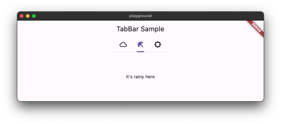
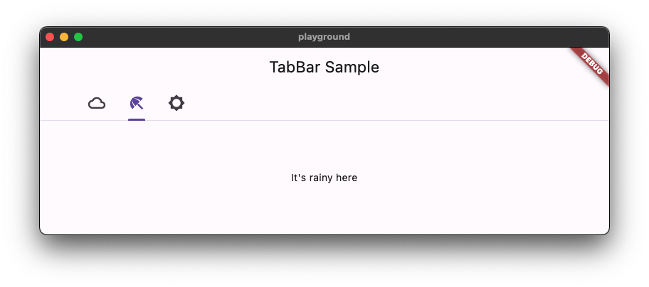
Fix Scrollable TabBar for Material 3 ( #131409 )
...
fixes [Material 3 `TabBar` does not take full width when `isScrollable: true`](https://github.com/flutter/flutter/issues/117722 )
### Description
1. Fixed the divider doesn't stretch to take all the available width in the scrollable tab bar in M3
2. Added `dividerHeight` property.
### Code sample
<details>
<summary>expand to view the code sample</summary>
```dart
import 'package:flutter/material.dart';
/// Flutter code sample for [TabBar].
void main() => runApp(const TabBarApp());
class TabBarApp extends StatelessWidget {
const TabBarApp({super.key});
@override
Widget build(BuildContext context) {
return const MaterialApp(
debugShowCheckedModeBanner: false,
home: TabBarExample(),
);
}
}
class TabBarExample extends StatefulWidget {
const TabBarExample({super.key});
@override
State<TabBarExample> createState() => _TabBarExampleState();
}
class _TabBarExampleState extends State<TabBarExample> {
bool rtl = false;
bool customColors = false;
bool removeDivider = false;
Color dividerColor = Colors.amber;
Color indicatorColor = Colors.red;
@override
Widget build(BuildContext context) {
return DefaultTabController(
initialIndex: 1,
length: 3,
child: Directionality(
textDirection: rtl ? TextDirection.rtl : TextDirection.ltr,
child: Scaffold(
appBar: AppBar(
title: const Text('TabBar Sample'),
actions: <Widget>[
IconButton.filledTonal(
tooltip: 'Switch direction',
icon: const Icon(Icons.swap_horiz),
onPressed: () {
setState(() {
rtl = !rtl;
});
},
),
IconButton.filledTonal(
tooltip: 'Use custom colors',
icon: const Icon(Icons.color_lens),
onPressed: () {
setState(() {
customColors = !customColors;
});
},
),
IconButton.filledTonal(
tooltip: 'Show/hide divider',
icon: const Icon(Icons.remove_rounded),
onPressed: () {
setState(() {
removeDivider = !removeDivider;
});
},
),
],
),
body: Column(
children: <Widget>[
const Spacer(),
const Text('Scrollable - TabAlignment.start'),
TabBar(
isScrollable: true,
tabAlignment: TabAlignment.start,
dividerColor: customColors ? dividerColor : null,
indicatorColor: customColors ? indicatorColor : null,
dividerHeight: removeDivider ? 0 : null,
tabs: const <Widget>[
Tab(
icon: Icon(Icons.cloud_outlined),
),
Tab(
icon: Icon(Icons.beach_access_sharp),
),
Tab(
icon: Icon(Icons.brightness_5_sharp),
),
],
),
const Text('Scrollable - TabAlignment.startOffset'),
TabBar(
isScrollable: true,
tabAlignment: TabAlignment.startOffset,
dividerColor: customColors ? dividerColor : null,
indicatorColor: customColors ? indicatorColor : null,
dividerHeight: removeDivider ? 0 : null,
tabs: const <Widget>[
Tab(
icon: Icon(Icons.cloud_outlined),
),
Tab(
icon: Icon(Icons.beach_access_sharp),
),
Tab(
icon: Icon(Icons.brightness_5_sharp),
),
],
),
const Text('Scrollable - TabAlignment.center'),
TabBar(
isScrollable: true,
tabAlignment: TabAlignment.center,
dividerColor: customColors ? dividerColor : null,
indicatorColor: customColors ? indicatorColor : null,
dividerHeight: removeDivider ? 0 : null,
tabs: const <Widget>[
Tab(
icon: Icon(Icons.cloud_outlined),
),
Tab(
icon: Icon(Icons.beach_access_sharp),
),
Tab(
icon: Icon(Icons.brightness_5_sharp),
),
],
),
const Spacer(),
const Text('Non-scrollable - TabAlignment.fill'),
TabBar(
tabAlignment: TabAlignment.fill,
dividerColor: customColors ? dividerColor : null,
indicatorColor: customColors ? indicatorColor : null,
dividerHeight: removeDivider ? 0 : null,
tabs: const <Widget>[
Tab(
icon: Icon(Icons.cloud_outlined),
),
Tab(
icon: Icon(Icons.beach_access_sharp),
),
Tab(
icon: Icon(Icons.brightness_5_sharp),
),
],
),
const Text('Non-scrollable - TabAlignment.center'),
TabBar(
tabAlignment: TabAlignment.center,
dividerColor: customColors ? dividerColor : null,
indicatorColor: customColors ? indicatorColor : null,
dividerHeight: removeDivider ? 0 : null,
tabs: const <Widget>[
Tab(
icon: Icon(Icons.cloud_outlined),
),
Tab(
icon: Icon(Icons.beach_access_sharp),
),
Tab(
icon: Icon(Icons.brightness_5_sharp),
),
],
),
const Spacer(),
const Text('Secondary - TabAlignment.fill'),
TabBar.secondary(
tabAlignment: TabAlignment.fill,
dividerColor: customColors ? dividerColor : null,
indicatorColor: customColors ? indicatorColor : null,
dividerHeight: removeDivider ? 0 : null,
tabs: const <Widget>[
Tab(
icon: Icon(Icons.cloud_outlined),
),
Tab(
icon: Icon(Icons.beach_access_sharp),
),
Tab(
icon: Icon(Icons.brightness_5_sharp),
),
],
),
const Text('Secondary - TabAlignment.center'),
TabBar.secondary(
tabAlignment: TabAlignment.center,
dividerColor: customColors ? dividerColor : null,
indicatorColor: customColors ? indicatorColor : null,
dividerHeight: removeDivider ? 0 : null,
tabs: const <Widget>[
Tab(
icon: Icon(Icons.cloud_outlined),
),
Tab(
icon: Icon(Icons.beach_access_sharp),
),
Tab(
icon: Icon(Icons.brightness_5_sharp),
),
],
),
const Spacer(),
],
),
),
),
);
}
}
```
</details>
### Before

### After

This also contains regression test for https://github.com/flutter/flutter/pull/125974#discussion_r1239089151
```dart
// This is a regression test for https://github.com/flutter/flutter/pull/125974#discussion_r1239089151 .
testWidgets('Divider can be constrained', (WidgetTester tester) async {
```

2023-08-02 00:48:06 +00:00
Polina Cherkasova
35213ceabd
Upgrade Flutter libraries. ( #131700 )
2023-08-01 12:59:47 -07:00
Taha Tesser
7d89617a92
Fix TimePicker defaults for hourMinuteTextStyle and dayPeriodTextColor for Material 3 ( #131253 )
...
fixes [`TimePicker` color and visual issues](https://github.com/flutter/flutter/issues/127035 )
## Description
- fixes default text style for `TimePicker`s `hourMinuteTextStyle` and added a todo for https://github.com/flutter/flutter/issues/131247
- fixes correct default color not being accessed for `dayPeriodTextColor`
- Updates tests
### Code sample
<details>
<summary>expand to view the code sample</summary>
```dart
import 'package:flutter/material.dart';
void main() => runApp(const MyApp());
class MyApp extends StatelessWidget {
const MyApp({super.key});
@override
Widget build(BuildContext context) {
return MaterialApp(
debugShowCheckedModeBanner: false,
theme: ThemeData(useMaterial3: true),
home: const Example(),
);
}
}
class Example extends StatelessWidget {
const Example({super.key});
@override
Widget build(BuildContext context) {
return Scaffold(
appBar: AppBar(
title: const Text('Sample'),
),
body: Center(
child: ElevatedButton(
onPressed: () {
showTimePicker(
context: context,
orientation: Orientation.portrait,
initialEntryMode: TimePickerEntryMode.input,
initialTime: TimeOfDay.now(),
builder: (BuildContext context, Widget? child) {
return MediaQuery(
data: MediaQuery.of(context)
.copyWith(alwaysUse24HourFormat: true),
child: child!,
);
},
);
},
child: const Text('Open Time Picker'),
),
),
);
}
}
```
</details>
### Before

### After

2023-07-28 14:11:23 +00:00
Jason Simmons
8a84437989
Manual roll to engine commit 9b14c382 using Dart SDK version 3.2.x ( #131371 )
...
Dart SDK 3.2.x requires a new version of the dart_internal package.
2023-07-27 17:33:07 +00:00
Taha Tesser
5554b0eeb3
Fix M3 TimePicker dial background uses incorrect color ( #131045 )
...
fixes [Material3: TimePicker clock dial use wrong spec color and its web spec has a mistake](https://github.com/flutter/flutter/issues/118657 )
### Description
This PR fixes the default color used for the Material 3 dial background.
### Code sample
<details>
<summary>expand to view the code sample</summary>
```dart
import 'package:flutter/material.dart';
void main() => runApp(const MyApp());
class MyApp extends StatelessWidget {
const MyApp({super.key});
@override
Widget build(BuildContext context) {
final ThemeData theme = ThemeData(useMaterial3: true);
return MaterialApp(
debugShowCheckedModeBanner: false,
// theme: theme,
theme: theme.copyWith(
colorScheme: theme.colorScheme.copyWith(
surfaceVariant: const Color(0xffffbf00),
),
),
home: const Example(),
);
}
}
class Example extends StatelessWidget {
const Example({super.key});
@override
Widget build(BuildContext context) {
return Scaffold(
appBar: AppBar(
title: const Text('Sample'),
),
body: Center(
child: ElevatedButton(
onPressed: () {
showTimePicker(
context: context,
initialTime: TimeOfDay.now(),
);
},
child: const Text('Open Time Picker'),
),
),
);
}
}
```
</details>
### Default dial background color
| Before | After |
| --------------- | --------------- |
| <img src="https://github.com/flutter/flutter/assets/48603081/59514586-60c6-489f-b024-f659a26fa1e7 " /> | <img src="https://github.com/flutter/flutter/assets/48603081/75c3c360-df2b-47c8-8187-136ff6d963b6 " /> |
### Custom color scheme
| Before | After |
| --------------- | --------------- |
| <img src="https://github.com/flutter/flutter/assets/48603081/666dd2fc-7ee2-4268-9af0-923019adfccd " /> | <img src="https://github.com/flutter/flutter/assets/48603081/f32dc39e-a43f-4a63-a6e4-9df479b723ed " /> |
2023-07-24 18:30:23 +00:00
Pierre-Louis
0830a362d5
Add support for M3 motion ( #129942 )
...
## Description

This adds support for M3 easing and duration tokens.

This PR includes these changes:
* Generation of duration and easing constants, in `Durations` and
`Easing`, respectively (`Curves` is already taken in the `animation`
library)
* Add 3 Dart fixes

Once this is merged, I'll migrate packages/plugins/customers and then
uncomment the deprecation notices for the 3 M2 curves, all of which have
1:1 replacements.

## Related Issues
 - Fixes https://github.com/flutter/flutter/issues/116525

## Tests
 - Added Dart fix tests

## Pre-launch Checklist

- [x] I read the [Contributor Guide] and followed the process outlined
there for submitting PRs.
- [x] I read the [Tree Hygiene] wiki page, which explains my
responsibilities.
- [x] I read and followed the [Flutter Style Guide], including [Features
we expect every widget to implement].
- [x] I signed the [CLA].
- [x] I listed at least one issue that this PR fixes in the description
above.
- [x] I updated/added relevant documentation (doc comments with `///`).
- [x] I added new tests to check the change I am making, or this PR is
[test-exempt].
- [x] All existing and new tests are passing.

If you need help, consider asking for advice on the #hackers-new channel
on [Discord].

<!-- Links -->
[Contributor Guide]:
https://github.com/flutter/flutter/wiki/Tree-hygiene#overview
[Tree Hygiene]: https://github.com/flutter/flutter/wiki/Tree-hygiene
[test-exempt]:
https://github.com/flutter/flutter/wiki/Tree-hygiene#tests
[Flutter Style Guide]:
https://github.com/flutter/flutter/wiki/Style-guide-for-Flutter-repo
[Features we expect every widget to implement]:
https://github.com/flutter/flutter/wiki/Style-guide-for-Flutter-repo#features-we-expect-every-widget-to-implement
[CLA]: https://cla.developers.google.com/
[flutter/tests]: https://github.com/flutter/tests
[breaking change policy]:
https://github.com/flutter/flutter/wiki/Tree-hygiene#handling-breaking-changes
[Discord]: https://github.com/flutter/flutter/wiki/Chat
2023-07-19 22:07:59 +02:00
flutter-pub-roller-bot
edcaa335d1
Roll pub packages ( #130821 )
...
This PR was generated by `flutter update-packages --force-upgrade`.
2023-07-18 21:55:17 +00:00
LongCatIsLooong
b2e22d3558
Replaces textScaleFactor with TextScaler ( #128522 )
...
Deprecate `textScaleFactor` in favor of `textScaler`, in preparation for Android 14 [Non-linear font scaling to 200%](https://developer.android.com/about/versions/14/features#non-linear-font-scaling ). The `TextScaler` class can be moved to `dart:ui` in the future, if we decide to use the Android platform API or AndroidX to get the scaling curve instead of hard coding the curve in the framework.
I haven't put the Flutter version in the deprecation message so the analyzer checks are failing. Will do so after I finish the migration guide.
**Why `TextScaler.textScaleFactor`**
The author of a `TextScaler` subclass should provide a fallback `textScaleFactor`. By making `TextScaler` also contain the `textScaleFactor` information it also makes it easier to migrate: if a widget overrides `MediaQueryData.textScaler` in the tree, for unmigrated widgets in the subtree it would also have to override `MediaQueryData.textScaleFactor`, and that makes it difficult to remove `MediaQueryData.textScaleFactor` in the future.
## A full list of affected APIs in this PR
Deprecated: The method/getter/setter/argument is annotated with a `@Deprecated()` annotation in this PR, and the caller should replace it with `textScaler` instead. Unless otherwise specified there will be a Flutter fix available to help with migration but it's still recommended to migrate case-by-case.
**Replaced**: The method this `textScaleFactor` argument belongs to is rarely called directly by user code and is not overridden by any of the registered custom tests, so the argument is directly replaced by `TextScaler`.
**To Be Deprecated**: The method/getter/setter/argument can't be deprecated in this PR because a registered customer test depends on it and a Flutter fix isn't available (or the test was run without applying flutter fixes first). This method/getter/setter/argument will be deprecated in a followup PR once the registered test is migrated.
### `Painting` Library
| Affected API | State of `textScaleFactor` | Comment |
| --- | --- | --- |
| `InlineSpan.build({ double textScaleFactor = 1.0 })` argument | **Replaced** | |
| `TextStyle.getParagraphStyle({ double TextScaleFactor = 1.0 })` argument | **Replaced** | |
| `TextStyle.getTextStyle({ double TextScaleFactor = 1.0 })` argument| Deprecated | Can't replace: c47fd38dca/super_editor/lib/src/infrastructure/super_textfield/desktop/desktop_textfield.dart (L1903-L1905)cd7b93532e/packages/flutter_markdown/test/text_scale_factor_test.dart (LL39C21-L39C35)cd7b93532e/packages/flutter_markdown/lib/src/_functions_io.dart (L68-L70)cd7b93532e/packages/flutter_markdown/lib/src/builder.dart (L829-L843)914d120da1/packages/rfw/lib/src/flutter/core_widgets.dart (L647)https://github.com/dart-lang/sdk/issues/52664 |
| `Text.rich({ double? TextScaleFactor = 1.0 })` constructor argument | **To Be Deprecated** | The default constructor has an argument that can't be deprecated right away. No Flutter Fix because of https://github.com/dart-lang/sdk/issues/52664 |
| `Text.textScaleFactor` getter | **To Be Deprecated** | A constructor argument can't be deprecated right away |
| `EditableText({ double? TextScaleFactor = 1.0 })` constructor argument | Deprecated | No Flutter Fix because of https://github.com/dart-lang/sdk/issues/52664 |
| `EditableText.textScaleFactor` getter | Deprecated | |
### `Material` Library
| Affected API | State of `textScaleFactor` | Comment |
| --- | --- | --- |
| `SelectableText({ double? TextScaleFactor = 1.0 })` constructor argument | **To Be Deprecated** | cd7b93532e/packages/flutter_markdown/lib/src/builder.dart (L829-L843)https://github.com/dart-lang/sdk/issues/52664 |
| `SelectableText.rich({ double? TextScaleFactor = 1.0 })` constructor argument | **To Be Deprecated** | The default constructor has an argument that can't be deprecated right away. No Flutter Fix because of https://github.com/dart-lang/sdk/issues/52664 |
| `SelectableText.textScaleFactor` getter | **To Be Deprecated** | A constructor argument can't be deprecated right away |
A lot of material widgets (`Slider`, `RangeSlider`, `TimePicker`, and different types of buttons) also change their layout based on `textScaleFactor`. These need to be handled in a case-by-case fashion and will be migrated in follow-up PRs.
2023-07-17 17:56:07 +00:00
Alexander Aprelev
3b8f6c4020
Upgrade framework pub dependencies, roll engine with rolled dart sdk ( #130163 )
...
Manual roll is needed because incoming dart sdk requires updated version
vm_snapshot_analysis (>=0.7.4).
5ae09b8b4f...7c83ea3e85#43457 )" (#43472 )
9ef3e8d533 Roll Skia from 5eba922297bb to 93c92f97f5ab (2 revisions) (#43471 )
```
Remove implementation of SuitePlatform from the test as well. Remove use
of fake cwd from SuitePlatform as it can't be properly faked.
2023-07-07 13:55:35 -07:00
Taha Tesser
7cef966147
Fix NavigationDrawer selected item has wrong icon color ( #129625 )
...
fixes [NavigationDrawer selected item has wrong icon color [Material3 spec]](https://github.com/flutter/flutter/issues/129572 )
### Description
This PR fixes a mistake in the `NavigationDrawer` defaults, where generated token value returns a `null`.
This issue can be detected when you want to customize the selected icon color for `NavigationDrawerDestination` using a custom color scheme.
### Code sample
<details>
<summary>expanded to view the code sample</summary>
```dart
import 'package:flutter/material.dart';
void main() => runApp(const MyApp());
class MyApp extends StatelessWidget {
const MyApp({super.key});
@override
Widget build(BuildContext context) {
return MaterialApp(
debugShowCheckedModeBanner: false,
themeMode: ThemeMode.light,
theme: ThemeData(
colorScheme: ColorScheme.fromSeed(seedColor: Colors.blue).copyWith(
onSecondaryContainer: Colors.red,
),
useMaterial3: true,
),
home: const Example(),
);
}
}
class Example extends StatelessWidget {
const Example({super.key});
@override
Widget build(BuildContext context) {
return Scaffold(
appBar: AppBar(
title: const Text('NavigationDrawer Sample'),
),
drawer: const NavigationDrawer(
children: <Widget>[
NavigationDrawerDestination(
icon: Icon(Icons.favorite_outline_rounded),
label: Text('Favorite'),
selectedIcon: Icon(Icons.favorite_rounded),
),
NavigationDrawerDestination(
icon: Icon(Icons.favorite_outline_rounded),
label: Text('Favorite'),
),
],
),
);
}
}
```
</details>
### Before
<img width="1053" alt="Screenshot 2023-06-27 at 13 24 38" src="https://github.com/flutter/flutter/assets/48603081/18c13a73-688f-4586-bb60-bddef45d173f ">
### After
<img width="1053" alt="Screenshot 2023-06-27 at 13 24 25" src="https://github.com/flutter/flutter/assets/48603081/8a1427c6-517f-424a-b0bd-24bad7c5fbb0 ">
2023-06-30 08:58:14 +00:00
Kate Lovett
087377ea2f
Revert "Fix Material 3 Scrollable TabBar" ( #129383 )
...
Reverts flutter/flutter#125974
2023-06-22 22:34:06 +00:00
Taha Tesser
32fde139bc
Fix Material 3 Scrollable TabBar ( #125974 )
...
fix https://github.com/flutter/flutter/issues/117722
### Description
1. Fix the divider doesn't stretch to take all the available width in the scrollable tab bar in M3
2. Add `dividerHeight` property.
3. Update the default tab alignment for the scrollable tab bar to match the specs (this is backward compatible for M2 with the new `tabAlignment` property).
### Bug (default tab alignment)

### Fix (default tab alignment)

### Code sample
<details>
<summary>code sample</summary>
```dart
import 'package:flutter/material.dart';
/// Flutter code sample for [TabBar].
void main() => runApp(const TabBarApp());
class TabBarApp extends StatelessWidget {
const TabBarApp({super.key});
@override
Widget build(BuildContext context) {
return MaterialApp(
theme: ThemeData(
// tabBarTheme: const TabBarTheme(tabAlignment: TabAlignment.start),
useMaterial3: true,
),
home: const TabBarExample(),
);
}
}
class TabBarExample extends StatefulWidget {
const TabBarExample({super.key});
@override
State<TabBarExample> createState() => _TabBarExampleState();
}
class _TabBarExampleState extends State<TabBarExample> {
bool rtl = false;
@override
Widget build(BuildContext context) {
return DefaultTabController(
initialIndex: 1,
length: 3,
child: Directionality(
textDirection: rtl ? TextDirection.rtl : TextDirection.ltr,
child: Scaffold(
appBar: AppBar(
title: const Text('TabBar Sample'),
),
body: const Column(
children: <Widget>[
Text('Scrollable-TabAlignment.start'),
TabBar(
isScrollable: true,
tabAlignment: TabAlignment.start,
tabs: <Widget>[
Tab(
icon: Icon(Icons.cloud_outlined),
),
Tab(
icon: Icon(Icons.beach_access_sharp),
),
Tab(
icon: Icon(Icons.brightness_5_sharp),
),
],
),
Text('Scrollable-TabAlignment.startOffset'),
TabBar(
isScrollable: true,
tabAlignment: TabAlignment.startOffset,
tabs: <Widget>[
Tab(
icon: Icon(Icons.cloud_outlined),
),
Tab(
icon: Icon(Icons.beach_access_sharp),
),
Tab(
icon: Icon(Icons.brightness_5_sharp),
),
],
),
Text('Scrollable-TabAlignment.center'),
TabBar(
isScrollable: true,
tabAlignment: TabAlignment.center,
tabs: <Widget>[
Tab(
icon: Icon(Icons.cloud_outlined),
),
Tab(
icon: Icon(Icons.beach_access_sharp),
),
Tab(
icon: Icon(Icons.brightness_5_sharp),
),
],
),
Spacer(),
Text('Non-scrollable-TabAlignment.fill'),
TabBar(
tabAlignment: TabAlignment.fill,
tabs: <Widget>[
Tab(
icon: Icon(Icons.cloud_outlined),
),
Tab(
icon: Icon(Icons.beach_access_sharp),
),
Tab(
icon: Icon(Icons.brightness_5_sharp),
),
],
),
Text('Non-scrollable-TabAlignment.center'),
TabBar(
tabAlignment: TabAlignment.center,
tabs: <Widget>[
Tab(
icon: Icon(Icons.cloud_outlined),
),
Tab(
icon: Icon(Icons.beach_access_sharp),
),
Tab(
icon: Icon(Icons.brightness_5_sharp),
),
],
),
Spacer(),
],
),
floatingActionButton: FloatingActionButton.extended(
onPressed: () {
setState(() {
rtl = !rtl;
});
},
label: const Text('Switch Direction'),
icon: const Icon(Icons.swap_horiz),
),
),
),
);
}
}
```
</details>

2023-06-22 17:30:46 +00:00
Taha Tesser
467c970bfb
Introduce MaterialState color property for chips ( #128584 )
...
fixes https://github.com/flutter/flutter/issues/115827
fixes https://github.com/flutter/flutter/issues/101325
### Description
1. This PR adds a new MaterialState `color` property to all the chips (this makes it possible to customize chips in all states from the M3 specs).
2. Updated defaults to use the new MaterialState `color` property.
3. Updated and added new tests to all the chip test classes.
<details>
<summary>code sample</summary>
```dart
import 'package:flutter/material.dart';
const Color disabledColor = Colors.black26;
const Color backgroundColor = Colors.cyan;
final Color disabledSelectedColor = Colors.red.shade100;
const Color selectedColor = Colors.amber;
final MaterialStateProperty<Color> color =
MaterialStateProperty.resolveWith((Set<MaterialState> states) {
if (states.contains(MaterialState.disabled) &&
states.contains(MaterialState.selected)) {
return disabledSelectedColor;
}
if (states.contains(MaterialState.disabled)) {
return disabledColor;
}
if (states.contains(MaterialState.selected)) {
return selectedColor;
}
return backgroundColor;
});
void main() => runApp(const MyApp());
class MyApp extends StatelessWidget {
const MyApp({super.key});
@override
Widget build(BuildContext context) {
return MaterialApp(
debugShowCheckedModeBanner: false,
theme: ThemeData(
useMaterial3: true,
// chipTheme: ChipThemeData(color: color),
),
home: const Example(),
);
}
}
class Example extends StatefulWidget {
const Example({super.key});
@override
State<Example> createState() => _ExampleState();
}
class _ExampleState extends State<Example> {
bool enabled = false;
bool selected = true;
@override
Widget build(BuildContext context) {
const Widget verticalSpace = SizedBox(height: 20);
return Scaffold(
body: Center(
child: Column(
children: <Widget>[
const SizedBox(height: 25),
Row(
mainAxisAlignment: MainAxisAlignment.spaceEvenly,
children: <Widget>[
const Card(
elevation: 0.0,
color: disabledColor,
child: Padding(
padding: EdgeInsets.all(8.0),
child: Text('disabledColor'),
),
),
const Card(
elevation: 0.0,
color: backgroundColor,
child: Padding(
padding: EdgeInsets.all(8.0),
child: Text('backgroundColor'),
),
),
Card(
elevation: 0.0,
color: disabledSelectedColor,
child: const Padding(
padding: EdgeInsets.all(8.0),
child: Text('disabledSelectedColor'),
),
),
const Card(
elevation: 0.0,
color: selectedColor,
child: Padding(
padding: EdgeInsets.all(8.0),
child: Text('selectedColor'),
),
),
],
),
const Spacer(),
Row(
mainAxisAlignment: MainAxisAlignment.spaceEvenly,
children: <Widget>[
Column(
mainAxisSize: MainAxisSize.min,
mainAxisAlignment: MainAxisAlignment.center,
children: <Widget>[
RawChip(
selected: selected,
selectedColor: selectedColor,
color: color,
label: const Text('RawChip'),
isEnabled: enabled,
onSelected: enabled ? (bool value) {} : null,
),
verticalSpace,
InputChip(
isEnabled: enabled,
selected: selected,
selectedColor: selectedColor,
color: color,
label: const Text('InputChip'),
onSelected: enabled ? (bool value) {} : null,
),
],
),
Column(
mainAxisSize: MainAxisSize.min,
children: <Widget>[
FilterChip(
selected: selected,
selectedColor: selectedColor,
color: color,
label: const Text('FilterChip'),
onSelected: enabled ? (bool value) {} : null,
),
verticalSpace,
FilterChip.elevated(
selected: selected,
selectedColor: selectedColor,
color: color,
label: const Text('FilterChip.elevated'),
onSelected: enabled ? (bool value) {} : null,
),
],
),
Column(
mainAxisSize: MainAxisSize.min,
children: <Widget>[
ChoiceChip(
selected: selected,
selectedColor: selectedColor,
color: color,
label: const Text('ChoiceChip'),
onSelected: enabled ? (bool value) {} : null,
),
verticalSpace,
ChoiceChip.elevated(
selected: selected,
selectedColor: selectedColor,
color: color,
label: const Text('ChoiceChip.elevated'),
onSelected: enabled ? (bool value) {} : null,
),
],
),
],
),
const Spacer(),
Row(
children: <Widget>[
Flexible(
child: SwitchListTile(
title: const Text('Enabled'),
value: enabled,
onChanged: (bool value) {
setState(() => enabled = value);
},
),
),
Flexible(
child: SwitchListTile(
title: const Text('Selected'),
value: selected,
onChanged: (bool value) {
setState(() => selected = value);
},
),
),
],
)
],
),
),
);
}
}
```
</details>
### Before (not possible to customize disabled and selected chips)

### After (using disabled and selected chips using the new MaterialState `color` property)

2023-06-19 22:03:26 +00:00
Mouad Debbar
a162d7546a
flutter update-packages --force-upgrade ( #128908 )
...
- Bumps `vm_service` from `11.6.0` to `11.7.1`
- Bumps `web` from `0.1.3-beta` to `0.1.4-beta` and adds it everywhere.
- Moves `js` from `dependencies` to `dev_dependencies`
2023-06-15 18:17:09 +00:00
Taha Tesser
ca5aa2329a
Update ListTile text defaults to use ColorScheme ( #128581 )
...
fixes https://github.com/flutter/flutter/issues/128569
<details>
<summary>code sample</summary>
```dart
import 'package:flutter/material.dart';
void main() {
runApp(const ListTileApp());
}
class ListTileApp extends StatelessWidget {
const ListTileApp({super.key});
@override
Widget build(BuildContext context) {
return MaterialApp(
title: 'Flutter Demo',
theme: ThemeData(
useMaterial3: true,
colorScheme: ColorScheme.fromSeed(seedColor: Colors.red).copyWith(
onSurface: Colors.yellow,
onSurfaceVariant: Colors.green,
),
),
home: const Scaffold(
body: Center(
child: ListTile(
title: Text('title'),
subtitle: Text('subtitle'),
),
),
),
);
}
}
```
</details>
# Description
M3 ListTile couldn't be customized using `ColorScheme` colors.
- This PR updates the list tile text defaults to `ColorScheme` text color tokens.
- Improved the `ListTile` template to use the token group.
- Update docs and tests.
```dart
colorScheme: ColorScheme.fromSeed(seedColor: Colors.red).copyWith(
onSurface: Colors.yellow,
onSurfaceVariant: Colors.green,
),
```
### Before

### After

2023-06-12 14:52:06 +00:00
Pierre-Louis
66cda5917d
Improve defaults generation with logging, stats, and token validation ( #128244 )
...
## Description
This improves defaults generation with logging, stats, and token validation.
This PR includes these changes:
* introduce `TokenLogger`, with a verbose mode
* prints versions and tokens usage to the console
* outputs `generated/used_tokens.csv`, a list of all used tokens, for use by Google
* find token files in `data` automatically
* hide tokens `Map`
* tokens can be obtained using existing resolvers (e.g. `color`, `shape`), or directly through `getToken`.
* tokens can be checked for existence with `tokenAvailable`
* remove version from template, since the tokens are aggregated and multiple versions are possible (as is the case currently), it does not make sense to attribute a single version
* improve documentation
## Related Issues
- Fixes https://github.com/flutter/flutter/issues/122602
## Tests
- Added tests for `TokenLogger`
- Regenerated tokens, no-op except version removal
## Future work
A future PR should replace or remove the following invalid tokens usages
<img width="578" alt="image" src="https://github.com/flutter/flutter/assets/6655696/b6f9e5a7-523f-4f72-94f9-1b0bf4cc9f00 ">
2023-06-09 11:28:18 +00:00
Jackson Gardner
7c15a26eab
Reland "Migrate benchmarks to package:web" ( #128266 )
...
This attempts to reland https://github.com/flutter/flutter/pull/126848
This was reverted because it made some unexpected changes to our perf measurements. After landing https://github.com/flutter/flutter/pull/127900 , we have much less noise in our benchmarks, so I'd like to reland this and see if there is still a significant measurement difference.
2023-06-08 22:25:40 +00:00
LongCatIsLooong
73e1f23426
Remove textScaleFactor dependent logic from AppBar ( #128112 )
...
I am trying to remove `textScaleFactor`-dependent logic from the framework since it's likely going to be deprecated, hopefully the original logic isn't from the material spec.
I stole the sample code from https://github.com/flutter/flutter/pull/125038 and here are the screenshots (`textScaleFactor = 3.0`).
Internal Tests: **no relevant test failures**
| Medium | Large |
| --------------- | --------------- |
|  |  |
2023-06-06 20:47:40 +00:00
Taha Tesser
513ff44bce
Add FilterChip.elevated, ChoiceChip.elevated, & ActionChip.elevated variants ( #128049 )
2023-06-01 16:29:28 -07:00
Christopher Fujino
0763d61f56
[flutter_tools] manually roll pub deps ( #127447 )
...
Fixes https://github.com/flutter/flutter/issues/127226
2023-05-30 23:34:52 +00:00
Polina Cherkasova
ea5eddb5a9
Upgrade leak_tracker to 5.0.0 ( #126367 )
...
Fixes https://github.com/flutter/flutter/issues/126259

Updated pubspec:
345f0bffbf/packages/flutter/pubspec.yaml
2023-05-16 04:39:26 +00:00
Tomasz Gucio
99c7e9f088
Add spaces after flow control statements ( #126320 )
2023-05-15 11:07:30 +02:00
Qun Cheng
4e7e4512b6
Reorder materialStateProperty defaults ( #125905 )
...
Fixes #122250 . This PR is to make sure all the MaterialStateProperty defaults are able to correctly resolve different states.
* When a widget is pressed, it is also hovered, so we need to put the `MaterialState.pressed` check before `MaterialState.hovered`.
* When a widget is focused, the widget should still be able to be hovered, so we should check `MaterialState.hovered` before `MaterialState.focused`.
* There are also cases like in _InputDecoratorDefaultsM3, the `MaterialState.disabled` should be checked before `MaterialState.error`.
the order should be disabled, (error), pressed, hovered, focused.
2023-05-11 00:03:09 +00:00
Pierre-Louis
65dfb555c0
Update packages ( #126140 )
...
In particular, update pin for `material_color_utilities` to `0.5.0`.
2023-05-08 09:51:28 +02:00
Qun Cheng
c1c2513ac9
Add Switch.trackOutlineWidth property ( #125848 )
2023-05-05 13:34:08 -07:00
Taha Tesser
ad009fb7ac
Fix Material 3 tab indicator weight and position ( #125883 )
...
fixes https://github.com/flutter/flutter/issues/123112
### Description
1. Add proper M3 indicator height aka`IndictorWeight` from the M3 specs for the primary tab bar with label indicator size.
db6074ade4/dev/tools/gen_defaults/data/navigation_tab_primary.json (L9)https://github.com/flutter/flutter/issues/123112 .
6. Fix the `startOffset` const value from https://github.com/flutter/flutter/pull/125036 to match docs and move it to a variable.
2023-05-05 14:09:18 +00:00
Taha Tesser
a732a74888
Introduce TabBar.tabAlignment ( #125036 )
...
fixes https://github.com/flutter/flutter/issues/124195

This introduces `TabBar.tabAlignment` while keeping the default alignment for both M2 and M3.
2023-05-01 16:59:55 +00:00
Flutter GitHub Bot
73a343f191
Roll pub packages ( #125698 )
...
This PR was generated by `flutter update-packages --force-upgrade`.
2023-04-28 19:30:06 +00:00
Qun Cheng
a433f88d16
Checkbox.fillColor should be applied to checkbox's background color when it is unchecked. (#125643 )
2023-04-28 12:05:31 -07:00
Flutter GitHub Bot
888b208d62
Roll pub packages ( #125447 )
...
This PR was generated by `flutter update-packages --force-upgrade`.
2023-04-28 17:31:45 +00:00
Pierre-Louis
1f602cb6ca
Provide default constraints for M3 bottom sheets ( #120065 )
...
This PR constrains M3 bottom sheets to 640dp max width by default.
`constraints` can be used to provide different `minWidth` and
`maxWidth`.

This is not a breaking change per the breaking change policy.

Part of https://github.com/flutter/flutter/issues/118619
Part of https://github.com/flutter/flutter/issues/111448

## Pre-launch Checklist

- [x] I read the [Contributor Guide] and followed the process outlined
there for submitting PRs.
- [x] I read the [Tree Hygiene] wiki page, which explains my
responsibilities.
- [x] I read and followed the [Flutter Style Guide], including [Features
we expect every widget to implement].
- [x] I signed the [CLA].
- [x] I listed at least one issue that this PR fixes in the description
above.
- [x] I updated/added relevant documentation (doc comments with `///`).
- [x] I added new tests to check the change I am making, or this PR is
[test-exempt].
- [x] All existing and new tests are passing.

If you need help, consider asking for advice on the #hackers-new channel
on [Discord].

<!-- Links -->
[Contributor Guide]:
https://github.com/flutter/flutter/wiki/Tree-hygiene#overview
[Tree Hygiene]: https://github.com/flutter/flutter/wiki/Tree-hygiene
[test-exempt]:
https://github.com/flutter/flutter/wiki/Tree-hygiene#tests
[Flutter Style Guide]:
https://github.com/flutter/flutter/wiki/Style-guide-for-Flutter-repo
[Features we expect every widget to implement]:
https://github.com/flutter/flutter/wiki/Style-guide-for-Flutter-repo#features-we-expect-every-widget-to-implement
[CLA]: https://cla.developers.google.com/
[flutter/tests]: https://github.com/flutter/tests
[breaking change policy]:
https://github.com/flutter/flutter/wiki/Tree-hygiene#handling-breaking-changes
[Discord]: https://github.com/flutter/flutter/wiki/Chat
2023-04-27 09:28:11 +02:00
Flutter GitHub Bot
d85e2fb810
Roll pub packages ( #125225 )
...
This PR was generated by `flutter update-packages --force-upgrade`.
2023-04-20 18:28:10 +00:00
Flutter GitHub Bot
d300b86e80
Roll pub packages ( #124709 )
...
Roll pub packages
2023-04-13 20:54:52 +00:00
Flutter GitHub Bot
cc4b455521
Roll pub packages ( #124364 )
...
Roll pub packages
2023-04-07 17:19:24 +00:00
Flutter GitHub Bot
0046a25e39
Roll pub packages ( #123899 )
...
Roll pub packages
2023-04-03 16:56:56 +00:00
Danny Tuppeny
a5fc8b2bd4
Roll pub packages ( #123854 )
...
Roll pub packages
2023-03-31 16:41:18 +00:00
Kate Lovett
3dfc60c0d1
Revert "Fix divider width in scrollable TabBar for Material 3 and add dividerHeight parameter ( #123127 )" ( #123616 )
...
Revert "Fix divider width in scrollable `TabBar` for Material 3 and add `dividerHeight` parameter"
2023-03-28 16:45:15 +00:00
Qun Cheng
0300cfa603
Create SearchAnchor and SearchViewTheme Widget ( #123256 )
2023-03-27 23:31:11 -07:00
Taha Tesser
3512c2cd76
Fix divider width in scrollable TabBar for Material 3 and add dividerHeight parameter ( #123127 )
...
Fix divider width in scrollable `TabBar` for Material 3 and add `dividerHeight` parameter
2023-03-27 22:52:59 +00:00
Pierre-Louis
02d5c7595b
Add support for secondary tab bar ( #122756 )
...
Add support for secondary tab bar
2023-03-23 22:49:59 +00:00
Flutter GitHub Bot
7b7af9f34c
roll packages ( #123339 )
...
Roll pub packages
2023-03-23 19:03:57 +00:00
Michael Goderbauer
25e38a2a87
Bump lower Dart SDK constraints to 3.0 & add class modifiers ( #122546 )
...
Bump lower Dart SDK constraints to 3.0 & add class modifiers
2023-03-21 20:21:58 +00:00
Christopher Fujino
6b7c60d69a
manual pub roll ( #123071 )
...
manual pub roll
2023-03-21 01:08:51 +00:00
hangyu
9fc1fd15f6
Update Material 3 bottom sheet ( #122445 )
...
* M3 bottomsheet

* Update bottom_sheet.dart

* Update bottom_sheet.dart

* Update bottom_sheet.dart

* Update bottom_sheet.dart

* Update bottom_sheet.dart

* Update bottom_sheet.dart

* Update bottom_sheet.dart

* Update bottom_sheet.dart

* Update bottom_sheet.dart

* Update bottom_sheet.dart

* Update packages/flutter/lib/src/material/bottom_sheet.dart

Co-authored-by: Pierre-Louis <6655696+guidezpl@users.noreply.github.com>

* Update packages/flutter/lib/src/material/bottom_sheet.dart

Co-authored-by: Pierre-Louis <6655696+guidezpl@users.noreply.github.com>

* Update packages/flutter/lib/src/material/bottom_sheet.dart

Co-authored-by: Pierre-Louis <6655696+guidezpl@users.noreply.github.com>

* Update packages/flutter/lib/src/material/bottom_sheet.dart

Co-authored-by: Pierre-Louis <6655696+guidezpl@users.noreply.github.com>

* Update packages/flutter/lib/src/material/bottom_sheet.dart

Co-authored-by: Pierre-Louis <6655696+guidezpl@users.noreply.github.com>

* Update packages/flutter/lib/src/material/bottom_sheet.dart

Co-authored-by: Pierre-Louis <6655696+guidezpl@users.noreply.github.com>

* Update bottom_sheet.dart

Update bottom_sheet_test.dart

Update bottom_sheet.dart

* showDragHandle defaults to false

* fix test

---------

Co-authored-by: Pierre-Louis <6655696+guidezpl@users.noreply.github.com>
2023-03-18 20:13:08 -07:00
Renzo Olivares
358d79cb0d
TextField should support disabled input text style ( #119216 )
...
Co-authored-by: Renzo Olivares <roliv@google.com>
2023-03-17 10:09:49 -07:00
Qun Cheng
5180e45080
Create SearchBar and SearchBarTheme ( #122309 )
2023-03-16 15:04:19 -07:00
Qun Cheng
e08d250eeb
Run dart command to update widget defaults ( #122557 )
...
* Run dart command to update widget defaults

* Revert the tokens and the template

---------

Co-authored-by: Qun Cheng <quncheng@google.com>
2023-03-15 18:53:29 +01:00
Taha Tesser
d24a28b806
Cleanup M3 token templates for theme lookups ( #122601 )
...
Cleanup M3 token templates for theme lookups
2023-03-14 17:01:13 +00:00
Pierre-Louis
598ebfbd66
Update Material tokens to 0.162 ( #122388 )
...
Update Material tokens to 0.162
2023-03-13 16:16:07 +00:00
Eilidh Southren
d696b05165
Bottom appbar/sheet shadow property ( #121406 )
...
* add shadowColor property

* add to bottom app bar

* add test

* update m2/m3 diffs

* reorder debug test

* finalize

* remove crswap

* update doc comments

* add m2 shadow back

* add const

* update docs

* update docs

* comment replies

* make param non-null

* indentation fix

* doc fix
2023-03-06 11:41:59 +00:00
Qun Cheng
b114654947
Add IconButton.filled, IconButton.filledTonal, IconButton.outlined ( #121884 )
2023-03-03 19:59:39 -08:00
Qun Cheng
d33125687b
Reland: Add visual density for menu default style ( #114878 )
2023-03-03 18:08:27 -08:00
Flutter GitHub Bot
0d9a0207ad
roll packages ( #121746 )
...
Roll pub packages
2023-03-03 01:38:03 +00:00
Qun Cheng
c7fa8e5f7d
Revert "Add visual density for menu default style ( #114878 )" ( #121810 )
...
This reverts commit 37be384205
2023-03-02 10:34:15 -08:00
Qun Cheng
37be384205
Add visual density for menu default style ( #114878 )
...
Add visual density for menu default style
2023-03-01 23:01:49 +00:00
Flutter GitHub Bot
d48aef0e27
roll packages ( #121675 )
...
Roll pub packages
2023-03-01 19:02:30 +00:00
Flutter GitHub Bot
2c3fa08253
roll packages ( #121556 )
...
Roll pub packages
2023-02-28 00:11:26 +00:00
Taha Tesser
219ff64574
Reland "Update ExpansionTile to support Material 3 & add an example" ( #121212 )
2023-02-24 06:30:33 -08:00
Flutter GitHub Bot
5d36cb77fb
roll packages ( #121358 )
2023-02-23 20:20:25 +00:00
Flutter GitHub Bot
8080becadf
roll packages ( #120951 )
2023-02-23 19:21:53 +00:00
Taha Tesser
56e1bddc59
Fix SliverAppBar.medium & SliverAppBar.large title overlap with leading/actions widgets, leading width, and title spacing ( #120780 )
...
* Fix `SliverAppBar.medium` & `SliverAppBar.large` title overlap with leading/actions widgets, leading width, and title spacing

* Add `titleSpacing` theme tests and consolidate multiple tests for the same widgets
2023-02-23 17:12:11 +00:00
Eilidh Southren
0c1ed75915
Remove newline ( #121090 )
...
* remove newline

* update crswap

* add const constructor

* update const
2023-02-23 10:39:41 +00:00
Eilidh Southren
ae8d05184e
[M3] Update checkbox shape value ( #120976 )
...
* update m3 values

* update test formatting

* update crswap

* update test

* update token value

* update tests
2023-02-20 11:38:26 +00:00
Renzo Olivares
9367641ce2
clean up ( #120934 )
...
Co-authored-by: Renzo Olivares <roliv@google.com>
2023-02-17 18:42:09 +00:00
Flutter GitHub Bot
206c6ae992
roll packages ( #120922 )
2023-02-16 23:53:16 +00:00
Qun Cheng
6029de2fb2
Update switch template ( #120919 )
2023-02-16 14:27:51 -08:00
Flutter GitHub Bot
b9b4d3e43e
roll packages ( #120628 )
2023-02-14 17:33:48 +00:00
Eilidh Southren
17b4c70ff5
[M3] Add customizable overflow property to Snackbar's action ( #120394 )
...
* add actionOverflowThreshold param

* analyzer tings

* https://www.youtube.com/watch?v=NPwyyjtxlzU

* remove erroneous switch changes

* rename test

* remove unwanted switch.dart diff

* remove redundant values

* review changes
2023-02-14 10:07:02 +00:00
Taha Tesser
402caec2e6
Fix ListTile's default iconColor token used & update examples ( #120444 )
2023-02-13 23:52:32 +00:00
Flutter GitHub Bot
d63c54c9c2
roll packages ( #120493 )
2023-02-10 23:11:53 +00:00
Eilidh Southren
9996126740
Add proper disabled values for input chips ( #120192 )
...
* add proper disabled values for input chips

* added test
2023-02-09 16:51:26 +00:00
Hans Muller
212bac80d1
Revert "Update ExpansionTile to support Material 3 & add an example ( #119712 )" ( #120300 )
...
This reverts commit e8eac0d047
2023-02-08 10:53:55 -08:00
Hans Muller
75ca31b0e4
Correct Badge interpretation of its alignment parameter ( #119853 )
2023-02-08 08:52:41 -08:00
Qun Cheng
1c225675c5
Update to v0.158 of the token database. ( #120149 )
...
* Update to v0.158 of the token database.

* Update checkbox template

* Fix DatePickerTheme test

---------

Co-authored-by: Qun Cheng <quncheng@google.com>
2023-02-07 19:16:24 +00:00
Taha Tesser
e8eac0d047
Update ExpansionTile to support Material 3 & add an example ( #119712 )
2023-02-07 08:21:18 -08:00
Eilidh Southren
7a6f1d81d6
M3 segmented buttons token fixes ( #120095 )
...
* add icon button property override
* Revert "add icon button property override"
This reverts commit 6c7f4d3067
2023-02-07 10:53:36 +00:00
Christopher Fujino
d820aec786
Manual pub roll with dwds fix ( #119575 )
...
* roll packages

* fix dwds

* empty

---------

Co-authored-by: fluttergithubbot <fluttergithubbot@gmail.com>
2023-02-02 21:38:08 +00:00
Hans Muller
198a51ace9
Migrate the Material Date pickers to M3 Reprise ( #119033 )
2023-01-31 15:31:06 -08:00
Flutter GitHub Bot
df8ad3d2cb
roll packages ( #119370 )
2023-01-30 17:34:10 +00:00
Danny Tuppeny
0b57596712
Run "flutter update-packages --force-upgrade" ( #119340 )
2023-01-27 17:20:18 +00:00