fixes [`RouteObserver` example throws an error](https://github.com/flutter/flutter/issues/141078)

### Description
This updates the `RouteObserver` example from snippet to Dartpad example and fixes the error when running the code snippet
fixes https://github.com/flutter/flutter/issues/138289

---

SegmentedButtom.styleFrom has been added to the segment button, so there is no longer any need to the button style from the beginning. It works like ElevatedButton.styleFrom only I added selectedForegroundColor, selectedBackgroundColor. In this way, the user will be able to change the color first without checking the MaterialState states. I added tests of the same controls.

#129215 I opened this problem myself, but I was rejected because I handled too many items in a PR. For now, I wrote a structure that only handles MaterialStates instead of users.

old (still avaliable)
<img width="626" alt="image" src="https://github.com/flutter/flutter/assets/65075121/9446b13b-c355-4d20-bda2-c47a23d42d4f">

new (just an option for developer)
<img width="483" alt="image" src="https://github.com/flutter/flutter/assets/65075121/0a645257-4c83-4029-9484-bd746c02265f">

### Code sample

<details>
<summary>expand to view the code sample</summary>

```dart
import 'package:flutter/material.dart';

/// Flutter code sample for [SegmentedButton].

void main() {
  runApp(const SegmentedButtonApp());
}

enum Calendar { day, week, month, year }

class SegmentedButtonApp extends StatefulWidget {
  const SegmentedButtonApp({super.key});

  @override
  State<SegmentedButtonApp> createState() => _SegmentedButtonAppState();
}

class _SegmentedButtonAppState extends State<SegmentedButtonApp> {
  Calendar calendarView = Calendar.day;

  @override
  Widget build(BuildContext context) {
    return MaterialApp(
      theme: ThemeData(useMaterial3: true),
      home: Scaffold(
        body: Center(
          child: SegmentedButton<Calendar>(
            style: SegmentedButton.styleFrom(
              foregroundColor: Colors.amber,
              visualDensity: VisualDensity.comfortable,
            ),
            // style: const ButtonStyle(
            //   foregroundColor: MaterialStatePropertyAll<Color>(Colors.deepPurple),
            //   visualDensity: VisualDensity.comfortable,
            // ),
            segments: const <ButtonSegment<Calendar>>[
              ButtonSegment<Calendar>(
                  value: Calendar.day,
                  label: Text('Day'),
                  icon: Icon(Icons.calendar_view_day)),
              ButtonSegment<Calendar>(
                  value: Calendar.week,
                  label: Text('Week'),
                  icon: Icon(Icons.calendar_view_week)),
              ButtonSegment<Calendar>(
                  value: Calendar.month,
                  label: Text('Month'),
                  icon: Icon(Icons.calendar_view_month)),
              ButtonSegment<Calendar>(
                  value: Calendar.year,
                  label: Text('Year'),
                  icon: Icon(Icons.calendar_today)),
            ],
            selected: <Calendar>{calendarView},
            onSelectionChanged: (Set<Calendar> newSelection) {
              setState(() {
                calendarView = newSelection.first;
              });
            },
          ),
        ),
      ),
    );
  }
}

```

</details>
Tests for `app_bar.0`, `app_bar.1`, `app_bar.2`, `app_bar.3`, `sliver_app_bar.1` and `sliver_app_bar.4` were already present. But directory name was `appbar` rather than `app_bar`. I've renamed the directory to `app_bar` since example files uses that only.

Part of #130459
This PR introduces a new property `exitDuration` to Tooltip, the counterpart to `waitDuration`. The need for this is shown by #136586. This changes the behaviour of `showDuration` on mouse pointer devices. This is because the use cases for the current behaviour on touch screen devices vs mouse pointer devices is fundamentally different.
<details>
<summary>Demo: tooltip with showDuration set</summary>
Tooltip disappears after 100 ms when moving away the mouse. Tooltip will not disappear when hovered.
https://github.com/flutter/flutter/assets/5138348/81d36dc9-78e0-4723-a84b-2552843ee181
</details>
Currently, when `showDuration` is set, this adjusts the time it takes for the tooltip to hide _after_ a mouse pointer has left the tooltip. This is not the same use case as its effect on touch screen devices, where it dictates how long the tooltip stays on screen after a long press. That is needed because the tooltip takes up screen space and there is not an intuitive way to hide it, whereas when using a mouse users expect to simply have to hover somewhere else. Having the tooltip stay around will look broken.
Thus, this PR splits the two use cases. `showDuration` no longer affects mouse pointer devices at all*. There is a precedent for such mouse pointer-only behaviour in `waitDuration`. Instead, I have split up the two use cases and created the new property `exitDuration`, which will still allow for tweaking the time it takes for the tooltip to hide after the user has moved their mouse pointer somewhere else.
*Note: Should `showDuration` affect [this line](e33d4b8627/packages/flutter/lib/src/material/tooltip.dart (L610))?
Fixes#136586.
Note: I noticed that when I made the change, no tests were broken. Hopefully, the tests added here help that in the future. I also noticed that in the _existing_ tests, the `waitDuration` tests contain assertions that implicate that it is the role of `waitDuration` to change this behaviour, but that's not currently (nor in the new behaviour) true, so I have fixed those tests.
Write Tests for API Examples of `cupertino_text_field.0`, `data_table.0`, `icon_button.2` & `ink_well.0`

Note: test for `cupertino_text_field.0` was already there but it was named `cupertino_text_field.0.dart`. I renamed it to `cupertino_text_field.0_test.dart`.

Part of #130459
Write Tests for API Examples of `snack_bar.0`, `elevated_button.0`, `stepper.0`, `radio.0`, `filled_button.0`, `outlined_button.0` & `card.0`

Part of #130459
This PR writes tests for a few of the API examples (not all), as requested in #130459. For the test names, I used the existing tests in the `api` folder as guide.
Reverts flutter/flutter#137945
Initiated by: HansMuller
This change reverts the following previous change:
Original Description:
This PR introduces `AnimationStyle`, it is used to override default animation curves and durations in several widgets.

fixes  [Add the ability to customize MaterialApp theme animation duration](https://github.com/flutter/flutter/issues/78372)
fixes [Allow customization of showMenu transition animation curves and duration](https://github.com/flutter/flutter/issues/135638)

Here is an example where popup menu curve and transition duration is overriden:

```dart
          popUpAnimationStyle: AnimationStyle(
            curve: Easing.emphasizedAccelerate,
            duration: Durations.medium4,
          ),
```

Set `AnimationStyle.noAnimation` to disable animation.
```dart
    return MaterialApp(
      themeAnimationStyle: AnimationStyle.noAnimation,
```
### Description

This PR intends to update `DraggableScrollableSheet` docs for Web and Desktop platforms. On these platforms, the vertical dragging gesture does not provide natural behavior similar to other desktop applications.

By adding a note before the sample code so users are aware that the sample code will not work as expected on Desktop and Web. Also, refer to the instructions if they still want to implement it on these platforms.

### Related issue

Fixes https://github.com/flutter/flutter/issues/111372
This example shows how to use `AnimationController` and
`SlideTransition` to create an animated digit like you might find on a
digital clock. New digit values slide into place from below, as the old
value slides upwards and out of view. Taps that occur while the
controller is already animating cause the controller's
`AnimationController.duration` to be reduced so that the visuals don't
fall behind.

You can try the example here:
https://dartpad.dev/?id=9553c20fe0fdb0c5447c1293e02400eb
Currently, `Switch.factory` delegates to `CupertinoSwitch` when platform
is iOS or macOS. This PR is to:
* have the factory configure the Material `Switch` for the expected look
and feel.
* introduce `Adaptation` class to customize themes for the adaptive
components.
Fixes#119401
This PR is to:
* add `Card.filled` and `Card.outlined` factory methods so that we can use tokens for these two types of cards to generate default theme instead of providing hard-corded values in example.
* update card.2.dart example.
* add test file for card.2.dart example.
* fix some mismatch caused by editing the auto-generated defaults by hand in navigation_bar.dart and navigation_drawer.dart.
## Description

This converts the `MenuAnchor` class to use `OverlayPortal` instead of directly using the overlay.

## Related Issues
 - Fixes https://github.com/flutter/flutter/issues/124830

## Tests
 - No tests yet (hence it is a draft)
The documentation for using `findChildIndexCallback` recommends using `indexOf`, but that causes [this line](05259ca938/packages/flutter/lib/src/rendering/sliver_multi_box_adaptor.dart (L259)) to throw in debug mode, and when using `SliverList`, it breaks the render.

This PR changes the usage to check if the index is not negative before using it, and changes to return `null` instead if the child wasn't able to be found.

There's the related issue #107123, but this doesn't actually fix it.

-----

This PR has been updated to add the snippets that were used in the `findChildIndexCallback` comment as examples with proper tests, as well as updating the comment to reference the new examples.
This change collapses the selection at the clicked/tapped location on single click down for desktop platforms, and on single click/tap up for mobile platforms to match native.

This is a change from how `SelectionArea` previously worked. Before this change a single click down would clear the selection. From observing a native browser it looks like when tapping on static text the selection is not cleared but collapsed. A user can still attain the selection from static text using the `window.getSelection` API.

https://jsfiddle.net/juepasn3/11/ You can try this demo out here to observe this behavior yourself. When clicking on static text the selection will change.

This change also allows `Paragraph.selections` to return selections that are collapsed. This for testing purposes to confirm where the selection has been collapsed.

Partially fixes: #129583
Reverts flutter/flutter#125927

context: b/300804374

Looks like a g3 fix might involve changing the names of widget on the customer app, and I am not sure if that would be the right approach forward. Putting up a revert to be safe for now.
New example for `InputChip` that demonstrate how to create/delete them based on user text inputs.

The sample application shows a custom text area where user can enter text. After the user has typed and hits _Enter_ the text will be replaced with an `InputChip` that contains that text. Is it possible to continue typing and add more chips in this way. All of them will be placed in a scrollable horizontal row. Also is it possible to have suggestion displayed below the text input field in case the typed text match some of the available suggestions.

Issue I'm trying to solve:

- https://github.com/flutter/flutter/issues/128247

**Code structure:**

The example app is composed of 2 main components that find places inside `MainScreen`:

 - `ChipsInput`
 - `ListView`

`ChipsInput` emulates a `TextField` where you can enter text. This text field accepts also a list of values of generic type T (`Topping` in my example), that gets rendered as `InputChip` inside the text field, before the text inserted by the user. This widgets is basically an `InputDecorator` widget that implements `TextInputClient` to get `TextEditingValue` events from the user keyboard. At the end of the input field there is another component, the `TextCursor`, that is displayed just when the user give the focus to the field and emulates the carrets that `TextField` has.

There are also some available callbacks that the user can use to capture events in the `ChipsInput` field like: `onChanged`, `onChipTapped`, `onSubmitted` and `onTextChanged`. This last callback is used to build a list of suggestion that will be placed just below the `ChipsInput` field inside the `ListView`.
- slightly improved assert message when row cell counts don't match column count.
- more breadcrumbs in API documentation. more documentation in general.
- added more documentation for the direction of the "ascending" arrow.
- two samples for PaginatedDataTable.
- make PaginatedDataTable support hot reloading across changes to the number of columns.
- introduce matrix3MoreOrLessEquals. An earlier version of this PR used it in tests, but eventually it was not needed. The function seems useful to keep though.
Migrate tests in flutter/flutter. Once the tests here and in `*_customer_testing` are migrated, the default value of the migration flag will be changed from false to true, making the rounding hack disabled by default.
This PR aims to support Android's predictive back gesture when popping the entire Flutter app. Predictive route transitions between routes inside of a Flutter app will come later.
<img width="200" src="https://user-images.githubusercontent.com/389558/217918109-945febaa-9086-41cc-a476-1a189c7831d8.gif" />
### Trying it out
If you want to try this feature yourself, here are the necessary steps:
1. Run Android 33 or above.
1. Enable the feature flag for predictive back on the device under "Developer
options".
1. Create a Flutter project, or clone [my example project](https://github.com/justinmc/flutter_predictive_back_examples).
1. Set `android:enableOnBackInvokedCallback="true"` in
android/app/src/main/AndroidManifest.xml (already done in the example project).
1. Check out this branch.
1. Run the app. Perform a back gesture (swipe from the left side of the
screen).
You should see the predictive back animation like in the animation above and be able to commit or cancel it.
### go_router support
go_router works with predictive back out of the box because it uses a Navigator internally that dispatches NavigationNotifications!
~~go_router can be supported by adding a listener to the router and updating SystemNavigator.setFrameworkHandlesBack.~~
Similar to with nested Navigators, nested go_routers is supported by using a PopScope widget.
<details>
<summary>Full example of nested go_routers</summary>
```dart
// Copyright 2014 The Flutter Authors. All rights reserved.
// Use of this source code is governed by a BSD-style license that can be
// found in the LICENSE file.
import 'package:go_router/go_router.dart';
import 'package:flutter/material.dart';
import 'package:flutter/scheduler.dart';
void main() => runApp(_MyApp());
class _MyApp extends StatelessWidget {
final GoRouter router = GoRouter(
routes: <RouteBase>[
GoRoute(
path: '/',
builder: (BuildContext context, GoRouterState state) => _HomePage(),
),
GoRoute(
path: '/nested_navigators',
builder: (BuildContext context, GoRouterState state) => _NestedGoRoutersPage(),
),
],
);
@override
Widget build(BuildContext context) {
return MaterialApp.router(
routerConfig: router,
);
}
}
class _HomePage extends StatelessWidget {
@override
Widget build(BuildContext context) {
return Scaffold(
appBar: AppBar(
title: const Text('Nested Navigators Example'),
),
body: Center(
child: Column(
mainAxisAlignment: MainAxisAlignment.center,
children: <Widget>[
const Text('Home Page'),
const Text('A system back gesture here will exit the app.'),
const SizedBox(height: 20.0),
ListTile(
title: const Text('Nested go_router route'),
subtitle: const Text('This route has another go_router in addition to the one used with MaterialApp above.'),
onTap: () {
context.push('/nested_navigators');
},
),
],
),
),
);
}
}
class _NestedGoRoutersPage extends StatefulWidget {
@override
State<_NestedGoRoutersPage> createState() => _NestedGoRoutersPageState();
}
class _NestedGoRoutersPageState extends State<_NestedGoRoutersPage> {
late final GoRouter _router;
final GlobalKey<NavigatorState> _nestedNavigatorKey = GlobalKey<NavigatorState>();
// If the nested navigator has routes that can be popped, then we want to
// block the root navigator from handling the pop so that the nested navigator
// can handle it instead.
bool get _popEnabled {
// canPop will throw an error if called before build. Is this the best way
// to avoid that?
return _nestedNavigatorKey.currentState == null ? true : !_router.canPop();
}
void _onRouterChanged() {
// Here the _router reports the location correctly, but canPop is still out
// of date. Hence the post frame callback.
SchedulerBinding.instance.addPostFrameCallback((Duration duration) {
setState(() {});
});
}
@override
void initState() {
super.initState();
final BuildContext rootContext = context;
_router = GoRouter(
navigatorKey: _nestedNavigatorKey,
routes: [
GoRoute(
path: '/',
builder: (BuildContext context, GoRouterState state) => _LinksPage(
title: 'Nested once - home route',
backgroundColor: Colors.indigo,
onBack: () {
rootContext.pop();
},
buttons: <Widget>[
TextButton(
onPressed: () {
context.push('/two');
},
child: const Text('Go to another route in this nested Navigator'),
),
],
),
),
GoRoute(
path: '/two',
builder: (BuildContext context, GoRouterState state) => _LinksPage(
backgroundColor: Colors.indigo.withBlue(255),
title: 'Nested once - page two',
),
),
],
);
_router.addListener(_onRouterChanged);
}
@override
void dispose() {
_router.removeListener(_onRouterChanged);
super.dispose();
}
@override
Widget build(BuildContext context) {
return PopScope(
popEnabled: _popEnabled,
onPopped: (bool success) {
if (success) {
return;
}
_router.pop();
},
child: Router<Object>.withConfig(
restorationScopeId: 'router-2',
config: _router,
),
);
}
}
class _LinksPage extends StatelessWidget {
const _LinksPage ({
required this.backgroundColor,
this.buttons = const <Widget>[],
this.onBack,
required this.title,
});
final Color backgroundColor;
final List<Widget> buttons;
final VoidCallback? onBack;
final String title;
@override
Widget build(BuildContext context) {
return Scaffold(
backgroundColor: backgroundColor,
body: Center(
child: Column(
mainAxisAlignment: MainAxisAlignment.center,
children: <Widget>[
Text(title),
//const Text('A system back here will go back to Nested Navigators Page One'),
...buttons,
TextButton(
onPressed: onBack ?? () {
context.pop();
},
child: const Text('Go back'),
),
],
),
),
);
}
}
```
</details>
### Resources
Fixes https://github.com/flutter/flutter/issues/109513
Depends on engine PR https://github.com/flutter/engine/pull/39208✔️
Design doc: https://docs.google.com/document/d/1BGCWy1_LRrXEB6qeqTAKlk-U2CZlKJ5xI97g45U7azk/edit#
Migration guide: https://github.com/flutter/website/pull/8952
## Description

This modifies the `MenuAnchor` `onPressed` activation to delay until after the current frame is built, and resolve any focus changes before it invokes the `onPressed`, so that actions that operate on the `primaryFocus` can have a chance of working on the focused item they were meant to work on.

## Related Issues
 - Fixes https://github.com/flutter/flutter/issues/118731

## Tests
 - No tests yet (hence draft still)
Updated tests in dev, examples/api, and tests/widgets to ensure that
they continue to pass when the default for `ThemeData.useMaterial3` is
changed to true.

This is the final set of changes required for
https://github.com/flutter/flutter/issues/127064.
## Description

Changes the context menu example for `MenuAnchor` so that it uses right-click, or (on macOS and iOS only) ctrl-left-click, for the context menu. Also disables the browser context menu on web platforms.

## Tests
 - Updated test to reflect new triggers.
Updated the ToggleButtons example and test to M3.

Updated the nested tabs test to avoid warnings like:
```
Warning: A call to tap() with finder "exactly one widget with type "Tab" which is an ancestor of text "Explore": Tab(text: "Explore", icon: Icon)" derived an Offset (Offset(666.7, 92.0)) that would not hit test on the specified widget.
```
Fixes https://github.com/flutter/flutter/issues/117627

### Behavior changes:
1. If fade in/fade out animation is already in progress, hiding/showing the tooltip will immediately take effect without waiting for `waitDuration`.
2. A PointerDownEvent that doesn't become a part of a "trigger" gesture dismisses the tooltip, even for hovered ones.
3. The OverlayEntry is now updated only when the previous tooltip was completely dismissed. This can be fixed by OverlayPortal but I'm not sure what the correct behavior is.
This example was incorrectly throwing away results from a query when multiple queries were pending at once.   Thanks to @sun-jiao in https://github.com/flutter/flutter/pull/127019#issuecomment-1552347037 for pointing this out.

I also added a quick  `Text` widget explaining what to do to use the examples.  Since there are only three small possible `options`, it's easy to type into the field and not get any results and wonder what's wrong.
This PR does a couple of things!
https://user-images.githubusercontent.com/16964204/231897483-416287f9-50ce-468d-a714-2a4bc0f2e011.mov
Fixes#20819Fixes#41910Fixes#121419
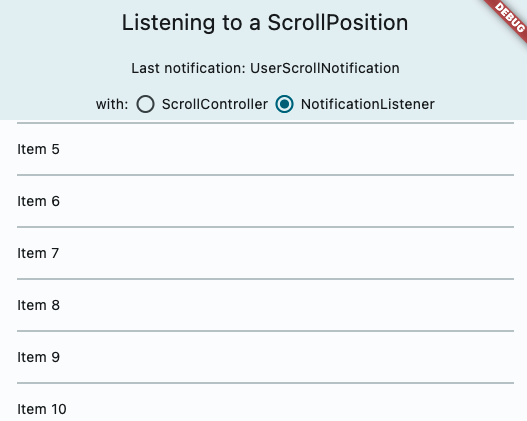
### Adds ScrollController.onAttach and ScrollController.onDetach
This resolves a long held pain point for developers. When using a scroll controller, there is not scroll position until the scrollable widget is built, and almost all methods of notification are only triggered when scrolling happens. Adding these two methods will help developers gain access to the scroll position when it is created. A common workaround for this was using a post frame callback to access controller.position after the first frame, but this is ripe for issues such as having multiple positions attached to the controller, or the scrollable no longer existing after that post frame callback. I think this can also be helpful for folks to debug cases when the scroll controller has multiple positions attached.
In particular, this also resolves this commented case: https://github.com/flutter/flutter/issues/20819#issuecomment-417784218
The isScrollingNotifier is hard for developers to access.
### Docs & samples
I was surprised we did not have samples on scroll notification or scroll controller, so I overhauled it and added a lot of docs on all the different ways to access scrolling information, when it is available and how they differ.
When swapping out delegate of selectioncontainer, if the newly passed in delegate doesn't have any selectable content(which is usually the case), the selectioncontainerstate will notify all of the listeners. One of the listener would be SelectionRegistrant._updateSelectionRegistrarSubscription, and since it doesn't have content, it would remove itself from the listener which causes concurrent modification
* Add ActionButtonIconsData for overriding action icons
* Fix formatting issues
* Add missing exports in material library and add copyWith method in ActionButtonIconsData
* Move all action buttons, and icons to action_buttons.dart
* Rename actionButtonIcons to actionIconTheme
* Refactor buttons in action_buttons.dart to extend a private class for common implementation
* Refactor icons in action_buttons
* Fix docs in action_buttons_theme
* Fix#107646 always use 'Icons.arrow_back' as a back_button icon in web
* Update documentation for action buttons and add style parameter to every action button
* Fix analyzer warnings
* Add missing style argument in IconButton of _ActionButton
* Add tests for action buttons, action icon theme, drawer buttons, and back buttons
* Add example (+test) for action icon button's action icon theme in examples/api
* Fix analysis errors
* Add missing license header in action_icon_theme.0.dart
* Fix deprecation notice in theme_data.dart
* Update theme data tests for actionIconTheme
* Remove iconSize parameter from ActionButtons and update docs
* Fix failing tests
* Update button color during backbutton tests to red
* Fix analytics issues
* Fix format
* added ListTile.textAlignment

* changed titlesHeight to titleHeight

* fixed a typo

* Add tests and example

* Update tests

* update example test

---------

Co-authored-by: tahatesser <tessertaha@gmail.com>