Commit Graph

488 Commits

Author SHA1 Message Date
Anis Alibegić
140edb9883
Fixed few typos (#147087)
Here's another PR with a couple of typos fixed. As you can see there was a typo in _fileReferenceI**n**dentifiers_, in class _ParsedProjectInfo._ Maybe we should do some check on that since I'm not sure if that property is used somewhere outside Flutter?
2024-04-22 16:49:19 +00:00
Kostia Sokolovskyi
142e247fab
Add tests for gesture_detector.0.dart and gesture_detector.1.dart API examples. (#146724)
This PR contributes to https://github.com/flutter/flutter/issues/130459

### Description
- Adds `examples/api/test/widgets/gesture_detector/gesture_detector.0_test.dart` test
- Adds `examples/api/test/widgets/gesture_detector/gesture_detector.1_test.dart` test
2024-04-19 23:08:04 +00:00
Kostia Sokolovskyi
a4e9026589
Add test for animated_padding.0.dart API example. (#146718)
This PR contributes to https://github.com/flutter/flutter/issues/130459

### Description
- Adds `examples/api/test/widgets/implicit_animations/animated_padding.0_test.dart` test
2024-04-19 20:16:56 +00:00
Kostia Sokolovskyi
cb3e689167
Add test for dismissible.0.dart API example. (#146723)
This PR contributes to https://github.com/flutter/flutter/issues/130459

### Description
- Adds `examples/api/test/widgets/dismissible/dismissible.0_test.dart` test
2024-04-19 19:21:08 +00:00
Kostia Sokolovskyi
e09ee6be9b
Add test for preferred_size.0.dart API example. (#146725)
This PR contributes to https://github.com/flutter/flutter/issues/130459

### Description
- Adds `examples/api/test/widgets/preferred_size/preferred_size.0_test.dart` test
2024-04-19 19:08:07 +00:00
auto-submit[bot]
bb4c9b381e
Reverts "Add generic type for result in PopScope (#139164)" (#147015)
Reverts: flutter/flutter#139164
Initiated by: chunhtai
Reason for reverting: hard breaking change
Original PR Author: chunhtai

Reviewed By: {justinmc}

This change reverts the following previous change:
Adds a generic type and pop result to popscope and its friend.

The use cases are to be able to capture the result when the pop is called.

migration guide: https://github.com/flutter/website/pull/9872
2024-04-18 22:36:26 +00:00
chunhtai
7ee05a05ff
Add generic type for result in PopScope (#139164)
Adds a generic type and pop result to popscope and its friend.

The use cases are to be able to capture the result when the pop is called.

migration guide: https://github.com/flutter/website/pull/9872
2024-04-18 19:30:10 +00:00
Matt Carroll
4daad32a01
Added missing tests for OverflowBar example. (#146780)
Added missing tests for OverflowBar example. Issue #130459
2024-04-16 22:10:56 +00:00
Taha Tesser
cba689cbf8
Add a custom shape example for AppBar.shape (#146421)
fixes [AppBar shape disappears on AppBar elevation change when scrolling](https://github.com/flutter/flutter/issues/145945)

### Description
This PR adds an example for complete custom app bar for the  `AppBar.shape` property.

### Preview

![Screenshot 2024-04-08 at 14 21 04](https://github.com/flutter/flutter/assets/48603081/ae3eda2b-b709-4652-9f2c-dd7b7dcfeb5c)
2024-04-08 18:42:07 +00:00
Kostia Sokolovskyi
8101f13a35
Add tests for theme_extension.1.dart API example. (#145819)
This PR contributes to https://github.com/flutter/flutter/issues/130459

### Description
- Adds tests for `examples/api/lib/material/theme/theme_extension.1.dart`
2024-04-03 23:39:17 +00:00
Taha Tesser
80d774d8dc
Add DropdownMenu cursor behavior sample (#146133)
fixes [Add `DropdownMenu` cursor behavior sample to  `DropdownMenu.enabled` & `DropdownMenu.requestFocusOnTap`  docs](https://github.com/flutter/flutter/issues/146131)

### Preview
![Screenshot 2024-04-02 at 17 12 43](https://github.com/flutter/flutter/assets/48603081/33865ca0-d48d-4651-9c83-9bdcd6369cb8)
2024-04-03 16:31:06 +00:00
Ian Hickson
950ec1c405
Enhance ColorScheme.fromSeed with a new variant parameter (#144805)
Fixes #144649

This PR is to add an enhancement for `ColorScheme.fromSeed()`.  When we input a brighter color with a high chroma and we want the resulting `ColorScheme` respects the source color, we can achieve this by setting

```dart
ColorScheme.fromSeed(
  seedColor: sourceColor,
  variant: Variant.fidelity,
  ...
)
```

Here is a demo for `ColorScheme` constructed by all 9 variants:
![Screenshot 2024-03-13 at 4 33 02 PM](https://github.com/flutter/flutter/assets/36861262/2cdbe559-67ff-4f8b-bd48-ccff5131b949)
![Screenshot 2024-03-13 at 4 33 07 PM](https://github.com/flutter/flutter/assets/36861262/e6af2362-c501-499b-8880-06a321de91e6)
2024-04-03 15:54:34 +00:00
Kostia Sokolovskyi
e6f078fff5
Add tests for material_state_mouse_cursor.0.dart API example. (#145987)
This PR contributes to https://github.com/flutter/flutter/issues/130459

### Description
- Updates `examples/api/lib/material/material_state/material_state_mouse_cursor.0.dart` to allow enable/disable `ListTile` in tests;
- Adds tests for `examples/api/lib/material/material_state/material_state_mouse_cursor.0.dart`.
2024-04-03 02:39:46 +00:00
Kostia Sokolovskyi
5850651d60
Add test for animated_container.0.dart API example. (#145995)
This PR contributes to https://github.com/flutter/flutter/issues/130459

### Description
- Adds test for `examples/api/test/widgets/implicit_animations/animated_container.0_test.dart`
2024-04-01 20:25:40 +00:00
Taha Tesser
23687c5260
Add AnimationStyle to showBottomSheet and showModalBottomSheet (#145536)
fixes [Introduce animation customizable with `AnimationStyle` to `BottomSheet`](https://github.com/flutter/flutter/issues/145532)

### Default bottom sheet animation
![00-ezgif com-video-to-gif-converter](https://github.com/flutter/flutter/assets/48603081/a295b002-b310-4dea-8bc4-23b1d299748c)

### Custom bottom sheet animation
![01-ezgif com-video-to-gif-converter](https://github.com/flutter/flutter/assets/48603081/8c5c3d5f-e67d-4ed5-880d-f17d262087e1)

### No bottom sheet animation
![02-ezgif com-video-to-gif-converter](https://github.com/flutter/flutter/assets/48603081/872409d8-8a8d-4db9-b95b-7f96a62cdffc)
2024-03-25 08:39:05 +00:00
Greg Spencer
0f685f88c6
Add some cross references in the docs, move an example to a dartpad example (#145571)
## Description

This adds some "See also" links to some docs for `TweenAnimationBuilder` and `ValueListenableBuilder`.

Also, moved a "snippet" example in `ValueListenableBuilder` into the examples directory as a Dartpad example.

## Tests
 - Added test for the example.
2024-03-22 02:35:11 +00:00
Jackson Gardner
31209d04ff
flutter test --wasm support (#145347)
* Adds support for `flutter test --wasm`.
  * The test compilation flow is a bit different now, so that it supports compilers other than DDC. Specifically, when we run a set of unit tests, we generate a "switchboard" main function that imports each unit test and runs the main function for a specific one based off of a value set by the JS bootstrapping code. This way, there is one compile step and the same compile output is invoked for each unit test file.
* Also, removes all references to `dart:html` from flutter/flutter.
* Adds CI steps for running the framework unit tests with dart2wasm+skwasm
  * These steps are marked as `bringup: true`, so we don't know what kind of failures they will result in. Any failures they have will not block the tree at all yet while we're still in `bringup: true`. Once this PR is merged, I plan on looking at any failures and either fixing them or disabling them so we can get these CI steps running on presubmit.

This fixes https://github.com/flutter/flutter/issues/126692
2024-03-21 20:08:07 +00:00
Vatsal Bhesaniya
01fc13d9f9
Add helper widget parameter to InputDecoration (#145157)
This pull request introduces a new field named `helper` to the InputDecoration class. This field allows for specifying a widget containing contextual information about the InputDecorator.child's value. Unlike `helperText`, which accepts a plain string, `helper` supports widgets, enabling functionalities like tappable links for further explanation. This change aligns with the established pattern of `error`, `label`, `prefix`, and `suffix`.

fixes [#145163](https://github.com/flutter/flutter/issues/145163)
2024-03-20 20:48:05 +00:00
goodmost
3236957f02
chore: fix some comments (#145397)
fix some comments
2024-03-19 17:00:24 +00:00
Elias Elfarri
46cb2d7b01
Write unit tests for API Examples of checkbox.0, checkbox.1 (#144888)
Write unit tests for API Examples of checkbox.0, checkbox.1

Part of  #130459
2024-03-12 16:25:58 +00:00
Hans Muller
52961f761f
Updated the smiley TextButton example again (#144630)
Improved the smiley image TextButton example a little. Handling the case where the `Future.delayed` object that represents the button's one second long action is superseded by a second button press that triggers a new one-second action. This does complicate the example - just a little - but it's a little more robust. In case someone copy-and-pastes the code.

The TextButton example was recently updated: https://github.com/flutter/flutter/pull/144583
2024-03-05 20:57:02 +00:00
Hans Muller
e73e7e2e56
Updated the TextButton image button example artwork (#144583)
Updated the "smiley" TextButton example with new images from Nancy Hu @google.  I also made the example a little more complicated, per the new artwork: now it displays a different image while the button's action pretends to run for a second.

https://github.com/flutter/flutter/assets/1377460/b631a484-4b4f-4e01-ad52-a877fb46ef72
2024-03-05 03:01:40 +00:00
Taha Tesser
ba719bc588
Fix CalendarDatePicker day selection shape and overlay (#144317)
fixes [`DatePickerDialog` date entry hover background and ink splash have different radius](https://github.com/flutter/flutter/issues/141350)
fixes [Ability to customize DatePicker day selection background and overlay shape](https://github.com/flutter/flutter/issues/144220)

### Code sample

<details>
<summary>expand to view the code sample</summary> 

```dart
import 'package:flutter/material.dart';

void main() {
  runApp(const MyApp());
}

class MyApp extends StatelessWidget {
  const MyApp({super.key});

  @override
  Widget build(BuildContext context) {
    return MaterialApp(
      home: Scaffold(
        body: Center(
          child: Builder(builder: (context) {
            return FilledButton(
              onPressed: () {
                showDatePicker(
                  context: context,
                  initialDate: DateTime.now(),
                  firstDate: DateTime.utc(2010),
                  lastDate: DateTime.utc(2030),
                );
              },
              child: const Text('Show Date picker'),
            );
          }),
        ),
      ),
    );
  }
}
```

</details>

### Material DatePicker states specs

![overlay_specs](https://github.com/flutter/flutter/assets/48603081/45ce16cf-7ee9-41e1-a4fa-327de07b78d1)

### Day selection overlay

| Before | After |
| --------------- | --------------- |
| <img src="https://github.com/flutter/flutter/assets/48603081/b529d38d-0232-494b-8bf2-55d28420a245" /> | <img src="https://github.com/flutter/flutter/assets/48603081/c4799559-a7ef-45fd-aed9-aeb386370580"  /> |

### Hover, pressed, highlight preview

| Before | After |
| --------------- | --------------- |
| <video src="https://github.com/flutter/flutter/assets/48603081/8edde82a-7f39-4482-afab-183e1bce5991" /> | <video src="https://github.com/flutter/flutter/assets/48603081/04e1502e-67a4-4b33-973d-463067d70151" /> |

### Using `DatePickerThemeData.dayShape` to customize day selection background and overlay shape

| Before | After |
| --------------- | --------------- |
| <img src="https://github.com/flutter/flutter/assets/48603081/a0c85f58-a69b-4e14-a45d-41e580ceedce"  />  | <img src="https://github.com/flutter/flutter/assets/48603081/db67cee1-d28d-4168-98b8-fd7a9cb70cda" /> | 

### Example preview

![Screenshot 2024-02-29 at 15 07 50](https://github.com/flutter/flutter/assets/48603081/3770ed5c-28bf-4d0a-9514-87e1cd2ce515)
2024-03-01 12:44:29 +00:00
Kate Lovett
a185ff907b
Disable flaky golden file test (#144351)
Filed https://github.com/flutter/flutter/issues/144350 for follow up.
This test has become flaky and is breaking the tree.

## Pre-launch Checklist

- [x] I read the [Contributor Guide] and followed the process outlined
there for submitting PRs.
- [x] I read the [Tree Hygiene] wiki page, which explains my
responsibilities.
- [x] I read and followed the [Flutter Style Guide], including [Features
we expect every widget to implement].
- [x] I signed the [CLA].
- [x] I listed at least one issue that this PR fixes in the description
above.
- [ ] I updated/added relevant documentation (doc comments with `///`).
- [ ] I added new tests to check the change I am making, or this PR is
[test-exempt].
- [ ] I followed the [breaking change policy] and added [Data Driven
Fixes] where supported.
- [ ] All existing and new tests are passing.

If you need help, consider asking for advice on the #hackers-new channel
on [Discord].

<!-- Links -->
[Contributor Guide]:
https://github.com/flutter/flutter/wiki/Tree-hygiene#overview
[Tree Hygiene]: https://github.com/flutter/flutter/wiki/Tree-hygiene
[test-exempt]:
https://github.com/flutter/flutter/wiki/Tree-hygiene#tests
[Flutter Style Guide]:
https://github.com/flutter/flutter/wiki/Style-guide-for-Flutter-repo
[Features we expect every widget to implement]:
https://github.com/flutter/flutter/wiki/Style-guide-for-Flutter-repo#features-we-expect-every-widget-to-implement
[CLA]: https://cla.developers.google.com/
[flutter/tests]: https://github.com/flutter/tests
[breaking change policy]:
https://github.com/flutter/flutter/wiki/Tree-hygiene#handling-breaking-changes
[Discord]: https://github.com/flutter/flutter/wiki/Chat
[Data Driven Fixes]:
https://github.com/flutter/flutter/wiki/Data-driven-Fixes
2024-02-28 18:10:50 -06:00
Qun Cheng
0d8eafb006
Reland "Reland - Introduce tone-based surfaces and accent color add-ons - Part 2" (#144273) 2024-02-28 13:55:50 -08:00
auto-submit[bot]
2eee0b5750
Reverts "Reland - Introduce tone-based surfaces and accent color add-ons - Part 2 (#144001)" (#144262)
Reverts flutter/flutter#144001

Initiated by: Piinks

Reason for reverting: Failing goldens at the tip of tree

Original PR Author: QuncCccccc

Reviewed By: {HansMuller}

This change reverts the following previous change:
Original Description:
Reverts flutter/flutter#143973

This is a reland for #138521 with an updated g3fix(cl/605555997). Local test: cl/609608958.
2024-02-27 22:04:18 +00:00
Qun Cheng
871d59221c
Reland - Introduce tone-based surfaces and accent color add-ons - Part 2 (#144001)
Reverts flutter/flutter#143973

This is a reland for #138521 with an updated g3fix(cl/605555997). Local test: cl/609608958.
2024-02-27 20:21:14 +00:00
LongCatIsLooong
a0a854a78b
Relands "Changing TextPainter.getOffsetForCaret implementation to remove the logarithmic search (#143281)" (reverted in #143801) (#143954)
The original PR was reverted because the new caret positioning callpath triggered a skparagraph assert. The assert has been removed. Relanding the PR with no changes applied.
2024-02-23 19:20:14 +00:00
Qun Cheng
4715216c01
Revert "Introduce tone-based surfaces and accent color add-ons - Part 2" (#143973)
Reverts flutter/flutter#138521
2024-02-22 14:51:28 -08:00
auto-submit[bot]
f9b3b84d4e
Reverts "Changing TextPainter.getOffsetForCaret implementation to remove the logarithmic search (#143281)" (#143801)
Reverts flutter/flutter#143281

Initiated by: LongCatIsLooong

Reason for reverting: https://github.com/flutter/flutter/issues/143797

Original PR Author: LongCatIsLooong

Reviewed By: {justinmc, jason-simmons}

This change reverts the following previous change:
Original Description:
The behavior largely remains the same, except:

1. The EOT cursor `(textLength, downstream)` for text ending in the opposite writing direction as the paragraph is now placed at the visual end of the last line. 
  For example, in a LTR paragraph, the EOT cursor for `aA` (lowercase for LTR and uppercase for RTL) is placed to the right of the line: `aA|` (it was `a|A` before). 
  This matches the behavior of most applications that do logical order arrow key navigation instead of visual order navigation. 
  And it makes the navigation order consistent for `aA\naA`:
```
  |aA    =>  aA|  => aA|  => aA  => aA   => aA 
   aA        aA      aA     |aA     aA|     aA|     
   (1)       (2)     (3)    (4)    (5)      (6)
```
This is indeed still pretty confusing as (2) and (3), as well as (5) and (6) are hard to distinguish (when the I beam has a large width they are actually visually distinguishable -- they use the same anchor but one gets painted to the left and the other to the right. I noticed that emacs does the same). 
But logical order navigation will always be confusing in bidi text, in one way or another.

Interestingly there are 3 different behaviors I've observed in chrome:
- the chrome download dialog (which I think uses GTK text widgets but not sure which version) gives me 2 cursors when navigating bidi text, and 
- its HTML fields only show one, and presumably they place the I beam at the **trailing edge** of the character (which makes more sense for backspacing I guess). 
- On the other hand, its (new) omnibar seems to use visual order arrow navigation

Side note: we may need to update the "tap to place the caret here" logic to handle the case where the tap lands outside of the text and the text ends in the opposite writing direction. 

2. Removed the logarithmic search. The same could be done using the characters package but when glyphInfo tells you about the baseline location in the future we probably don't need the `getBoxesForRange` call. This should fix https://github.com/flutter/flutter/issues/123424.

## Internal Tests

This is going to change the image output of some internal golden tests. I'm planning to merge https://github.com/flutter/flutter/pull/143281 before this to avoid updating the same golden files twice for invalid selections.
2024-02-21 00:10:18 +00:00
LongCatIsLooong
3538e4c788
Changing TextPainter.getOffsetForCaret implementation to remove the logarithmic search (#143281)
The behavior largely remains the same, except:

1. The EOT cursor `(textLength, downstream)` for text ending in the opposite writing direction as the paragraph is now placed at the visual end of the last line. 
  For example, in a LTR paragraph, the EOT cursor for `aA` (lowercase for LTR and uppercase for RTL) is placed to the right of the line: `aA|` (it was `a|A` before). 
  This matches the behavior of most applications that do logical order arrow key navigation instead of visual order navigation. 
  And it makes the navigation order consistent for `aA\naA`:
```
  |aA    =>  aA|  => aA|  => aA  => aA   => aA 
   aA        aA      aA     |aA     aA|     aA|     
   (1)       (2)     (3)    (4)    (5)      (6)
```
This is indeed still pretty confusing as (2) and (3), as well as (5) and (6) are hard to distinguish (when the I beam has a large width they are actually visually distinguishable -- they use the same anchor but one gets painted to the left and the other to the right. I noticed that emacs does the same). 
But logical order navigation will always be confusing in bidi text, in one way or another.

Interestingly there are 3 different behaviors I've observed in chrome:
- the chrome download dialog (which I think uses GTK text widgets but not sure which version) gives me 2 cursors when navigating bidi text, and 
- its HTML fields only show one, and presumably they place the I beam at the **trailing edge** of the character (which makes more sense for backspacing I guess). 
- On the other hand, its (new) omnibar seems to use visual order arrow navigation

Side note: we may need to update the "tap to place the caret here" logic to handle the case where the tap lands outside of the text and the text ends in the opposite writing direction. 

2. Removed the logarithmic search. The same could be done using the characters package but when glyphInfo tells you about the baseline location in the future we probably don't need the `getBoxesForRange` call. This should fix https://github.com/flutter/flutter/issues/123424.

## Internal Tests

This is going to change the image output of some internal golden tests. I'm planning to merge https://github.com/flutter/flutter/pull/143281 before this to avoid updating the same golden files twice for invalid selections.
2024-02-20 20:51:06 +00:00
Qun Cheng
a2c7ed95d1
Introduce tone-based surfaces and accent color add-ons - Part 2 (#138521)
This PR is to introduce 19 new color roles and deprecate 3 color roles in `ColorScheme`.
**Tone-based surface colors** (7 colors): 
* surfaceBright
* surfaceDim
* surfaceContainer
* surfaceContainerLowest
* surfaceContainerLow
* surfaceContainerHigh
* surfaceContainerHighest

**Accent color add-ons** (12 colors):
* primary/secondary/tertiary-Fixed
* primary/secondary/tertiary-FixedDim
* onPrimary/onSecondary/onTertiary-Fixed
* onPrimary/onSecondary/onTertiary-FixedVariant

**Deprecated colors**:
* background -> replaced with surface
* onBackground -> replaced with onSurface
* surfaceVariant -> replaced with surfaceContainerHighest

Please checkout this [design doc](https://docs.google.com/document/d/1ODqivpM_6c490T4j5XIiWCDKo5YqHy78YEFqDm4S8h4/edit?usp=sharing) for more information:)

![Screenshot 2024-01-08 at 4 56 51 PM](https://github.com/flutter/flutter/assets/36861262/353cdb4c-6ba9-4435-a518-fd3f67e415f0)
2024-02-20 19:01:50 +00:00
Bruno Leroux
5c88fbf0b9
Add more documentation for TextEditingController default constructor (#143452)
## Description

This PR adds more documentation for `TextEditingController(String text)` constructor and it adds one example.

https://github.com/flutter/flutter/pull/96245 was a first improvement to the documentation.
https://github.com/flutter/flutter/issues/79495 tried to hide the cursor when an invalid selection is set but it was reverted.
https://github.com/flutter/flutter/pull/123777 mitigated the issue of having a default invalid selection: it takes care of setting a proper selection when a text field is focused and its controller selection is not initialized.

I will try changing the initial selection in another PR, but It will probably break several existing tests.

## Related Issue

Fixes https://github.com/flutter/flutter/issues/95978

## Tests

Adds 1 test for the new example.
2024-02-14 20:10:18 +00:00
Taha Tesser
ccf42dde88
Introduce avatarBoxConstraints & deleteIconBoxConstraints for the chips (#143302)
fixes [Chip widget's avatar padding changing if label text is more than 1 line](https://github.com/flutter/flutter/issues/136892)

### Code sample

<details>
<summary>expand to view the code sample</summary> 

```dart
import 'package:flutter/material.dart';

List<String> strings = [
  'hello good morning',
  'hello good morning hello good morning',
  'hello good morning hello good morning hello good morning'
];

void main() => runApp(const MyApp());

class MyApp extends StatelessWidget {
  const MyApp({super.key});

  @override
  Widget build(BuildContext context) {
    return MaterialApp(
      debugShowCheckedModeBanner: false,
      home: Scaffold(
        body: Center(
          child: Row(
            mainAxisAlignment: MainAxisAlignment.spaceEvenly,
            children: [
              Column(
                mainAxisSize: MainAxisSize.min,
                crossAxisAlignment: CrossAxisAlignment.center,
                children: [
                  const Text(
                      'avatarBoxConstraints: null \ndeleteIconBoxConstraints: null',
                      textAlign: TextAlign.center),
                  for (String string in strings)
                    Padding(
                      padding: const EdgeInsets.all(8.0),
                      child: RawChip(
                        label: Container(
                          width: 150,
                          color: Colors.amber,
                          child: Text(
                            string,
                            maxLines: 3,
                            overflow: TextOverflow.ellipsis,
                          ),
                        ),
                        avatar: const Icon(Icons.settings),
                        onDeleted: () {},
                      ),
                    ),
                ],
              ),
              Column(
                mainAxisSize: MainAxisSize.min,
                crossAxisAlignment: CrossAxisAlignment.center,
                children: [
                  const Text(
                      'avatarBoxConstraints: BoxConstraints.tightForFinite() \ndeleteIconBoxConstraints: BoxConstraints.tightForFinite()',
                      textAlign: TextAlign.center),
                  for (String string in strings)
                    Padding(
                      padding: const EdgeInsets.all(8.0),
                      child: RawChip(
                        avatarBoxConstraints:
                            const BoxConstraints.tightForFinite(),
                        deleteIconBoxConstraints:
                            const BoxConstraints.tightForFinite(),
                        label: Container(
                          width: 150,
                          color: Colors.amber,
                          child: Text(
                            string,
                            maxLines: 3,
                            overflow: TextOverflow.ellipsis,
                          ),
                        ),
                        avatar: const Icon(Icons.settings),
                        onDeleted: () {},
                      ),
                    ),
                ],
              ),
            ],
          ),
        ),
      ),
    );
  }
}

```

</details>

### Preview
![Screenshot 2024-02-12 at 14 58 35](https://github.com/flutter/flutter/assets/48603081/5724bd07-7ac7-4987-b992-fa3ab8488273)

# Example previews
![Screenshot 2024-02-12 at 22 15 14](https://github.com/flutter/flutter/assets/48603081/33af472d-3561-47d4-8d0d-e1628de1e0aa)
![Screenshot 2024-02-12 at 22 15 46](https://github.com/flutter/flutter/assets/48603081/3de78b59-5cb6-4fd8-879b-8e204aacb069)
2024-02-13 20:30:53 +00:00
Tirth
10442399fb
Introduce iconAlignment for the buttons with icon (#137348)
Adds `iconAlignment` property to `ButtonStyleButton` widget.

Fixes #89564

### Example

https://github.com/flutter/flutter/assets/13456345/1b5236c4-5c60-4915-b3c6-0a56c43f8a19
2024-02-12 17:08:20 +00:00
Bruno Leroux
6a7baf573e
Fix M3 text field height + initial step for input decorator M3 test migration (#142981)
## Description

This PR main purpose is to make progress on the M3 test migration for `InputDecorator` (see https://github.com/flutter/flutter/issues/139076).

Before this PR more than 80 of the 156 tests defined in `input_decorator_test.dart` fail on M3.
Migrating all those tests in one shot is not easy at all because many failures are related to wrong positionning due to M3 typography changes. Another reason is that several M3 specific changes are required in order to get a proper M3 compliant text field, for instance:
- https://github.com/flutter/flutter/issues/142972
- https://github.com/flutter/flutter/issues/141354

Most of the tests were relying on an helper function (`buildInputDecorator`) which had a `useMaterial3` parameter. Unfortunately when `useMaterial3: true `was passed to this function it forced `useMaterial3: false` at the top level but overrided it at a lower level, which was very misleading because people could assume that the tests are ok with M3 (but in fact they were run using M2 typography but have some M3 logic in use).
I considered various way to make this change and I finally decided to run all existing tests only on M2 for the moment. Next step will be to move most of those tests to M3. In this PR, I migrated two of these existing tests for illustration.

Because many of the existing tests are checking input decorator height, I think it would also make sense to fix https://github.com/flutter/flutter/issues/142972 first. That's why I choosed to include a fix to https://github.com/flutter/flutter/issues/142972 in this PR.

A M3 filled `TextField` on Android:

| Before this PR | After this PR |
|--------|--------|
| ![image](https://github.com/flutter/flutter/assets/840911/403225b7-4c91-4aee-b19c-0490447ae7e3) | ![image](https://github.com/flutter/flutter/assets/840911/e96cf786-a9f5-4e15-bcdd-078350ff1608) | 

## Related Issue

Fixes https://github.com/flutter/flutter/issues/142972
Related to https://github.com/flutter/flutter/issues/139076

## Tests

Updates many existing tests 
+ adds 2 tests related to the fix for https://github.com/flutter/flutter/issues/142972
+ adds 1 tests for the M3 migration
+ move 1 tests related to M3
2024-02-07 13:57:21 +00:00
Taha Tesser
c539ded64b
[reland] Add AnimationStyle to showSnackBar (#143052)
[Original was reverted due to uncaught analysis failure 
](https://github.com/flutter/flutter/pull/142825#issuecomment-1930620085)

---

fixes [`showSnackBar` is always replacing `animation` parameter of `SnackBar`](https://github.com/flutter/flutter/issues/141646)

### Code sample preview

![Screenshot 2024-02-02 at 21 10 57](https://github.com/flutter/flutter/assets/48603081/66d808f0-d638-4561-b9a4-96d1b93938f4)
2024-02-07 10:26:27 +00:00
auto-submit[bot]
83aca58fa7
Reverts "Add AnimationStyle to showSnackBar" (#143001)
Reverts flutter/flutter#142825

Initiated by: zanderso

Reason for reverting: Analysis failure closing the engine tree https://logs.chromium.org/logs/flutter/buildbucket/cr-buildbucket/8756815302197889649/+/u/Framework_analyze/Framework_analyze/stdout?format=raw

Original PR Author: TahaTesser

Reviewed By: {HansMuller}

This change reverts the following previous change:
Original Description:
fixes [`showSnackBar` is always replacing `animation` parameter of `SnackBar`](https://github.com/flutter/flutter/issues/141646)

### Code sample preview

![Screenshot 2024-02-02 at 21 10 57](https://github.com/flutter/flutter/assets/48603081/66d808f0-d638-4561-b9a4-96d1b93938f4)
2024-02-06 19:35:19 +00:00
Taha Tesser
0cc381da19
Add AnimationStyle to showSnackBar (#142825)
fixes [`showSnackBar` is always replacing `animation` parameter of `SnackBar`](https://github.com/flutter/flutter/issues/141646)

### Code sample preview

![Screenshot 2024-02-02 at 21 10 57](https://github.com/flutter/flutter/assets/48603081/66d808f0-d638-4561-b9a4-96d1b93938f4)
2024-02-06 18:54:41 +00:00
Hans Muller
c6f2cea65e
Reland: Added ButtonStyle.foregroundBuilder and ButtonStyle.backgroundBuilder (#142762)
Reland https://github.com/flutter/flutter/pull/141818 with a fix for a special case: If only `background` is specified for `TextButton.styleFrom` or `OutlinedButton.styleFrom` it applies the button's disabled state, i.e. as if the same value had been specified for disabledBackgroundColor.

The change relative to #141818 is the indicated line below:
```dart
final MaterialStateProperty<Color?>? backgroundColorProp = switch ((backgroundColor, disabledBackgroundColor)) {
  (null, null) => null,
  (_, null) => MaterialStatePropertyAll<Color?>(backgroundColor), // ADDED THIS LINE
  (_, _) => _TextButtonDefaultColor(backgroundColor, disabledBackgroundColor),
};
  ```

This backwards incompatibility cropped up in an internal test, see internal Google issue b/323399158.
2024-02-02 01:48:17 +00:00
Tirth
10e4f26868
Write Tests for API Example of form.0.dart (#142635)
Write Tests for API Example of `form.0.dart`.

Part of #130459
2024-02-01 21:54:46 +00:00
auto-submit[bot]
07ca92a69e
Reverts "Added ButtonStyle.foregroundBuilder and ButtonStyle.backgroundBuilder" (#142748)
Reverts flutter/flutter#141818
Initiated by: XilaiZhang
This change reverts the following previous change:
Original Description:
Fixes https://github.com/flutter/flutter/issues/139456, https://github.com/flutter/flutter/issues/130335, https://github.com/flutter/flutter/issues/89563.

Two new properties have been added to ButtonStyle to make it possible to insert arbitrary state-dependent widgets in a button's background or foreground. These properties can be specified for an individual button, using the style parameter, or for all buttons using a button theme's style parameter.

The new ButtonStyle properties are `backgroundBuilder` and `foregroundBuilder` and their (function) types are:

```dart
typedef ButtonLayerBuilder = Widget Function(
  BuildContext context,
  Set<MaterialState> states,
  Widget? child
);
```

The new builder functions are called whenever the button is built and the `states` parameter communicates the pressed/hovered/etc state fo the button.

## `backgroundBuilder`

Creates a widget that becomes the child of the button's Material and whose child is the rest of the button, including the button's `child` parameter.  By default the returned widget is clipped to the Material's ButtonStyle.shape.

The `backgroundBuilder` can be used to add a gradient to the button's background. Here's an example that creates a yellow/orange gradient background:

![opaque-gradient-bg](https://github.com/flutter/flutter/assets/1377460/80df8368-e7cf-49ef-aee7-2776a573644c)

```dart
TextButton(
  onPressed: () {},
  style: TextButton.styleFrom(
    backgroundBuilder: (BuildContext context, Set<MaterialState> states, Widget? child) {
      return DecoratedBox(
        decoration: BoxDecoration(
          gradient: LinearGradient(colors: [Colors.orange, Colors.yellow]),
        ),
        child: child,
      );
    },
  ),
  child: Text('Text Button'),
)
```

Because the background widget becomes the child of the button's Material, if it's opaque (as it is in this case) then it obscures the overlay highlights which are painted on the button's Material. To ensure that the highlights show through one can decorate the background with an `Ink` widget.  This version also overrides the overlay color to be (shades of) red, because that makes the highlights look a little nicer with the yellow/orange background.

![ink-gradient-bg](https://github.com/flutter/flutter/assets/1377460/68a49733-f30e-44a1-a948-dc8cc95e1716)

```dart
TextButton(
  onPressed: () {},
  style: TextButton.styleFrom(
    overlayColor: Colors.red,
    backgroundBuilder: (BuildContext context, Set<MaterialState> states, Widget? child) {
      return Ink(
        decoration: BoxDecoration(
          gradient: LinearGradient(colors: [Colors.orange, Colors.yellow]),
        ),
        child: child,
      );
    },
  ),
  child: Text('Text Button'),
)
```

Now the button's overlay highlights are painted on the Ink widget. An Ink widget isn't needed if the background is sufficiently translucent. This version of the example creates a translucent backround widget. 

![translucent-graident-bg](https://github.com/flutter/flutter/assets/1377460/3b016e1f-200a-4d07-8111-e20d29f18014)

```dart
TextButton(
  onPressed: () {},
  style: TextButton.styleFrom(
    overlayColor: Colors.red,
    backgroundBuilder: (BuildContext context, Set<MaterialState> states, Widget? child) {
      return DecoratedBox(
        decoration: BoxDecoration(
          gradient: LinearGradient(colors: [
            Colors.orange.withOpacity(0.5),
            Colors.yellow.withOpacity(0.5),
          ]),
        ),
        child: child,
      );
    },
  ),
  child: Text('Text Button'),
)
```

One can also decorate the background with an image. In this example, the button's background is an burlap texture image. The foreground color has been changed to black to make the button's text a little clearer relative to the mottled brown backround.

![burlap-bg](https://github.com/flutter/flutter/assets/1377460/f2f61ab1-10d9-43a4-bd63-beecdce33b45)

```dart
TextButton(
  onPressed: () {},
  style: TextButton.styleFrom(
    foregroundColor: Colors.black,
    backgroundBuilder: (BuildContext context, Set<MaterialState> states, Widget? child) {
      return Ink(
        decoration: BoxDecoration(
          image: DecorationImage(
            image: NetworkImage(burlapUrl),
            fit: BoxFit.cover,
          ),
        ),
        child: child,
      );
    },
  ),
  child: Text('Text Button'),
)
```

The background widget can depend on the `states` parameter. In this example the blue/orange gradient flips horizontally when the button is hovered/pressed.

![gradient-flip](https://github.com/flutter/flutter/assets/1377460/c6c6fe26-ae47-445b-b82d-4605d9583bd8)

```dart
TextButton(
  onPressed: () {},
  style: TextButton.styleFrom(
    backgroundBuilder: (BuildContext context, Set<MaterialState> states, Widget? child) {
      final Color color1 = Colors.blue.withOpacity(0.5);
      final Color color2 = Colors.orange.withOpacity(0.5);
      return DecoratedBox(
        decoration: BoxDecoration(
          gradient: LinearGradient(
            colors: switch (states.contains(MaterialState.hovered)) {
              true => <Color>[color1, color2],
              false => <Color>[color2, color1],
            },
          ),
        ),
        child: child,
      );
    },
  ),
  child: Text('Text Button'),
)
```

The preceeding examples have not included a BoxDecoration border because ButtonStyle already supports `ButtonStyle.shape` and `ButtonStyle.side` parameters that can be uesd to define state-dependent borders. Borders defined with the ButtonStyle side parameter match the button's shape. To add a border that changes color when the button is hovered or pressed, one must specify the side property using `copyWith`, since there's no `styleFrom` shorthand for this case.

![border-gradient-bg](https://github.com/flutter/flutter/assets/1377460/63cffcd3-0dcf-4eb1-aed5-d14adf1e57f6)

```dart
TextButton(
  onPressed: () {},
  style: TextButton.styleFrom(
    foregroundColor: Colors.indigo,
    backgroundBuilder: (BuildContext context, Set<MaterialState> states, Widget? child) {
      final Color color1 = Colors.blue.withOpacity(0.5);
      final Color color2 = Colors.orange.withOpacity(0.5);
      return DecoratedBox(
        decoration: BoxDecoration(
          gradient: LinearGradient(
            colors: switch (states.contains(MaterialState.hovered)) {
              true => <Color>[color1, color2],
              false => <Color>[color2, color1],
            },
          ),
        ),
        child: child,
      );
    },
  ).copyWith(
    side: MaterialStateProperty.resolveWith<BorderSide?>((Set<MaterialState> states) {
      if (states.contains(MaterialState.hovered)) {
        return BorderSide(width: 3, color: Colors.yellow);
      }
      return null; // defer to the default
    }),
  ),
  child: Text('Text Button'),
)
```

Although all of the examples have created a ButtonStyle locally and only applied it to one button, they could have configured the `ThemeData.textButtonTheme` instead and applied the style to all TextButtons. And, of course, all of this works for all of the ButtonStyleButton classes, not just TextButton.

## `foregroundBuilder`

Creates a Widget that contains the button's child parameter. The returned widget is clipped by the button's [ButtonStyle.shape] inset by the button's [ButtonStyle.padding] and aligned by the button's [ButtonStyle.alignment].

The `foregroundBuilder` can be used to wrap the button's child, e.g. with a border or a `ShaderMask` or as a state-dependent substitute for the child.

This example adds a border that's just applied to the child. The border only appears when the button is hovered/pressed.

![border-fg](https://github.com/flutter/flutter/assets/1377460/687a3245-fe68-4983-a04e-5fcc77f8aa21)

```dart
ElevatedButton(
  onPressed: () {},
  style: ElevatedButton.styleFrom(
    foregroundBuilder: (BuildContext context, Set<MaterialState> states, Widget? child) {
      final ColorScheme colorScheme = Theme.of(context).colorScheme;
      return DecoratedBox(
        decoration: BoxDecoration(
          border: states.contains(MaterialState.hovered)
            ? Border(bottom: BorderSide(color: colorScheme.primary))
            : Border(), // essentially "no border"
        ),
        child: child,
      );
    },
  ),
  child: Text('Text Button'),
)
```

The foregroundBuilder can be used with `ShaderMask` to change the way the button's child is rendered. In this example the ShaderMask's gradient causes the button's child to fade out on top.

![shader_mask_fg](https://github.com/flutter/flutter/assets/1377460/54010f24-e65d-4551-ae58-712135df3d8d)

```dart
ElevatedButton(
  onPressed: () { },
  style: ElevatedButton.styleFrom(
    foregroundBuilder: (BuildContext context, Set<MaterialState> states, Widget? child) {
      final ColorScheme colorScheme = Theme.of(context).colorScheme;
      return ShaderMask(
        shaderCallback: (Rect bounds) {
          return LinearGradient(
            begin: Alignment.bottomCenter,
            end: Alignment.topCenter,
            colors: <Color>[
              colorScheme.primary,
              colorScheme.primaryContainer,
            ],
          ).createShader(bounds);
        },
        blendMode: BlendMode.srcATop,
        child: child,
      );
    },
  ),
  child:  const Text('Elevated Button'),
)
```

A commonly requested configuration for butttons has the developer provide images, one for pressed/hovered/normal state. You can use the foregroundBuilder to create a button that fades between a normal image and another image when the button is pressed. In this case the foregroundBuilder doesn't use the child it's passed, even though we've provided the required TextButton child parameter.

![image-button](https://github.com/flutter/flutter/assets/1377460/f5b1a22f-43ce-4be3-8e70-06de4c958380)

```dart
TextButton(
  onPressed: () {},
  style: TextButton.styleFrom(
    foregroundBuilder: (BuildContext context, Set<MaterialState> states, Widget? child) {
      final String url = states.contains(MaterialState.pressed) ? smiley2Url : smiley1Url;
      return AnimatedContainer(
        width: 100,
        height: 100,
        duration: Duration(milliseconds: 300),
        decoration: BoxDecoration(
          image: DecorationImage(
            image: NetworkImage(url),
            fit: BoxFit.contain,
          ),
        ),
      );
    },
  ),
  child: Text('No Child'),
)
```

In this example the button's default overlay appears when the button is hovered and pressed. Another image can be used to indicate the hovered state and the default overlay can be defeated by specifying `Colors.transparent` for the `overlayColor`:

![image-per-state](https://github.com/flutter/flutter/assets/1377460/7ab9da2f-f661-4374-b395-c2e0c7c4cf13)

```dart
TextButton(
  onPressed: () {},
  style: TextButton.styleFrom(
    overlayColor: Colors.transparent,
    foregroundBuilder: (BuildContext context, Set<MaterialState> states, Widget? child) {
      String url = states.contains(MaterialState.hovered) ? smiley3Url : smiley1Url;
      if (states.contains(MaterialState.pressed)) {
        url = smiley2Url;
      }
      return AnimatedContainer(
        width: 100,
        height: 100,
        duration: Duration(milliseconds: 300),
        decoration: BoxDecoration(
          image: DecorationImage(
            image: NetworkImage(url),
            fit: BoxFit.contain,
          ),
        ),
      );
    },
  ),
  child: Text('No Child'),
)
```
2024-02-01 21:11:26 +00:00
Hans Muller
ff6c8f5d37
Added ButtonStyle.foregroundBuilder and ButtonStyle.backgroundBuilder (#141818)
Fixes https://github.com/flutter/flutter/issues/139456, https://github.com/flutter/flutter/issues/130335, https://github.com/flutter/flutter/issues/89563.

Two new properties have been added to ButtonStyle to make it possible to insert arbitrary state-dependent widgets in a button's background or foreground. These properties can be specified for an individual button, using the style parameter, or for all buttons using a button theme's style parameter.

The new ButtonStyle properties are `backgroundBuilder` and `foregroundBuilder` and their (function) types are:

```dart
typedef ButtonLayerBuilder = Widget Function(
  BuildContext context,
  Set<MaterialState> states,
  Widget? child
);
```

The new builder functions are called whenever the button is built and the `states` parameter communicates the pressed/hovered/etc state fo the button.

## `backgroundBuilder`

Creates a widget that becomes the child of the button's Material and whose child is the rest of the button, including the button's `child` parameter.  By default the returned widget is clipped to the Material's ButtonStyle.shape.

The `backgroundBuilder` can be used to add a gradient to the button's background. Here's an example that creates a yellow/orange gradient background:

![opaque-gradient-bg](https://github.com/flutter/flutter/assets/1377460/80df8368-e7cf-49ef-aee7-2776a573644c)

```dart
TextButton(
  onPressed: () {},
  style: TextButton.styleFrom(
    backgroundBuilder: (BuildContext context, Set<MaterialState> states, Widget? child) {
      return DecoratedBox(
        decoration: BoxDecoration(
          gradient: LinearGradient(colors: [Colors.orange, Colors.yellow]),
        ),
        child: child,
      );
    },
  ),
  child: Text('Text Button'),
)
```

Because the background widget becomes the child of the button's Material, if it's opaque (as it is in this case) then it obscures the overlay highlights which are painted on the button's Material. To ensure that the highlights show through one can decorate the background with an `Ink` widget.  This version also overrides the overlay color to be (shades of) red, because that makes the highlights look a little nicer with the yellow/orange background.

![ink-gradient-bg](https://github.com/flutter/flutter/assets/1377460/68a49733-f30e-44a1-a948-dc8cc95e1716)

```dart
TextButton(
  onPressed: () {},
  style: TextButton.styleFrom(
    overlayColor: Colors.red,
    backgroundBuilder: (BuildContext context, Set<MaterialState> states, Widget? child) {
      return Ink(
        decoration: BoxDecoration(
          gradient: LinearGradient(colors: [Colors.orange, Colors.yellow]),
        ),
        child: child,
      );
    },
  ),
  child: Text('Text Button'),
)
```

Now the button's overlay highlights are painted on the Ink widget. An Ink widget isn't needed if the background is sufficiently translucent. This version of the example creates a translucent backround widget. 

![translucent-graident-bg](https://github.com/flutter/flutter/assets/1377460/3b016e1f-200a-4d07-8111-e20d29f18014)

```dart
TextButton(
  onPressed: () {},
  style: TextButton.styleFrom(
    overlayColor: Colors.red,
    backgroundBuilder: (BuildContext context, Set<MaterialState> states, Widget? child) {
      return DecoratedBox(
        decoration: BoxDecoration(
          gradient: LinearGradient(colors: [
            Colors.orange.withOpacity(0.5),
            Colors.yellow.withOpacity(0.5),
          ]),
        ),
        child: child,
      );
    },
  ),
  child: Text('Text Button'),
)
```

One can also decorate the background with an image. In this example, the button's background is an burlap texture image. The foreground color has been changed to black to make the button's text a little clearer relative to the mottled brown backround.

![burlap-bg](https://github.com/flutter/flutter/assets/1377460/f2f61ab1-10d9-43a4-bd63-beecdce33b45)

```dart
TextButton(
  onPressed: () {},
  style: TextButton.styleFrom(
    foregroundColor: Colors.black,
    backgroundBuilder: (BuildContext context, Set<MaterialState> states, Widget? child) {
      return Ink(
        decoration: BoxDecoration(
          image: DecorationImage(
            image: NetworkImage(burlapUrl),
            fit: BoxFit.cover,
          ),
        ),
        child: child,
      );
    },
  ),
  child: Text('Text Button'),
)
```

The background widget can depend on the `states` parameter. In this example the blue/orange gradient flips horizontally when the button is hovered/pressed.

![gradient-flip](https://github.com/flutter/flutter/assets/1377460/c6c6fe26-ae47-445b-b82d-4605d9583bd8)

```dart
TextButton(
  onPressed: () {},
  style: TextButton.styleFrom(
    backgroundBuilder: (BuildContext context, Set<MaterialState> states, Widget? child) {
      final Color color1 = Colors.blue.withOpacity(0.5);
      final Color color2 = Colors.orange.withOpacity(0.5);
      return DecoratedBox(
        decoration: BoxDecoration(
          gradient: LinearGradient(
            colors: switch (states.contains(MaterialState.hovered)) {
              true => <Color>[color1, color2],
              false => <Color>[color2, color1],
            },
          ),
        ),
        child: child,
      );
    },
  ),
  child: Text('Text Button'),
)
```

The preceeding examples have not included a BoxDecoration border because ButtonStyle already supports `ButtonStyle.shape` and `ButtonStyle.side` parameters that can be uesd to define state-dependent borders. Borders defined with the ButtonStyle side parameter match the button's shape. To add a border that changes color when the button is hovered or pressed, one must specify the side property using `copyWith`, since there's no `styleFrom` shorthand for this case.

![border-gradient-bg](https://github.com/flutter/flutter/assets/1377460/63cffcd3-0dcf-4eb1-aed5-d14adf1e57f6)

```dart
TextButton(
  onPressed: () {},
  style: TextButton.styleFrom(
    foregroundColor: Colors.indigo,
    backgroundBuilder: (BuildContext context, Set<MaterialState> states, Widget? child) {
      final Color color1 = Colors.blue.withOpacity(0.5);
      final Color color2 = Colors.orange.withOpacity(0.5);
      return DecoratedBox(
        decoration: BoxDecoration(
          gradient: LinearGradient(
            colors: switch (states.contains(MaterialState.hovered)) {
              true => <Color>[color1, color2],
              false => <Color>[color2, color1],
            },
          ),
        ),
        child: child,
      );
    },
  ).copyWith(
    side: MaterialStateProperty.resolveWith<BorderSide?>((Set<MaterialState> states) {
      if (states.contains(MaterialState.hovered)) {
        return BorderSide(width: 3, color: Colors.yellow);
      }
      return null; // defer to the default
    }),
  ),
  child: Text('Text Button'),
)
```

Although all of the examples have created a ButtonStyle locally and only applied it to one button, they could have configured the `ThemeData.textButtonTheme` instead and applied the style to all TextButtons. And, of course, all of this works for all of the ButtonStyleButton classes, not just TextButton.

## `foregroundBuilder`

Creates a Widget that contains the button's child parameter. The returned widget is clipped by the button's [ButtonStyle.shape] inset by the button's [ButtonStyle.padding] and aligned by the button's [ButtonStyle.alignment].

The `foregroundBuilder` can be used to wrap the button's child, e.g. with a border or a `ShaderMask` or as a state-dependent substitute for the child.

This example adds a border that's just applied to the child. The border only appears when the button is hovered/pressed.

![border-fg](https://github.com/flutter/flutter/assets/1377460/687a3245-fe68-4983-a04e-5fcc77f8aa21)

```dart
ElevatedButton(
  onPressed: () {},
  style: ElevatedButton.styleFrom(
    foregroundBuilder: (BuildContext context, Set<MaterialState> states, Widget? child) {
      final ColorScheme colorScheme = Theme.of(context).colorScheme;
      return DecoratedBox(
        decoration: BoxDecoration(
          border: states.contains(MaterialState.hovered)
            ? Border(bottom: BorderSide(color: colorScheme.primary))
            : Border(), // essentially "no border"
        ),
        child: child,
      );
    },
  ),
  child: Text('Text Button'),
)
```

The foregroundBuilder can be used with `ShaderMask` to change the way the button's child is rendered. In this example the ShaderMask's gradient causes the button's child to fade out on top.

![shader_mask_fg](https://github.com/flutter/flutter/assets/1377460/54010f24-e65d-4551-ae58-712135df3d8d)

```dart
ElevatedButton(
  onPressed: () { },
  style: ElevatedButton.styleFrom(
    foregroundBuilder: (BuildContext context, Set<MaterialState> states, Widget? child) {
      final ColorScheme colorScheme = Theme.of(context).colorScheme;
      return ShaderMask(
        shaderCallback: (Rect bounds) {
          return LinearGradient(
            begin: Alignment.bottomCenter,
            end: Alignment.topCenter,
            colors: <Color>[
              colorScheme.primary,
              colorScheme.primaryContainer,
            ],
          ).createShader(bounds);
        },
        blendMode: BlendMode.srcATop,
        child: child,
      );
    },
  ),
  child:  const Text('Elevated Button'),
)
```

A commonly requested configuration for butttons has the developer provide images, one for pressed/hovered/normal state. You can use the foregroundBuilder to create a button that fades between a normal image and another image when the button is pressed. In this case the foregroundBuilder doesn't use the child it's passed, even though we've provided the required TextButton child parameter.

![image-button](https://github.com/flutter/flutter/assets/1377460/f5b1a22f-43ce-4be3-8e70-06de4c958380)

```dart
TextButton(
  onPressed: () {},
  style: TextButton.styleFrom(
    foregroundBuilder: (BuildContext context, Set<MaterialState> states, Widget? child) {
      final String url = states.contains(MaterialState.pressed) ? smiley2Url : smiley1Url;
      return AnimatedContainer(
        width: 100,
        height: 100,
        duration: Duration(milliseconds: 300),
        decoration: BoxDecoration(
          image: DecorationImage(
            image: NetworkImage(url),
            fit: BoxFit.contain,
          ),
        ),
      );
    },
  ),
  child: Text('No Child'),
)
```

In this example the button's default overlay appears when the button is hovered and pressed. Another image can be used to indicate the hovered state and the default overlay can be defeated by specifying `Colors.transparent` for the `overlayColor`:

![image-per-state](https://github.com/flutter/flutter/assets/1377460/7ab9da2f-f661-4374-b395-c2e0c7c4cf13)

```dart
TextButton(
  onPressed: () {},
  style: TextButton.styleFrom(
    overlayColor: Colors.transparent,
    foregroundBuilder: (BuildContext context, Set<MaterialState> states, Widget? child) {
      String url = states.contains(MaterialState.hovered) ? smiley3Url : smiley1Url;
      if (states.contains(MaterialState.pressed)) {
        url = smiley2Url;
      }
      return AnimatedContainer(
        width: 100,
        height: 100,
        duration: Duration(milliseconds: 300),
        decoration: BoxDecoration(
          image: DecorationImage(
            image: NetworkImage(url),
            fit: BoxFit.contain,
          ),
        ),
      );
    },
  ),
  child: Text('No Child'),
)
```
2024-02-01 00:02:23 +00:00
Polina Cherkasova
47d8252a85
Reland "Remove hack from PageView." (#142172)
Original PR: https://github.com/flutter/flutter/pull/141533
Failure: https://fusion2.corp.google.com/presubmit/601217743/OCL:601217743:BASE:601219708:1706132224874:9a4bcab3/targets
Fix: [b/321743868](https://b.corp.google.com/321743868), http://cl/601219001 (added as g3 fix.
2024-01-24 23:44:11 +00:00
Jesús S Guerrero
a3cd05c6d3
Revert "Remove hack from PageView." (#141977)
Reverts flutter/flutter#141533

 b/321743868
2024-01-22 20:14:44 +00:00
Polina Cherkasova
2cd448574b
Reland "Remove hack from PageView." (#141533)
Fixes https://github.com/flutter/flutter/issues/141119
Original PR: https://github.com/flutter/flutter/pull/141138
Revert: https://github.com/flutter/flutter/pull/141479
Reason for revert: https://fusion2.corp.google.com/presubmit/597877179/OCL:597877179:BASE:597883748:1705084754455:88d992fc/targets
Fix: cl/599347719
2024-01-18 20:45:08 +00:00
Anis Alibegić
81d80c587d
Fixed a lot of typos (#141431)
Fair amount of typos spotted and fixed. Some of them are in comments, some of them are in code and some of them are in nondart files.

There is no need for issues since it's a typo fix.

I have doubts about [packages/flutter_tools/lib/src/ios/core_devices.dart](https://github.com/flutter/flutter/compare/master...anisalibegic:flutter:master#diff-fdbc1496b4bbe7e2b445a567fd385677af861c0093774e3d8cc460fdd5b794fa), I have a feeling it might broke some things on the other end, even though it's a typo.
2024-01-12 22:10:25 +00:00
auto-submit[bot]
8f797fc379
Reverts "Remove hack from PageView." (#141479)
Reverts flutter/flutter#141138
Initiated by: itsjustkevin
This change reverts the following previous change:
Original Description:
Fixes https://github.com/flutter/flutter/issues/141119

The change is breaking, because now controller is nullable.

Migration path: https://github.com/flutter/website/pull/10033

Packages to fix:
2024-01-12 21:19:18 +00:00
Polina Cherkasova
2da87e6108
Remove hack from PageView. (#141138) 2024-01-12 09:47:34 -08:00
Mairramer
f40a99ce7e
Adds support for StepStyle visual property bundle to the Step widget (#140825)
Fixes  #140770 and #103124

Adds the possibility of passing a height and width to icons. And also a margin for the distance of the lines between the icons.
2024-01-12 16:35:08 +00:00
Qun Cheng
5887d6c742
Fix typo (#141426) 2024-01-11 17:05:01 -08:00
Taha Tesser
536de5ed91
Update RouteObserver example and fix an error thrown (#141166)
fixes [`RouteObserver` example throws an error](https://github.com/flutter/flutter/issues/141078)

### Description
This updates the `RouteObserver` example from snippet to Dartpad example and fixes the error when running the code snippet
2024-01-09 20:48:56 +00:00
Furkan Acar
83ac76050d
Add SegmentedButton.styleFrom (#137542)
fixes https://github.com/flutter/flutter/issues/138289

---

SegmentedButtom.styleFrom has been added to the segment button, so there is no longer any need to the button style from the beginning. It works like ElevatedButton.styleFrom only I added selectedForegroundColor, selectedBackgroundColor. In this way, the user will be able to change the color first without checking the MaterialState states. I added tests of the same controls.

#129215 I opened this problem myself, but I was rejected because I handled too many items in a PR. For now, I wrote a structure that only handles MaterialStates instead of users.

old (still avaliable)
<img width="626" alt="image" src="https://github.com/flutter/flutter/assets/65075121/9446b13b-c355-4d20-bda2-c47a23d42d4f">

new (just an option for developer)
<img width="483" alt="image" src="https://github.com/flutter/flutter/assets/65075121/0a645257-4c83-4029-9484-bd746c02265f">

### Code sample

<details>
<summary>expand to view the code sample</summary> 

```dart
import 'package:flutter/material.dart';

/// Flutter code sample for [SegmentedButton].

void main() {
  runApp(const SegmentedButtonApp());
}

enum Calendar { day, week, month, year }

class SegmentedButtonApp extends StatefulWidget {
  const SegmentedButtonApp({super.key});

  @override
  State<SegmentedButtonApp> createState() => _SegmentedButtonAppState();
}

class _SegmentedButtonAppState extends State<SegmentedButtonApp> {
  Calendar calendarView = Calendar.day;

  @override
  Widget build(BuildContext context) {
    return MaterialApp(
      theme: ThemeData(useMaterial3: true),
      home: Scaffold(
        body: Center(
          child: SegmentedButton<Calendar>(
            style: SegmentedButton.styleFrom(
              foregroundColor: Colors.amber,
              visualDensity: VisualDensity.comfortable,
            ),
            // style: const ButtonStyle(
            //   foregroundColor: MaterialStatePropertyAll<Color>(Colors.deepPurple),
            //   visualDensity: VisualDensity.comfortable,
            // ),
            segments: const <ButtonSegment<Calendar>>[
              ButtonSegment<Calendar>(
                  value: Calendar.day,
                  label: Text('Day'),
                  icon: Icon(Icons.calendar_view_day)),
              ButtonSegment<Calendar>(
                  value: Calendar.week,
                  label: Text('Week'),
                  icon: Icon(Icons.calendar_view_week)),
              ButtonSegment<Calendar>(
                  value: Calendar.month,
                  label: Text('Month'),
                  icon: Icon(Icons.calendar_view_month)),
              ButtonSegment<Calendar>(
                  value: Calendar.year,
                  label: Text('Year'),
                  icon: Icon(Icons.calendar_today)),
            ],
            selected: <Calendar>{calendarView},
            onSelectionChanged: (Set<Calendar> newSelection) {
              setState(() {
                calendarView = newSelection.first;
              });
            },
          ),
        ),
      ),
    );
  }
}

```

</details>
2024-01-03 21:26:02 +00:00
Tirth
6a61e878a6
Renamed appbar to app_bar directory in API Examples Tests (#139922)
Tests for `app_bar.0`, `app_bar.1`, `app_bar.2`, `app_bar.3`, `sliver_app_bar.1` and `sliver_app_bar.4` were already present. But directory name was `appbar` rather than `app_bar`. I've renamed the directory to `app_bar` since example files uses that only.

Part of #130459
2023-12-11 22:54:13 +00:00
Ian Hickson
c674161404
Animate TextStyle.fontVariations (#138881)
Fixes https://github.com/flutter/flutter/issues/105120

I also exposed the relevant dart:ui types which had the effect of removing a large number of dart:ui imports from examples.
2023-12-08 09:08:26 +00:00
Jasper van Riet
3c422dd750
Introduce exitDuration to Tooltip for mouse pointer devices (#138321)
This PR introduces a new property `exitDuration` to Tooltip, the counterpart to `waitDuration`. The need for this is shown by #136586. This changes the behaviour of `showDuration` on mouse pointer devices. This is because the use cases for the current behaviour on touch screen devices vs mouse pointer devices is fundamentally different.

<details>
<summary>Demo: tooltip with showDuration set</summary>

Tooltip disappears after 100 ms when moving away the mouse. Tooltip will not disappear when hovered.

https://github.com/flutter/flutter/assets/5138348/81d36dc9-78e0-4723-a84b-2552843ee181

</details>

Currently, when `showDuration` is set, this adjusts the time it takes for the tooltip to hide _after_ a mouse pointer has left the tooltip. This is not the same use case as its effect on touch screen devices, where it dictates how long the tooltip stays on screen after a long press. That is needed because the tooltip takes up screen space and there is not an intuitive way to hide it, whereas when using a mouse users expect to simply have to hover somewhere else. Having the tooltip stay around will look broken.

Thus, this PR splits the two use cases. `showDuration` no longer affects mouse pointer devices at all*. There is a precedent for such mouse pointer-only behaviour in `waitDuration`. Instead, I have split up the two use cases and created the new property `exitDuration`, which will still allow for tweaking the time it takes for the tooltip to hide after the user has moved their mouse pointer somewhere else.

*Note: Should `showDuration` affect [this line](e33d4b8627/packages/flutter/lib/src/material/tooltip.dart (L610))?

Fixes #136586.

Note: I noticed that when I made the change, no tests were broken. Hopefully, the tests added here help that in the future. I also noticed that in the _existing_ tests, the `waitDuration` tests contain assertions that implicate that it is the role of `waitDuration` to change this behaviour, but that's not currently (nor in the new behaviour) true, so I have fixed those tests.
2023-12-07 21:20:06 +00:00
Taha Tesser
f794cf9d97
Add AnimationStyle to ExpansionTile (#139664)
fixes [Expose animation parameters for the [ExpansionTile] widget](https://github.com/flutter/flutter/issues/138047)

### Description
Add `AnimationStyle` to the `ExpansionTile` widget to override the default expand and close animation.

Syntax:
```dart
        child: ExpansionTile(
          title: const Text('Tap to expand'),
          expansionAnimationStyle: AnimationStyle(
            duration: Durations.extralong1,
            curve: Easing.emphasizedAccelerate,
          ),
          children: const <Widget>[FlutterLogo(size: 200)],
        ),
```

### Code sample

<details>
<summary>expand to view the code sample</summary> 

```dart
// Copyright 2014 The Flutter Authors. All rights reserved.
// Use of this source code is governed by a BSD-style license that can be
// found in the LICENSE file.

import 'package:flutter/material.dart';

/// Flutter code sample for [ExpansionTile] and [AnimationStyle].

void main() {
  runApp(const ExpansionTileAnimationStyleApp());
}

enum AnimationStyles { defaultStyle, custom, none }
const List<(AnimationStyles, String)> animationStyleSegments = <(AnimationStyles, String)>[
  (AnimationStyles.defaultStyle, 'Default'),
  (AnimationStyles.custom, 'Custom'),
  (AnimationStyles.none, 'None'),
];

class ExpansionTileAnimationStyleApp extends StatefulWidget {
  const ExpansionTileAnimationStyleApp({super.key});

  @override
  State<ExpansionTileAnimationStyleApp> createState() => _ExpansionTileAnimationStyleAppState();
}

class _ExpansionTileAnimationStyleAppState extends State<ExpansionTileAnimationStyleApp> {
  Set<AnimationStyles> _animationStyleSelection = <AnimationStyles>{AnimationStyles.defaultStyle};
  AnimationStyle? _animationStyle;

  @override
  Widget build(BuildContext context) {
    return MaterialApp(
      home: Scaffold(
        body: SafeArea(
          child: Column(
            mainAxisAlignment: MainAxisAlignment.center,
            children: <Widget>[
              SegmentedButton<AnimationStyles>(
                selected: _animationStyleSelection,
                onSelectionChanged: (Set<AnimationStyles> styles) {
                  setState(() {
                    _animationStyleSelection = styles;
                    switch (styles.first) {
                      case AnimationStyles.defaultStyle:
                        _animationStyle = null;
                      case AnimationStyles.custom:
                        _animationStyle = AnimationStyle(
                          curve: Easing.emphasizedAccelerate,
                          duration: Durations.extralong1,
                        );
                      case AnimationStyles.none:
                        _animationStyle = AnimationStyle.noAnimation;
                    }
                  });
                },
                segments: animationStyleSegments
                  .map<ButtonSegment<AnimationStyles>>(((AnimationStyles, String) shirt) {
                    return ButtonSegment<AnimationStyles>(value: shirt.$1, label: Text(shirt.$2));
                  })
                  .toList(),
              ),
              const SizedBox(height: 20),
              ExpansionTile(
                expansionAnimationStyle: _animationStyle,
                title: const Text('ExpansionTile'),
                children: const <Widget>[
                  ListTile(title: Text('Expanded Item 1')),
                  ListTile(title: Text('Expanded Item 2')),
                ],
              )
            ],
          ),
        ),
      ),
    );
  }
}
```

</details>

Related to https://github.com/flutter/flutter/pull/138721.
2023-12-06 16:40:24 +00:00
Tirth
c10787bc6a
Write Tests for API Examples of cupertino_text_field.0, data_table.0, icon_button.2 & ink_well.0 (#139258)
Write Tests for API Examples of `cupertino_text_field.0`, `data_table.0`, `icon_button.2` & `ink_well.0`

Note: test for `cupertino_text_field.0` was already there but it was named `cupertino_text_field.0.dart`. I renamed it to `cupertino_text_field.0_test.dart`.

Part of #130459
2023-11-30 20:07:00 +00:00
Tirth
a49ee534c6
Write Tests for API Examples of snack_bar.0, elevated_button.0, stepper.0, radio.0, filled_button.0, outlined_button.0 & card.0 (#138987)
Write Tests for API Examples of `snack_bar.0`, `elevated_button.0`, `stepper.0`, `radio.0`, `filled_button.0`, `outlined_button.0` & `card.0`

Part of #130459
2023-11-28 23:57:10 +00:00
Jasper van Riet
ec639f359c
Write tests for API examples of BottomNavigationBar and IconButton (#138188)
This PR writes tests for a few of the API examples (not all), as requested in #130459. For the test names, I used the existing tests in the `api` folder as guide.
2023-11-27 17:26:37 +00:00
Taha Tesser
fc917c7184
[Reland] Introduce AnimationStyle (#138721)
This PR introduces `AnimationStyle`, it is used to override default
animation curves and durations in several widgets.

fixes [Add the ability to customize MaterialApp theme animation
duration](https://github.com/flutter/flutter/issues/78372)
fixes [Allow customization of showMenu transition animation curves and
duration](https://github.com/flutter/flutter/issues/135638)
fixes [`AnimationStyle.noAnimation` needs to replace `AnimatedTheme`
with just `Theme` in the
`MaterialApp`](https://github.com/flutter/flutter/issues/138618)

Here is an example where popup menu curve and transition duration is
overridden:

```dart
          popUpAnimationStyle: AnimationStyle(
            curve: Easing.emphasizedAccelerate,
            duration: Durations.medium4,
          ),
```

Set `AnimationStyle.noAnimation` to disable animation.
```dart
    return MaterialApp(
      themeAnimationStyle: AnimationStyle.noAnimation,
```

## Pre-launch Checklist

- [x] I read the [Contributor Guide] and followed the process outlined
there for submitting PRs.
- [x] I read the [Tree Hygiene] wiki page, which explains my
responsibilities.
- [x] I read and followed the [Flutter Style Guide], including [Features
we expect every widget to implement].
- [x] I signed the [CLA].
- [x] I listed at least one issue that this PR fixes in the description
above.
- [x] I updated/added relevant documentation (doc comments with `///`).
- [x] I added new tests to check the change I am making, or this PR is
[test-exempt].
- [x] All existing and new tests are passing.

If you need help, consider asking for advice on the #hackers-new channel
on [Discord].

<!-- Links -->
[Contributor Guide]:
https://github.com/flutter/flutter/wiki/Tree-hygiene#overview
[Tree Hygiene]: https://github.com/flutter/flutter/wiki/Tree-hygiene
[test-exempt]:
https://github.com/flutter/flutter/wiki/Tree-hygiene#tests
[Flutter Style Guide]:
https://github.com/flutter/flutter/wiki/Style-guide-for-Flutter-repo
[Features we expect every widget to implement]:
https://github.com/flutter/flutter/wiki/Style-guide-for-Flutter-repo#features-we-expect-every-widget-to-implement
[CLA]: https://cla.developers.google.com/
[flutter/tests]: https://github.com/flutter/tests
[breaking change policy]:
https://github.com/flutter/flutter/wiki/Tree-hygiene#handling-breaking-changes
[Discord]: https://github.com/flutter/flutter/wiki/Chat
2023-11-20 15:24:41 -08:00
auto-submit[bot]
0135a3310a
Reverts "Introduce AnimationStyle" (#138628)
Reverts flutter/flutter#137945
Initiated by: HansMuller
This change reverts the following previous change:
Original Description:
This PR introduces `AnimationStyle`, it is used to override default animation curves and durations in several widgets.

fixes  [Add the ability to customize MaterialApp theme animation duration](https://github.com/flutter/flutter/issues/78372)
fixes [Allow customization of showMenu transition animation curves and duration](https://github.com/flutter/flutter/issues/135638)

Here is an example where popup menu curve and transition duration is overriden:

```dart
          popUpAnimationStyle: AnimationStyle(
            curve: Easing.emphasizedAccelerate,
            duration: Durations.medium4,
          ),
```

Set `AnimationStyle.noAnimation` to disable animation.
```dart
    return MaterialApp(
      themeAnimationStyle: AnimationStyle.noAnimation,
```
2023-11-17 16:59:19 +00:00
Taha Tesser
19e284f88f
Introduce AnimationStyle (#137945)
This PR introduces `AnimationStyle`, it is used to override default animation curves and durations in several widgets.

fixes  [Add the ability to customize MaterialApp theme animation duration](https://github.com/flutter/flutter/issues/78372)
fixes [Allow customization of showMenu transition animation curves and duration](https://github.com/flutter/flutter/issues/135638)

Here is an example where popup menu curve and transition duration is overriden:

```dart
          popUpAnimationStyle: AnimationStyle(
            curve: Easing.emphasizedAccelerate,
            duration: Durations.medium4,
          ),
```

Set `AnimationStyle.noAnimation` to disable animation.
```dart
    return MaterialApp(
      themeAnimationStyle: AnimationStyle.noAnimation,
```
2023-11-16 18:33:20 +00:00
huycozy
61c007a3f7
Update DraggableScrollableSheet docs to reflect API change (#136471)
### Description

This PR intends to update `DraggableScrollableSheet` docs for Web and Desktop platforms. On these platforms, the vertical dragging gesture does not provide natural behavior similar to other desktop applications. 

By adding a note before the sample code so users are aware that the sample code will not work as expected on Desktop and Web. Also, refer to the instructions if they still want to implement it on these platforms.

### Related issue

Fixes https://github.com/flutter/flutter/issues/111372
2023-11-13 21:48:03 +00:00
Hans Muller
84bfe64023
Added an AnimationController API doc example (#137975)
This example shows how to use `AnimationController` and
`SlideTransition` to create an animated digit like you might find on a
digital clock. New digit values slide into place from below, as the old
value slides upwards and out of view. Taps that occur while the
controller is already animating cause the controller's
`AnimationController.duration` to be reduced so that the visuals don't
fall behind.

You can try the example here:
https://dartpad.dev/?id=9553c20fe0fdb0c5447c1293e02400eb
2023-11-07 13:33:20 -08:00
Qun Cheng
ed70f4e248
Adaptive Switch (#130425)
Currently, `Switch.factory` delegates to `CupertinoSwitch` when platform
is iOS or macOS. This PR is to:
* have the factory configure the Material `Switch` for the expected look
and feel.
* introduce `Adaptation` class to customize themes for the adaptive
components.
2023-11-07 10:26:23 -08:00
Qun Cheng
4a0f261b4e
Add Card.filled and Card.outlined factory methods (#136229)
Fixes #119401

This PR is to:
* add `Card.filled` and `Card.outlined` factory methods so that we can use tokens for these two types of cards to generate default theme instead of providing hard-corded values in example.
* update card.2.dart example.
* add test file for card.2.dart example.
* fix some mismatch caused by editing the auto-generated defaults by hand in navigation_bar.dart and navigation_drawer.dart.
2023-11-01 23:29:49 +00:00
Greg Spencer
13a0d475f5
Convert menus to use OverlayPortal (#130534)
## Description

This converts the `MenuAnchor` class to use `OverlayPortal` instead of directly using the overlay.

## Related Issues
 - Fixes https://github.com/flutter/flutter/issues/124830

## Tests
 - No tests yet (hence it is a draft)
2023-10-18 20:13:08 +00:00
Gildásio Filho
492b6f7ddf
Add findChildIndexCallback examples (#133469)
The documentation for using `findChildIndexCallback` recommends using `indexOf`, but that causes [this line](05259ca938/packages/flutter/lib/src/rendering/sliver_multi_box_adaptor.dart (L259)) to throw in debug mode, and when using `SliverList`, it breaks the render.

This PR changes the usage to check if the index is not negative before using it, and changes to return `null` instead if the child wasn't able to be found.

There's the related issue #107123, but this doesn't actually fix it.

-----

This PR has been updated to add the snippets that were used in the `findChildIndexCallback` comment as examples with proper tests, as well as updating the comment to reference the new examples.
2023-10-18 00:26:17 +00:00
huycozy
e8a0cf3ae8
Fix PageView API doc sample fails on Desktop and Web (#135910)
### Description

This PR aims to improve/fix the PageView API doc sample for Web and Desktop platforms. On these platforms, mouse dragging gestures do not provide natural behavior similar to other desktop applications. This PR will add navigation buttons (indicators) so users can interact with the demo.

### Related issue

Fixes https://github.com/flutter/flutter/issues/135188

### Demo video

https://github.com/flutter/flutter/assets/104349824/0f9c60bd-8b18-404e-b5b6-1d594604de31
2023-10-12 17:28:13 +00:00
Renzo Olivares
21ad7122a1
Implement SelectionArea single click/tap gestures (#132682)
This change collapses the selection at the clicked/tapped location on single click down for desktop platforms, and on single click/tap up for mobile platforms to match native.

This is a change from how `SelectionArea` previously worked. Before this change a single click down would clear the selection. From observing a native browser it looks like when tapping on static text the selection is not cleared but collapsed. A user can still attain the selection from static text using the `window.getSelection` API.

https://jsfiddle.net/juepasn3/11/ You can try this demo out here to observe this behavior yourself. When clicking on static text the selection will change.

This change also allows `Paragraph.selections` to return selections that are collapsed. This for testing purposes to confirm where the selection has been collapsed.

Partially fixes: #129583
2023-09-28 01:42:16 +00:00
Xilai Zhang
6425a3b431
[flutter roll] Revert "LinkedText (Linkify)" (#134955)
Reverts flutter/flutter#125927

context: b/300804374

Looks like a g3 fix might involve changing the names of widget on the customer app, and I am not sure if that would be the right approach forward. Putting up a revert to be safe for now.
2023-09-18 19:49:10 +00:00
huycozy
c2b1e483dd
Improve DropdownMenu sample code for requestFocusOnTap on mobile platforms (#134867)
### Description

This PR is to improve `DropdownMenu` sample code. By default, `requestFocusOnTap` is false on mobile platforms. When users run API sample code on mobile platforms, they can not edit the text field and think it is a bug. Although it is detailed at https://api.flutter.dev/flutter/material/DropdownMenu/requestFocusOnTap.html, users often do not pay attention to it.

### Related issue

Fixes https://github.com/flutter/flutter/issues/127672
2023-09-18 08:33:14 +00:00
Justin McCandless
4db47db177
LinkedText (Linkify) (#125927)
New LinkedText widget and TextLinker class for easily adding hyperlinks to text.
2023-09-13 20:39:58 -07:00
Chinmay Kabi
4a3ab6828a
Fix DataTable example not being scrollable (#131556) 2023-09-11 18:55:53 -05:00
xubaolin
f4707c2b3d
fix a Scrollbar example crash (#127925)
Fix a scrollbar example crash.
https://api.flutter.dev/flutter/material/Scrollbar-class.html#material.Scrollbar.1
2023-09-08 09:40:49 +00:00
Andrea Cioni
400702d1d6
Add an example for InputChip generated by user input (#130645)
New example for `InputChip` that demonstrate how to create/delete them based on user text inputs.

The sample application shows a custom text area where user can enter text. After the user has typed and hits _Enter_ the text will be replaced with an `InputChip` that contains that text. Is it possible to continue typing and add more chips in this way. All of them will be placed in a scrollable horizontal row. Also is it possible to have suggestion displayed below the text input field in case the typed text match some of the available suggestions.

Issue I'm trying to solve:

- https://github.com/flutter/flutter/issues/128247

**Code structure:**

The example app is composed of 2 main components that find places inside `MainScreen`:

 - `ChipsInput`
 - `ListView`

`ChipsInput` emulates a `TextField` where you can enter text. This text field accepts also a list of values of generic type T (`Topping` in my example), that gets rendered as `InputChip` inside the text field, before the text inserted by the user. This widgets is basically an `InputDecorator` widget that implements `TextInputClient` to get `TextEditingValue` events from the user keyboard. At the end of the input field there is another component, the `TextCursor`, that is displayed just when the user give the focus to the field and emulates the carrets that `TextField` has.

There are also some available callbacks that the user can use to capture events in the `ChipsInput` field like: `onChanged`, `onChipTapped`, `onSubmitted` and `onTextChanged`. This last callback is used to build a list of suggestion that will be placed just below the `ChipsInput` field inside the `ListView`.
2023-09-01 00:02:04 +00:00
Kate Lovett
5b6d748cb4
Fix sample code crash, add test (#133812)
Fixes https://github.com/flutter/flutter/issues/133402

On web `1 << 32` crashes, 31 is the maximum.
2023-08-31 22:56:06 +00:00
Hans Muller
336d60d29c
Updated DropdownMenu example and added a test (#133592) 2023-08-30 14:33:54 -07:00
Hans Muller
4022864c65
Added DropdownMenuEntry.labelWidget (#133491) 2023-08-29 13:01:49 -07:00
Taha Tesser
d8d7e019c1
Add FAB Additional Color Mappings example (#133453)
fixes [Additional color mappings for FAB in Material 3](https://github.com/flutter/flutter/issues/130702)

### Preview
![image](https://github.com/flutter/flutter/assets/48603081/a6f9aef6-af80-41ce-8e59-50f095db047d)
2023-08-29 17:31:02 +00:00
gmilou
40af7db6bb
Add an example showing how to use a MatrixTransition. (#132874) 2023-08-25 15:09:58 -05:00
Taha Tesser
1bc791697c
Update default menu text styles for Material 3 (#131930)
Related https://github.com/flutter/flutter/issues/131676

## Description

#### Fix default input text style for `DropdownMenu`

![dropdown_input](https://github.com/flutter/flutter/assets/48603081/301f8243-155a-4b8f-84a8-5e6b7bebb3bc)

### Fix default text style for  `MenuAnchor`'s menu items (which `DropdownMenu` uses for menu items)

![dropdown_item](https://github.com/flutter/flutter/assets/48603081/6b5be81a-72fc-4705-a577-074c7a4cad8f)

###  Default  `DropdownMenu` Input text style 

![Screenshot 2023-08-04 at 16 48 28](https://github.com/flutter/flutter/assets/48603081/bcd9da98-e74d-491e-ae64-6268ae0b3893)

### Default `DropdownMenu` menu item text style

![Screenshot 2023-08-04 at 16 50 19](https://github.com/flutter/flutter/assets/48603081/9592ca43-2854-45b5-8648-203ab65d9745)

### Default `MenuAnchor` menu item text style

![Screenshot 2023-08-04 at 14 34 28](https://github.com/flutter/flutter/assets/48603081/e87e1073-05f8-4dc7-a435-d864e9cce6ab)

### Code sample

<details> 
<summary>expand to view the code sample</summary> 

```dart
import 'package:flutter/material.dart';

/// Flutter code sample for [DropdownMenu]s. The first dropdown menu has an outlined border.

void main() => runApp(const DropdownMenuExample());

class DropdownMenuExample extends StatefulWidget {
  const DropdownMenuExample({super.key});

  @override
  State<DropdownMenuExample> createState() => _DropdownMenuExampleState();
}

class _DropdownMenuExampleState extends State<DropdownMenuExample> {
  final TextEditingController colorController = TextEditingController();
  final TextEditingController iconController = TextEditingController();
  ColorLabel? selectedColor;
  IconLabel? selectedIcon;

  @override
  Widget build(BuildContext context) {
    final List<DropdownMenuEntry<ColorLabel>> colorEntries =
        <DropdownMenuEntry<ColorLabel>>[];
    for (final ColorLabel color in ColorLabel.values) {
      colorEntries.add(
        DropdownMenuEntry<ColorLabel>(
            value: color, label: color.label, enabled: color.label != 'Grey'),
      );
    }

    final List<DropdownMenuEntry<IconLabel>> iconEntries =
        <DropdownMenuEntry<IconLabel>>[];
    for (final IconLabel icon in IconLabel.values) {
      iconEntries
          .add(DropdownMenuEntry<IconLabel>(value: icon, label: icon.label));
    }

    return MaterialApp(
      theme: ThemeData(
        useMaterial3: true,
        colorSchemeSeed: Colors.green,
        // textTheme: const TextTheme(
        //   bodyLarge: TextStyle(
        //     fontWeight: FontWeight.bold,
        //     fontStyle: FontStyle.italic,
        //     decoration: TextDecoration.underline,
        //   ),
        // ),
      ),
      home: Scaffold(
        body: SafeArea(
          child: Column(
            children: <Widget>[
              const Text('DropdownMenus'),
              Padding(
                padding: const EdgeInsets.symmetric(vertical: 20),
                child: Row(
                  mainAxisAlignment: MainAxisAlignment.center,
                  children: <Widget>[
                    DropdownMenu<ColorLabel>(
                      controller: colorController,
                      label: const Text('Color'),
                      dropdownMenuEntries: colorEntries,
                      onSelected: (ColorLabel? color) {
                        setState(() {
                          selectedColor = color;
                        });
                      },
                    ),
                    const SizedBox(width: 20),
                    DropdownMenu<IconLabel>(
                      controller: iconController,
                      enableFilter: true,
                      leadingIcon: const Icon(Icons.search),
                      label: const Text('Icon'),
                      dropdownMenuEntries: iconEntries,
                      inputDecorationTheme: const InputDecorationTheme(
                        filled: true,
                        contentPadding: EdgeInsets.symmetric(vertical: 5.0),
                      ),
                      onSelected: (IconLabel? icon) {
                        setState(() {
                          selectedIcon = icon;
                        });
                      },
                    ),
                  ],
                ),
              ),
              const Text('Plain TextFields'),
              Padding(
                padding: const EdgeInsets.symmetric(vertical: 20),
                child: Row(
                  mainAxisAlignment: MainAxisAlignment.center,
                  children: <Widget>[
                    SizedBox(
                      width: 150,
                      child: TextField(
                          controller: TextEditingController(text: 'Blue'),
                          decoration: const InputDecoration(
                            suffixIcon: Icon(Icons.arrow_drop_down),
                            labelText: 'Color',
                            border: OutlineInputBorder(),
                          )),
                    ),
                    const SizedBox(width: 20),
                    SizedBox(
                      width: 150,
                      child: TextField(
                          controller: TextEditingController(text: 'Smile'),
                          decoration: const InputDecoration(
                            prefixIcon: Icon(Icons.search),
                            suffixIcon: Icon(Icons.arrow_drop_down),
                            filled: true,
                            labelText: 'Icon',
                          )),
                    ),
                  ],
                ),
              ),
              if (selectedColor != null && selectedIcon != null)
                Row(
                  mainAxisAlignment: MainAxisAlignment.center,
                  children: <Widget>[
                    Text(
                        'You selected a ${selectedColor?.label} ${selectedIcon?.label}'),
                    Padding(
                      padding: const EdgeInsets.symmetric(horizontal: 5),
                      child: Icon(
                        selectedIcon?.icon,
                        color: selectedColor?.color,
                      ),
                    )
                  ],
                )
              else
                const Text('Please select a color and an icon.')
            ],
          ),
        ),
      ),
    );
  }
}

enum ColorLabel {
  blue('Blue', Colors.blue),
  pink('Pink', Colors.pink),
  green('Green', Colors.green),
  yellow('Yellow', Colors.yellow),
  grey('Grey', Colors.grey);

  const ColorLabel(this.label, this.color);
  final String label;
  final Color color;
}

enum IconLabel {
  smile('Smile', Icons.sentiment_satisfied_outlined),
  cloud(
    'Cloud',
    Icons.cloud_outlined,
  ),
  brush('Brush', Icons.brush_outlined),
  heart('Heart', Icons.favorite);

  const IconLabel(this.label, this.icon);
  final String label;
  final IconData icon;
}

``` 
	
</details>
2023-08-22 22:21:00 +00:00
Taha Tesser
af79b4c7a3
Update ExpansionPanel example for the updated expansionCallback callback (#132837)
fixes [ExpansionPanelList can't expand/collapse on the latest stable/master
](https://github.com/flutter/flutter/issues/132759)

https://github.com/flutter/flutter/pull/128082 updated the `expansionCallback` and also the `ExpansionPanel` sample in the Flutter gallery but not the API example. 

This PR fixes the API example and adds tests.
2023-08-21 20:13:22 +00:00
Justin McCandless
f68d03f1cd
Reland root predictive back (#132249)
Root predictive back (https://github.com/flutter/flutter/pull/120385) was reverted in https://github.com/flutter/flutter/pull/132167.  This PR is an attempt to reland it.

The reversion happened due to failed Google tests (b/295073110).
2023-08-17 23:55:05 +00:00
Ian Hickson
ccdf826466
PaginatedDataTable improvements (#131374)
- slightly improved assert message when row cell counts don't match column count.
- more breadcrumbs in API documentation. more documentation in general.
- added more documentation for the direction of the "ascending" arrow.
- two samples for PaginatedDataTable.
- make PaginatedDataTable support hot reloading across changes to the number of columns.
- introduce matrix3MoreOrLessEquals. An earlier version of this PR used it in tests, but eventually it was not needed. The function seems useful to keep though.
2023-08-15 00:55:07 +00:00
Taha Tesser
5c96642fa0
Update menu examples for SafeArea (#132390)
fixes [Some of the menu examples don't contain `SafeArea`](https://github.com/flutter/flutter/issues/132388)

### Description

This fixes the menu examples for running on mobile with a safe area.

![Group 2](https://github.com/flutter/flutter/assets/48603081/0d460c00-60f5-45e0-87ee-c010ede9ee42)
2023-08-14 20:30:01 +00:00
Ian Hickson
4d42f1a852
GridView sample code (#131900) 2023-08-10 20:53:05 +00:00
Ian Hickson
f9a578dd82
An example of parentData usage. (#131818) 2023-08-10 19:40:06 +00:00
LongCatIsLooong
3f831b694f
Making TextPainter rounding hack disabled by default (#132094)
Migrate tests in flutter/flutter. Once the tests here and in `*_customer_testing` are migrated, the default value of the migration flag will be changed from false to true, making the rounding hack disabled by default.
2023-08-10 00:30:52 +00:00
Ian Hickson
9c8f3950e3
Sample code for ImageProvider (#131952)
Also:
- minor improvements to documentation
- wrap one of our test error messages in a manner more consistent with other messages
2023-08-09 22:58:26 +00:00
Renzo Olivares
6ac161f909
Add an example for TapAndPanGestureRecognizer (#131873)
This adds an example for `TapAndPanGestureRecognizer` that demonstrates how to scale a widget using a double tap + vertical drag gesture.

https://github.com/flutter/flutter/assets/948037/4c6c5467-2157-4b6a-bc52-264a3b6303de
2023-08-09 19:59:03 +00:00
Jesús S Guerrero
2728ba0f23
Revert of #120385 (#132167)
Breaking google testing 
revert of: https://github.com/flutter/flutter/pull/120385
b/295065534
2023-08-08 16:16:52 -07:00
Justin McCandless
dedd100ebd
Predictive back support for root routes (#120385)
This PR aims to support Android's predictive back gesture when popping the entire Flutter app.  Predictive route transitions between routes inside of a Flutter app will come later.

<img width="200" src="https://user-images.githubusercontent.com/389558/217918109-945febaa-9086-41cc-a476-1a189c7831d8.gif" />

### Trying it out

If you want to try this feature yourself, here are the necessary steps:

  1. Run Android 33 or above.
  1. Enable the feature flag for predictive back on the device under "Developer
     options".
  1. Create a Flutter project, or clone [my example project](https://github.com/justinmc/flutter_predictive_back_examples).
  1. Set `android:enableOnBackInvokedCallback="true"` in
     android/app/src/main/AndroidManifest.xml (already done in the example project).
  1. Check out this branch.
  1. Run the app. Perform a back gesture (swipe from the left side of the
     screen).

You should see the predictive back animation like in the animation above and be able to commit or cancel it.

### go_router support

go_router works with predictive back out of the box because it uses a Navigator internally that dispatches NavigationNotifications!

~~go_router can be supported by adding a listener to the router and updating SystemNavigator.setFrameworkHandlesBack.~~

Similar to with nested Navigators, nested go_routers is supported by using a PopScope widget.

<details>

<summary>Full example of nested go_routers</summary>

```dart
// Copyright 2014 The Flutter Authors. All rights reserved.
// Use of this source code is governed by a BSD-style license that can be
// found in the LICENSE file.

import 'package:go_router/go_router.dart';

import 'package:flutter/material.dart';
import 'package:flutter/scheduler.dart';

void main() => runApp(_MyApp());

class _MyApp extends StatelessWidget {
  final GoRouter router = GoRouter(
    routes: <RouteBase>[
      GoRoute(
        path: '/',
        builder: (BuildContext context, GoRouterState state) => _HomePage(),
      ),
      GoRoute(
        path: '/nested_navigators',
        builder: (BuildContext context, GoRouterState state) => _NestedGoRoutersPage(),
      ),
    ],
  );

  @override
  Widget build(BuildContext context) {
    return MaterialApp.router(
      routerConfig: router,
    );
  }
}

class _HomePage extends StatelessWidget {
  @override
  Widget build(BuildContext context) {
    return Scaffold(
      appBar: AppBar(
        title: const Text('Nested Navigators Example'),
      ),
      body: Center(
        child: Column(
          mainAxisAlignment: MainAxisAlignment.center,
          children: <Widget>[
            const Text('Home Page'),
            const Text('A system back gesture here will exit the app.'),
            const SizedBox(height: 20.0),
            ListTile(
              title: const Text('Nested go_router route'),
              subtitle: const Text('This route has another go_router in addition to the one used with MaterialApp above.'),
              onTap: () {
                context.push('/nested_navigators');
              },
            ),
          ],
        ),
      ),
    );
  }
}

class _NestedGoRoutersPage extends StatefulWidget {
  @override
  State<_NestedGoRoutersPage> createState() => _NestedGoRoutersPageState();
}

class _NestedGoRoutersPageState extends State<_NestedGoRoutersPage> {
  late final GoRouter _router;
  final GlobalKey<NavigatorState> _nestedNavigatorKey = GlobalKey<NavigatorState>();

  // If the nested navigator has routes that can be popped, then we want to
  // block the root navigator from handling the pop so that the nested navigator
  // can handle it instead.
  bool get _popEnabled {
    // canPop will throw an error if called before build. Is this the best way
    // to avoid that?
    return _nestedNavigatorKey.currentState == null ? true : !_router.canPop();
  }

  void _onRouterChanged() {
    // Here the _router reports the location correctly, but canPop is still out
    // of date.  Hence the post frame callback.
    SchedulerBinding.instance.addPostFrameCallback((Duration duration) {
      setState(() {});
    });
  }

  @override
  void initState() {
    super.initState();

    final BuildContext rootContext = context;
    _router = GoRouter(
      navigatorKey: _nestedNavigatorKey,
      routes: [
        GoRoute(
          path: '/',
          builder: (BuildContext context, GoRouterState state) => _LinksPage(
            title: 'Nested once - home route',
            backgroundColor: Colors.indigo,
            onBack: () {
              rootContext.pop();
            },
            buttons: <Widget>[
              TextButton(
                onPressed: () {
                  context.push('/two');
                },
                child: const Text('Go to another route in this nested Navigator'),
              ),
            ],
          ),
        ),
        GoRoute(
          path: '/two',
          builder: (BuildContext context, GoRouterState state) => _LinksPage(
            backgroundColor: Colors.indigo.withBlue(255),
            title: 'Nested once - page two',
          ),
        ),
      ],
    );

    _router.addListener(_onRouterChanged);
  }

  @override
  void dispose() {
    _router.removeListener(_onRouterChanged);
    super.dispose();
  }

  @override
  Widget build(BuildContext context) {
    return PopScope(
      popEnabled: _popEnabled,
      onPopped: (bool success) {
        if (success) {
          return;
        }
        _router.pop();
      },
      child: Router<Object>.withConfig(
        restorationScopeId: 'router-2',
        config: _router,
      ),
    );
  }
}

class _LinksPage extends StatelessWidget {
  const _LinksPage ({
    required this.backgroundColor,
    this.buttons = const <Widget>[],
    this.onBack,
    required this.title,
  });

  final Color backgroundColor;
  final List<Widget> buttons;
  final VoidCallback? onBack;
  final String title;

  @override
  Widget build(BuildContext context) {
    return Scaffold(
      backgroundColor: backgroundColor,
      body: Center(
        child: Column(
          mainAxisAlignment: MainAxisAlignment.center,
          children: <Widget>[
            Text(title),
            //const Text('A system back here will go back to Nested Navigators Page One'),
            ...buttons,
            TextButton(
              onPressed: onBack ?? () {
                context.pop();
              },
              child: const Text('Go back'),
            ),
          ],
        ),
      ),
    );
  }
}
```

</details>

### Resources

Fixes https://github.com/flutter/flutter/issues/109513
Depends on engine PR https://github.com/flutter/engine/pull/39208 ✔️ 
Design doc: https://docs.google.com/document/d/1BGCWy1_LRrXEB6qeqTAKlk-U2CZlKJ5xI97g45U7azk/edit#
Migration guide: https://github.com/flutter/website/pull/8952
2023-08-04 20:44:44 +00:00
Greg Spencer
e4a39fa2ed
Add applyFocusChangeIfNeeded, have menus restore focus before activating (#130536)
## Description

This modifies the `MenuAnchor` `onPressed` activation to delay until after the current frame is built, and resolve any focus changes before it invokes the `onPressed`, so that actions that operate on the `primaryFocus` can have a chance of working on the focused item they were meant to work on.

## Related Issues
 - Fixes https://github.com/flutter/flutter/issues/118731

## Tests
 - No tests yet (hence draft still)
2023-07-20 22:11:20 +00:00
Hans Muller
93f7dc321d
Updated the ThemeData API example (#130954) 2023-07-20 13:12:34 -07:00
Greg Spencer
0df4496cdb
Add missing example links (#130521)
## Description

This adds some more missing example links.

I also wrote another PR for adding a check to make sure that examples are all linked from a source file and have tests: https://github.com/flutter/flutter/pull/130523

## Related Issues
 - https://github.com/flutter/flutter/issues/129956

## Tests
 - Documentation and refactoring only.
2023-07-17 18:24:49 +00:00
Taha Tesser
476e2d5166
Add Badge widget to NavigationBar and NavigationRail examples (#129834)
fixes [Showcase `Badge` widget in `NavigationBar` and `NavigationRail` examples
](https://github.com/flutter/flutter/issues/129832)

| Preview | Preview | Preview |
| --------------- | --------------- | --------------- |
| <img src="https://github.com/flutter/flutter/assets/48603081/808c9577-c6b4-465f-b9fe-100d422dd408" /> | <img src="https://github.com/flutter/flutter/assets/48603081/c9b3ee03-56d7-4220-94cf-06e235631714" /> | <img src="https://github.com/flutter/flutter/assets/48603081/43fab47b-25e8-4412-92d2-6d4868e43ff8"  /> |
2023-07-11 09:30:05 +00:00
Hans Muller
26ad4a4a79
Updated some golden image tests for M2/M3 (#129794)
Updated some of the golden image tests that were temporarily changed in https://github.com/flutter/flutter/pull/128914 to have M2 and M3 versions. 

Updated the linear_gradient_0 example to M3 (which will require updating its golden image as well).

More info in https://github.com/flutter/flutter/issues/127064
2023-06-30 18:09:56 +00:00
Hans Muller
0d4b5ae122
Dev, examples/api, etc updated for Material 3 by default (#129683)
Updated tests in dev, examples/api, and tests/widgets to ensure that
they continue to pass when the default for `ThemeData.useMaterial3` is
changed to true.

This is the final set of changes required for
https://github.com/flutter/flutter/issues/127064.
2023-06-28 09:41:58 -07:00
Qun Cheng
c3b2175a40
Update golden tests (#128914) 2023-06-15 13:09:43 -07:00
Greg Spencer
a280346193
Add AppLifecycleListener, with support for application exit handling (#123274)
## Description

This adds `AppLifecycleListener`, a class for listening to changes in the application lifecycle, and responding to requests to exit the application.

It depends on changes in the Engine that add new lifecycle states: https://github.com/flutter/engine/pull/42418

Here's a diagram for the lifecycle states. I'll add a similar diagram to the documentation for these classes.

![Application Lifecycle Diagram](https://github.com/flutter/flutter/assets/8867023/f6937002-cb93-4ab9-a221-25de2c45cf0e)

## Related Issues
 - https://github.com/flutter/flutter/issues/30735

## Tests
- Added tests for new lifecycle value, as well as for the `AppLifecycleListener` itself.
2023-06-08 22:57:19 +00:00
Tae Hyung Kim
f2351f61d4
Sliver Main Axis Group (#126596)
This widget implements the ability to place slivers one after another in
a single ScrollView in a way that all child slivers are drawn within the
bounds of the group itself (i.e. SliverPersistentHeaders aren't drawn
outside of the scroll extent provided by all of the child slivers). The
design document for SliverMainAxisGroup can be found
[here](https://docs.google.com/document/d/1e2bdLSYV_Dq2h8aHpF8mda67aOmZocPiMyjCcTTZhTg/edit?resourcekey=0-Xj2X2XA3CAFae22Sv3hAiA).

Fixes https://github.com/flutter/flutter/issues/33137.

## Pre-launch Checklist

- [x] I read the [Contributor Guide] and followed the process outlined
there for submitting PRs.
- [x] I read the [Tree Hygiene] wiki page, which explains my
responsibilities.
- [x] I read and followed the [Flutter Style Guide], including [Features
we expect every widget to implement].
- [x] I signed the [CLA].
- [x] I listed at least one issue that this PR fixes in the description
above.
- [x] I updated/added relevant documentation (doc comments with `///`).
- [x] I added new tests to check the change I am making, or this PR is
[test-exempt].
- [x] All existing and new tests are passing.

If you need help, consider asking for advice on the #hackers-new channel
on [Discord].

<!-- Links -->
[Contributor Guide]:
https://github.com/flutter/flutter/wiki/Tree-hygiene#overview
[Tree Hygiene]: https://github.com/flutter/flutter/wiki/Tree-hygiene
[test-exempt]:
https://github.com/flutter/flutter/wiki/Tree-hygiene#tests
[Flutter Style Guide]:
https://github.com/flutter/flutter/wiki/Style-guide-for-Flutter-repo
[Features we expect every widget to implement]:
https://github.com/flutter/flutter/wiki/Style-guide-for-Flutter-repo#features-we-expect-every-widget-to-implement
[CLA]: https://cla.developers.google.com/
[flutter/tests]: https://github.com/flutter/tests
[breaking change policy]:
https://github.com/flutter/flutter/wiki/Tree-hygiene#handling-breaking-changes
[Discord]: https://github.com/flutter/flutter/wiki/Chat

---------

Co-authored-by: Kate Lovett <katelovett@google.com>
2023-06-08 15:54:09 -07:00
Greg Spencer
36f73cf645
Disable context menu (#128365)
## Description

Changes the context menu example for `MenuAnchor` so that it uses right-click, or (on macOS and iOS only) ctrl-left-click, for the context menu. Also disables the browser context menu on web platforms.

## Tests
 - Updated test to reflect new triggers.
2023-06-07 23:40:17 +00:00
Leigha Jarett
6c8cf3a9d0
Migration guide for moving from BottomNavigationBar to NavigationBar (#128263)
Fixes https://github.com/flutter/flutter/issues/127213
2023-06-06 03:52:07 +00:00
Hans Muller
4464d09db0
Updated TabBar and ToggleButtons examples (#128088)
Updated the ToggleButtons example and test to M3.

Updated the nested tabs test to avoid warnings like:
```
Warning: A call to tap() with finder "exactly one widget with type "Tab" which is an ancestor of text "Explore": Tab(text: "Explore", icon: Icon)" derived an Offset (Offset(666.7, 92.0)) that would not hit test on the specified widget.
```
2023-06-02 01:05:31 +00:00
Hans Muller
14136ae319
Updated custom ListTile examples (#128071) 2023-06-01 16:21:42 -07:00
Hans Muller
f0e32fc6ca
Updated Menu examples (#128080) 2023-06-01 15:27:34 -07:00
Hans Muller
420f442e5c
Updated InputDecoratorExamples for M3 (#128065) 2023-06-01 15:22:03 -07:00
Hans Muller
1a098ae8eb
Revised Floating Action Button examples (#128058)
Of the original 4 examples, the first 3 mostly covered the same API features and occupied quite a bit of real-estate at the top of https://api.flutter.dev/flutter/material/FloatingActionButton-class.html.  Additionally the illustrations and the code samples didn't match in some cases.

Replaced examples 0,1,2 with one example that changes attributes of the FAB when it's pushed. 

Fixes https://github.com/flutter/flutter/issues/128048
2023-06-01 22:16:48 +00:00
Taha Tesser
9bce790162
Updated the ToggleButtons API doc to link to SegmentedButton (#127021)
fixes https://github.com/flutter/flutter/issues/124884
2023-05-27 00:27:19 +00:00
Taha Tesser
c05a05e6fc
Add ScrollNotificationObserver sample (#127023)
fixes https://github.com/flutter/flutter/issues/126702

### Preview

https://github.com/flutter/flutter/assets/48603081/4c529a0d-b8a5-4950-9095-429f1c5eccbb
2023-05-25 15:58:52 +00:00
LongCatIsLooong
1b800fd496
Remove Tooltip mouse tracker listener & update hovering/MouseRegion logic & animation (#119199)
Fixes https://github.com/flutter/flutter/issues/117627

### Behavior changes:
1. If fade in/fade out animation is already in progress, hiding/showing the tooltip will immediately take effect without waiting for `waitDuration`.
2. A PointerDownEvent that doesn't become a part of a "trigger" gesture dismisses the tooltip, even for hovered ones.
3. The OverlayEntry is now updated only when the previous tooltip was completely dismissed. This can be fixed by OverlayPortal but I'm not sure what the correct behavior is.
2023-05-25 07:24:45 +00:00
Sun Jiao
7b67aa587a
make suggestionsBuilder in SearchAnchor asyncable (#127019) 2023-05-24 13:12:47 -07:00
Justin McCandless
f6f5bb9023
Fix bug in Autocomplete example (#127219)
This example was incorrectly throwing away results from a query when multiple queries were pending at once.   Thanks to @sun-jiao in https://github.com/flutter/flutter/pull/127019#issuecomment-1552347037 for pointing this out.

I also added a quick  `Text` widget explaining what to do to use the examples.  Since there are only three small possible `options`, it's easy to type into the field and not get any results and wonder what's wrong.
2023-05-22 16:55:21 +00:00
Justin McCandless
9d882983ff
Autocomplete async examples (#126283)
Added examples clarifying how to fetch Autocomplete options asynchronously.
2023-05-17 09:46:26 -07:00
Kate Lovett
27caa7fed9
Add ScrollController.onAttach & onDetach, samples/docs on listening/getting scrolling info (#124823)
This PR does a couple of things!

https://user-images.githubusercontent.com/16964204/231897483-416287f9-50ce-468d-a714-2a4bc0f2e011.mov

![Screenshot 2023-04-13 at 3 24 28 PM](https://user-images.githubusercontent.com/16964204/231897497-f5bee17d-43ed-46e5-acd7-e1bd64768274.png)

Fixes #20819 
Fixes #41910 
Fixes #121419

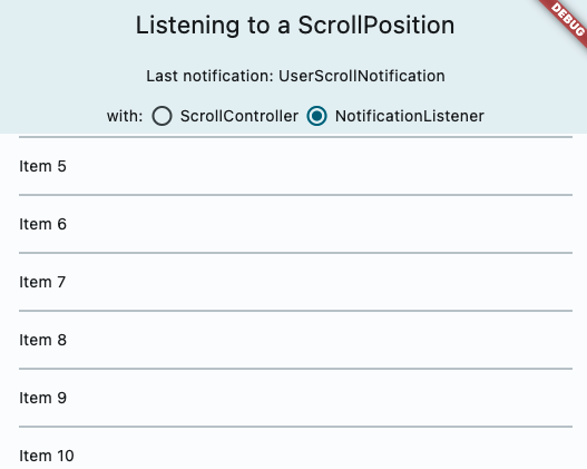
### Adds ScrollController.onAttach and ScrollController.onDetach

This resolves a long held pain point for developers. When using a scroll controller, there is not scroll position until the scrollable widget is built, and almost all methods of notification are only triggered when scrolling happens. Adding these two methods will help developers gain access to the scroll position when it is created. A common workaround for this was using a post frame callback to access controller.position after the first frame, but this is ripe for issues such as having multiple positions attached to the controller, or the scrollable no longer existing after that post frame callback. I think this can also be helpful for folks to debug cases when the scroll controller has multiple positions attached.

In particular, this also resolves this commented case: https://github.com/flutter/flutter/issues/20819#issuecomment-417784218
The isScrollingNotifier is hard for developers to access.

### Docs & samples

I was surprised we did not have samples on scroll notification or scroll controller, so I overhauled it and added a lot of docs on all the different ways to access scrolling information, when it is available and how they differ.
2023-05-15 21:01:06 +00:00
Taha Tesser
12659f2a7b
Fix MultiChildLayoutDelegate.hasChild doc (#126433)
fixes https://github.com/flutter/flutter/issues/115898

`hasChild` checks `_idToChild` map.  `_idToChild` is not assigned until `_callPerformLayout` is called.
So `hasChild` shouldn't be called in `getSize`.

df789c9e76/packages/flutter/lib/src/rendering/custom_layout.dart (L400-L404)

Updated docs and example class names.
2023-05-11 14:59:07 +00:00
Istiak Ahmed
042eaf6b90
Add sample code for SliverAppBar (#125785)
This PR adds an another example for SliverAppBar, showing the use of stretch and onStretchTrigger

https://user-images.githubusercontent.com/68919043/235420973-2bfb9871-9e05-4d87-9538-941d43178c76.mp4

Fixes #125651 

### Adds sample code for SliverAppBar [stretch, onStretchTrigger]

This PR adds an another simple and easily understandable example code for SliverAppBar.
2023-05-05 18:09:25 +00:00
Bruno Leroux
de2615462c
Add a ReorderableListView example with cards + cleanup existing tests (#126155)
## Description

This PR adds one `ReorderableListView` example to demonstrate how `proxyDecorator` can be used to animate cards elevation.

https://user-images.githubusercontent.com/840911/236468570-d2b33ab3-6b6d-4f8d-90de-778dcf1ad8ce.mp4

For motivation, see https://github.com/flutter/flutter/issues/124729#issuecomment-1521524190.

## Related Issue

Fixes https://github.com/flutter/flutter/issues/124729

## Tests

Adds 1 tests.

This PR also moves some misplaced example tests from `examples/api/test/reorderable_list` to `examples/api/test/material/reorderable_list` (and replaces two existing ones).
2023-05-05 16:39:11 +00:00
Tae Hyung Kim
1a0b03cb25
Sliver Cross Axis Group (#123862)
This widget implements the ability to place slivers side by side in a single ScrollView so that they scroll together. The design document for `SliverCrossAxisGroup` can be found [here](https://docs.google.com/document/d/1e2bdLSYV_Dq2h8aHpF8mda67aOmZocPiMyjCcTTZhTg/edit?resourcekey=0-Xj2X2XA3CAFae22Sv3hAiA).

Fixes #56756.
2023-04-28 23:41:58 +00:00
Tae Hyung Kim
482d1aaf13
Sliver Constrained Cross Axis (#125239)
Reimplements what we reverted here: #125233.
2023-04-24 23:17:36 +00:00
Tae Hyung Kim
9caabdd220
Revert "Sliver Constrained Cross Axis" (#125233)
Going to make some changes to the implementation so I'll revert in the meantime.

Reverts flutter/flutter#124337
2023-04-20 18:47:50 +00:00
Mitchell Goodwin
bd2617ecb9
Adaptive alert dialog (#124336)
Fixes #102811. Adds an adaptive constructor to AlertDialog, along with the adaptive function showAdaptiveDialog.

<img width="357" alt="Screenshot 2023-04-06 at 10 40 18 AM" src="https://user-images.githubusercontent.com/58190796/230455412-31100922-cfc5-4252-b8c6-6f076353f29e.png">
<img width="350" alt="Screenshot 2023-04-06 at 10 42 50 AM" src="https://user-images.githubusercontent.com/58190796/230455454-363dd37e-c44e-4aca-b6a0-cfa1d959f606.png">
2023-04-18 23:00:03 +00:00
Qun Cheng
6e85113418
Add an example for SearchBar (#124992)
This PR is to: 
* Update API doc for `SearchBar`.
* Add an example to show how to use a `SearchBar` as the builder of the `SearchAnchor`.
2023-04-17 23:23:57 +00:00
chunhtai
cc9ffd3f3b
SelectionContainer's listeners can remove itself during listener call… (#124624)
When swapping out delegate of  selectioncontainer, if the newly passed in delegate doesn't have any selectable content(which is usually the case), the selectioncontainerstate will notify all of the listeners. One of the listener would be SelectionRegistrant._updateSelectionRegistrarSubscription, and since it doesn't have content, it would remove itself from the listener which causes concurrent modification
2023-04-17 23:19:11 +00:00
Tae Hyung Kim
3c18f57480
Sliver Constrained Cross Axis (#124337)
Sliver Constrained Cross Axis
2023-04-10 21:15:48 +00:00
Ian Hickson
806c1f8186
Deprecate these old APIs (#116793)
Deprecate these old APIs
2023-04-06 19:53:50 +00:00
Loïc Sharma
6058e95919
Add CallbackShortcuts example (#123944)
Add CallbackShortcuts example
2023-04-05 22:17:59 +00:00
Greg Spencer
e3bc8efd39
Rename Sample classes (#124080)
Rename Sample classes
2023-04-04 20:34:29 +00:00
Kate Lovett
dd7d4b9521
Fix docs and error messages for scroll directions + sample code (#123819)
Fix docs and error messages for scroll directions + sample code
2023-03-31 23:46:59 +00:00
Mitchell Goodwin
84078c856f
Create CupertinoRadio Widget (#123296)
Create CupertinoRadio Widget
2023-03-30 15:43:36 +00:00
Vinny
f44064991d
Modified TextField docs - Replaced 'labelText' to 'hintText' in code snippet (#94128)
Modified TextField docs - Replaced 'labelText' to 'hintText' in code snippet
2023-03-29 20:02:33 +00:00
Simon Binder
c71f1dd76b
Treat hidden IndexedStack children as offstage for test finder (#123129)
Treat hidden `IndexedStack` children as offstage for test finder
2023-03-29 19:58:58 +00:00
Hans Muller
59c9d4e845
Added ExpansionTileController (#123298)
Added ExpansionTileController
2023-03-24 00:51:06 +00:00
Pierre-Louis
02d5c7595b
Add support for secondary tab bar (#122756)
Add support for secondary tab bar
2023-03-23 22:49:59 +00:00
Michael Goderbauer
fda9ecfef7
Remove 1745 decorative breaks (#123259)
Remove 1745 decorative breaks
2023-03-22 21:12:22 +00:00
Greg Spencer
bcdab118ba
Add support for application exit requests (#121378)
Add support for application exit requests
2023-03-17 15:35:55 +00:00
Bruno Leroux
3b4a882b61
Add one DefaultTextStyle example (#122182)
Add one DefaultTextStyle example
2023-03-08 20:40:54 +00:00
Bruno Leroux
a5ed960d0b
SystemUiOverlayStyle, add examples and improve documentation (#122187)
SystemUiOverlayStyle, add two examples and improve documentation
2023-03-08 20:31:59 +00:00
Bruno Leroux
961df985fa
Add ZoomPageTransitionsBuilder.allowSnapshotting (#122019)
Add ZoomPageTransitionsBuilder.allowSnapshotting
2023-03-06 22:43:00 +00:00
Bruno Leroux
a4ecd3e2f1
Cleanup PageTransitionsTheme documentation and add one example (#121701)
Cleanup PageTransitionsTheme documentation and add one example
2023-03-02 20:47:53 +00:00
LongCatIsLooong
e7ab3b07f8
OverlayPortal (#105335)
`OverlayPortal`
2023-03-02 17:34:01 +00:00
Taha Tesser
87679ff1c3
Update date picker examples, remove unused variables and add missing tests (#121528)
Update date picker examples, remove unused variables and add missing tests
2023-02-28 08:31:51 +00:00
Skandar Munir
681b72c304
fixes Show Week Day in CupertinoDatePicker with CupertinoDatePickerMo… (#120052)
fixes Show Week Day in CupertinoDatePicker with CupertinoDatePickerMo…
2023-02-28 01:52:51 +00:00
Taha Tesser
9a4e897965
Add OverflowBox example and update existing examples under basic.dart (#121213)
Add `OverflowBox` example and update existing examples under `basic.dart`
2023-02-27 18:52:00 +00:00
Taha Tesser
219ff64574
Reland "Update ExpansionTile to support Material 3 & add an example" (#121212) 2023-02-24 06:30:33 -08:00
Lioness100
26b6c1bedd
Fix typos (#121171)
* Fix typos

* lowercase animated & opacity

* Undo typo fix

---------

Co-authored-by: Michael Goderbauer <goderbauer@google.com>
2023-02-23 19:43:21 +00:00
Mushaheed Syed
7d85a585da
Add ActionButtonIconsData for overriding action icons (#118229)
* Add ActionButtonIconsData for overriding action icons

* Fix formatting issues

* Add missing exports in material library and add copyWith method in ActionButtonIconsData

* Move all action buttons, and icons to action_buttons.dart

* Rename actionButtonIcons to actionIconTheme

* Refactor buttons in action_buttons.dart to extend a private class for common implementation

* Refactor icons in action_buttons

* Fix docs in action_buttons_theme

* Fix #107646 always use 'Icons.arrow_back' as a back_button icon in web

* Update documentation for action buttons and add style parameter to every action button

* Fix analyzer warnings

* Add missing style argument in IconButton of _ActionButton

* Add tests for action buttons, action icon theme, drawer buttons, and back buttons

* Add example (+test) for action icon button's action icon theme in examples/api

* Fix analysis errors

* Add missing license header in action_icon_theme.0.dart

* Fix deprecation notice in theme_data.dart

* Update theme data tests for actionIconTheme

* Remove iconSize parameter from ActionButtons and update docs

* Fix failing tests

* Update button color during backbutton tests to red

* Fix analytics issues

* Fix format
2023-02-22 09:22:44 -08:00
Ian Hickson
6205c110d6
Remove "note that" in our documentation (as per style guide) (#120842)
* lerp documentation

* Remove Note, Note That from repo

* Improve BorderSide documentation.

* apply review comments
2023-02-17 22:27:33 +00:00
Hans Muller
42b20cf953
Added ListTile.titleAlignment, ListTileThemeData.titleAlignment (#119872)
* added ListTile.textAlignment

* changed titlesHeight to titleHeight

* fixed a typo

* Add tests and example

* Update tests

* update example test

---------

Co-authored-by: tahatesser <tessertaha@gmail.com>
2023-02-09 18:34:01 +00:00
Hans Muller
212bac80d1
Revert "Update ExpansionTile to support Material 3 & add an example (#119712)" (#120300)
This reverts commit e8eac0d047.
2023-02-08 10:53:55 -08:00
Taha Tesser
e8eac0d047
Update ExpansionTile to support Material 3 & add an example (#119712) 2023-02-07 08:21:18 -08:00
Justin McCandless
575ced6c5a
Fix context menu web examples (#120104)
The context menu examples on the docs site now work on the web.
2023-02-06 15:51:11 -08:00
Taha Tesser
bbca7ff693
Add Material 3 SwitchListTile example and update existing examples (#119714)
* Add Material 3 `SwitchListTile` example and update existing examples

* Update examples with `useMaterial3: true` and update example descriptions.

* add a `ColorScheme` colour
2023-02-06 09:02:37 +00:00
Taha Tesser
7177c413a9
Add Material 3 RadioListTile example and update existing examples (#119716)
* Add Material 3 `RadioListTile` example and update existing examples

* Update examples with `useMaterial3: true` and update example descriptions.

* add a `ColorScheme` colour
2023-02-03 16:27:43 +00:00
Jessica Pereira
9b86a4853e
Fix gets removedItem instead of its index (#119638)
* fix: gets removedItem instead of its index
add: sliver_animated_list.0_test.dart

* fix: sliver_animated_list.0_test.dart

* fix: pr comments

* fix test import

Co-authored-by: Taha Tesser <tessertaha@gmail.com>

---------

Co-authored-by: Taha Tesser <tessertaha@gmail.com>
2023-02-03 00:15:58 +00:00
Tanay Neotia
0e22aca785
Add support for image insertion on Android (#110052)
* Add support for image insertion on Android

* Fix checks

* Use proper Dart syntax on snippet

* Specify type annotation on list

* Fix nits, add some asserts, and improve example code

* Add missing import

* Fix nullsafety error

* Fix nullsafety error

* Remove reference to contentCommitMimeTypes in docs

* Fix nits

* Fix warnings and import

* Add test for content commit in editable_text_test.dart

* Check that URIs are equal in test

* Fix nits and rename functions / classes to be more self-explanatory

* Fix failing debugFillProperties tests

* Add empty implementation to `insertContent` in TextInputClient

* Tweak documentation slightly

* Improve docs for contentInsertionMimeTypes and fix assert

* Rework contentInsertionMimeType asserts

* Add test for onContentInserted example

* Switch implementation to a configuration class for more granularity in setting mime types

* Fix nits

* Improve docs and fix doc tests

* Fix more nits (LongCatIsLooong)

* Fix failing tests

* Make parameters (guaranteed by platform to be non-nullable) non-nullable

* Fix analysis issues
2023-01-31 19:46:18 +00:00
Taha Tesser
29ab437e28
Add Material 3 CheckboxListTile example and update existing examples (#118792)
* Add Material 3 `CheckboxListTile` example and update existing examples

* fix `list_tile.dart` doc issues

* Remove unnecessary comma
2023-01-25 13:21:18 +00:00
Taha Tesser
3e71e0caf4
Updated ListTile documentation, add Material 3 example and other ListTile examples fixes. (#118705) 2023-01-19 11:05:30 +00:00
Hans Muller
3a181e495a
Added LinearBorder, an OutlinedBorder like BoxBorder (#116940) 2023-01-13 08:04:22 -08:00
Taha Tesser
3d3f8e85a6
Update CupertinoPicker example (#118248)
* Update `CupertinoPicker` example

* format lines

* Revert making variable public

* revert variable change
2023-01-10 19:49:22 +00:00
Michael Goderbauer
81bc54be75
Enable use_colored_box lint (#117370) 2022-12-20 14:09:55 -08:00
Taha Tesser
f07db4018a
NavigationBar improvements (#116992) 2022-12-13 17:25:49 -08:00
Greg Spencer
fae458b925
Convert TimePicker to Material 3 (#116396)
* Make some minor changes in preparation for updating the Time Picker to M3

* Revert OutlineInputBorder.borderRadius type change

* Revert more OutlineInputBorder.borderRadius changes.

* Convert TimePicker to Material 3

* Add example test

* Revert OutlineInputBorder.borderRadius type change

* Fix test

* Review Changes

* Merge changes

* Some sizing and elevation fixes

* Fix localization tests
2022-12-14 00:09:52 +00:00
ivirtex
ef40e3ea6f
Add CupertinoSliverNavigationBar large title magnification on over scroll (#110127)
* Add magnification of CupertinoSliverNavigationBar large title

* Fix padding in maximum scale computation

* Apply magnification by using RenderBox

* Do not pass key to the superclass constructor

* Use `clampDouble` instead of `clamp` extension method

* Remove trailing whitespaces to make linter happy

* Name test variables more precisely

* Move transform computation to `performLayout` and implement `hitTestChildren`

* Address comments

* Address comments

* Address comments

* Update comment about scale

* Fix hit-testing

* Fix hit-testing again

* Make linter happy

* Implement magnifying without using LayoutBuilder

* Remove trailing spaces

* Add hit-testing of the large title

* Remove whitespaces

* Fix scale computation and some tests

* Fix remaining tests

* Refactor and fix comments

* Update comments
2022-12-08 17:15:09 +00:00
Greg Spencer
fb9133b881
Add ListenableBuilder with examples (#116543)
* Add ListenableBuilder with examples

* Add tests

* Add tests

* Fix Test

* Change AnimatedBuilder to be a subclass of ListenableBuilder
2022-12-07 01:15:22 +00:00
Pierre-Louis
1e696d304c
Support theming CupertinoSwitchs (#116510)
* Introduce flag to maximally apply CupertinoTheme

* add missing docs

* add tests

* fix docs

* fix test
2022-12-06 15:32:58 +01:00
Taha Tesser
aaa4a52839
Add Material 3 Slider example (#115638)
* Add Material 3 `Slider` example

* Update doc

* Update test titles
2022-12-01 00:00:19 +00:00
Mitchell Goodwin
97195d1d51
Update CupertinoContextMenu to iOS 16 visuals (#110616)
* Update CupertinoContextMenu to iOS 16 visuals

* Revert some formatting

* Remove space

* Remove formatting changes, add more comments

* Added shadow effect

* Update context menu tests

* Remove white spaces

* Remove unused variable

* Refactor type checking logic

* Set default previewBuilder and update tests

* Check for border radius

* Remove trailing spaces

* Add builder to constructor

* Update previewBuilder

Rebase to master

* Update builder and tests

* Remove trailing spaces

* Update examples

* Refactor builder

* Update builder to use one animation

* Update scale

* Change deprecation message, remove white spaces

* Change deprecation message

* Change deprecation message

* Change deprecation message

* Update documentation

* Update documentation

* Update documentation and examples

* Update documentation and examples

* Remove white spaces

* Remove white spaces

* Remove const

* Address linting errors

* Seperate builder into own constructor

* Remove trailing characters

* Formatting changes

* Remove white spaces

* Change ignore comment

* Add TODO

* Remove whitespace
2022-11-30 16:28:04 -07:00
Taha Tesser
333397a0ed
Fix Material 3 BottomSheet example (#116112)
fix title
2022-11-30 02:08:21 +00:00
Greg Spencer
0cb9f70460
Menu bar accelerators (#114852)
* Add MenuMenuAcceleratorLabel to support accelerators.

* Review Changes

* Review Changed

* Fix default label builder to use characters

* Remove golden test that shouldn't have been there.
2022-11-29 00:27:20 +00:00
Zachary Anderson
a84e369bd2
Revert "Allow Flutter golden file tests to be flaky (#114450)" (#114902)
This reverts commit 53e6876226.
2022-11-08 09:26:55 -08:00
Kate Lovett
53e6876226
Allow Flutter golden file tests to be flaky (#114450)
* allow marking a golden check as flaky

* add matchesFlutterGolden to analyze.dart; no tags for flutter_goldens/lib

* Pause

* ++

* ++

* Analyzer therapy

* Once more with feeling

* Nits

* Review feedback

* Silly oops

* Test progress

* More tests

* Finish

* Nits

* Analyzer

* Review feedback

Co-authored-by: Yegor Jbanov <yjbanov@google.com>
2022-11-08 01:14:03 +00:00
Taha Tesser
eadda3c393
Add Material 3 Popup Menu example and update existing example (#114228) 2022-11-01 22:10:45 +00:00
Justin McCandless
0b451b6dfd
Context Menus (#107193)
* Can show context menus anywhere in the app, not just on text.
* Unifies all desktop/mobile context menus to go through one class (ContextMenuController).
* All context menus are now just plain widgets that can be fully customized.
* Existing default context menus can be customized and reused.
2022-10-28 12:40:09 -07:00
Qun Cheng
3ce88d3813
Replace menu defaults with tokens (#113963) 2022-10-25 14:46:34 -07:00
Taha Tesser
7f75d24164
Add Material 3 ProgressIndicator examples (#113950) 2022-10-25 07:27:08 +00:00
Taha Tesser
b0e7c9c4f0
Move AnimatedIcons example and fix typo in cupertino/text_selection_toolbar.dart (#113937) 2022-10-25 07:27:06 +00:00
J-P Nurmi
28e0f089a2
Reland "[text_input] introduce TextInputControl" (#113758) 2022-10-24 07:23:32 -07:00
Zachary Anderson
9064bf674b
Revert "[text_input] introduce TextInputControl (#76072)" (#113724)
This reverts commit 2fdfa29e08.
2022-10-19 15:00:00 -07:00
Taha Tesser
8815f60a5a
Add AnimatedIcons previews and examples (#113700) 2022-10-19 17:12:19 +00:00
Greg Spencer
7523ab5cc1
Add SliverAnimatedGrid and AnimatedGrid (#112982) 2022-10-07 22:15:11 +00:00
Greg Spencer
6b32c0691b
Add checkbox and radio menu buttons (#112821) 2022-10-07 21:13:36 +00:00
J-P Nurmi
2fdfa29e08
[text_input] introduce TextInputControl (#76072)
Allows the creation of virtual in-app keyboards written in Flutter.  Especially useful for embedded environments.
2022-10-04 15:23:12 -07:00
Taha Tesser
6432742036
Update AnimatedSlide example (#112803) 2022-10-03 18:44:13 +00:00
Darren Austin
2bf83dd860
Add support for Material 3 Divider and VerticalDivider (#112655) 2022-09-29 11:30:53 -07:00
Taha Tesser
fd6997f07a
Add Dialog.fullscreen and example (#112261) 2022-09-29 09:12:05 -07:00
Greg Spencer
8c271e5cb8
Implement Material MenuBar and MenuAnchor (#112239)
This implements a MenuBar widget that can render a Material menu bar, and a MenuAnchor widget used to create a cascading menu in a region. The menus are drawn in the overlay, while the menu bar itself is in the regular widget tree. Keyboard traversal works between the two.

This implementation of the MenuBar uses MenuAnchor to create a cascading menu that contains widgets representing the menu items. These menu items can be any kind of widget, but are typically SubmenuButtons that host submenus, or MenuItemButtons that have shortcut hints (but don't actually activate the shortcuts) and don't host submenus.

Cascading menus can be created outside of a MenuBar by using a MenuAnchor. They can be either given a specific location to appear (a coordinate), or they can be located by the MenuAnchor region that wraps the control that opens them.

The developer may also create a MenuController to pass to the various menu primitives (MenuBar or MenuAnchor) to associate menus so that they can be traversed together and closed together. Creating a controller is not required.
2022-09-28 14:10:18 -07:00
Casey Hillers
bd5c347193
Revert "Add support for Material 3 Divider and VerticalDivider" (#112471) 2022-09-27 15:15:59 +00:00
Taha Tesser
1d5f455c4c
Add support for Material 3 Divider and VerticalDivider (#112378) 2022-09-26 20:36:09 +00:00
Anthony Oleinik
4ceeca0833
Added example for Magnifier and TextMagnifier (#110218) 2022-09-23 20:29:32 +00:00
Taha Tesser
844a8ad7e8
Update CupertinoSwitch example (#112063) 2022-09-21 15:27:20 +00:00
Greg Spencer
fb28a0d3fe
Re-Land "Actually add example templates (#111531)" (#111666) 2022-09-15 16:17:06 +00:00
Zachary Anderson
e2d3019a37
Revert "Actually add example templates (#111531)" (#111632)
This reverts commit 7242ea2252.
2022-09-14 20:24:17 -07:00
Greg Spencer
7242ea2252
Actually add example templates (#111531) 2022-09-15 01:17:21 +00:00
Greg Spencer
e617d003fb
Normalize examples (#111223) 2022-09-09 21:17:11 +00:00
Darren Austin
33ed6a3533
Fixing elevation issues with Material 3 (#110624)
* Added support for surfaceTintColor and shadowColor to the Dialog widgets.
* Updated the defaults for Material.shadowColor and Material.surfaceTint to allow turning off the features with a transparent color.
* Added support for shadowColor and surfaceTintColor for Drawer widget.
2022-09-06 16:16:45 -07:00
Pierre-Louis
8853926601
Deprecate ThemeData errorColor and backgroundColor (#110162) 2022-09-02 04:02:55 +00:00
LongCatIsLooong
bdb74e16c6
Fix Action.overridable example (#110824) 2022-09-02 00:46:21 +00:00
Akshdeep Singh
519a5783c0
add material slider secondary value (#109808) 2022-08-28 23:26:32 +00:00
Greg Spencer
fefb2b00ba
Re-Land "Refactor StrokeAlign to allow double values." (#108339) (#110234) 2022-08-25 20:56:24 +00:00
Qun Cheng
c0c3874c77
Revert "Reland: Set IconButton.visualDensity default to VisualDensity.standard (#109432)" (#110119)
This reverts commit 79013b2be8.
2022-08-23 15:41:03 -07:00
Bryan Oltman
6540ae0be7
Add clipBehavior to Card+InkWell example (#109872)
* Add clipBehavior to Card+InkWell example

* Add test for example

* Update comment
2022-08-22 11:24:23 -04:00
Greg Spencer
957a8da4a2
Revert "Re-Land "Refactor StrokeAlign to allow double values." (#109805)" (#109955)
This reverts commit b3aba4d9c8 because it breaks Google tests.
2022-08-21 20:18:09 +02:00
Greg Spencer
b3aba4d9c8
Re-Land "Refactor StrokeAlign to allow double values." (#109591) (#109805) 2022-08-19 19:36:11 +00:00
Qun Cheng
79013b2be8
Reland: Set IconButton.visualDensity default to VisualDensity.standard (#109432)
* Revert "Revert "Set `IconButton.visualDensity` default to `VisualDensity.standard` (#109349)" (#109421)"

Co-authored-by: Qun Cheng <quncheng@google.com>
2022-08-18 09:46:13 -07:00
Taha Tesser
9da693e3fa
Add an example for how to hide default scrollbar on desktop platform. (#108542) 2022-08-18 13:09:23 +00:00
Casey Hillers
370fc483e3
Revert "Refactor StrokeAlign to allow double values." (#109591) 2022-08-16 06:56:07 +00:00
Bernardo Ferrari
dd8573b871
Refactor StrokeAlign to allow double values. (#108339) 2022-08-15 20:23:20 +00:00
Qun Cheng
625d96a1c6
Revert "Set IconButton.visualDensity default to VisualDensity.standard (#109349)" (#109421)
This reverts commit 3070baf175.
2022-08-11 15:29:19 -07:00
Qun Cheng
3070baf175
Set IconButton.visualDensity default to VisualDensity.standard (#109349)
* Set IconButton's visualDensity to standard

Co-authored-by: Qun Cheng <quncheng@google.com>
2022-08-11 10:59:51 -07:00
Ian Hickson
9b2668a451
Minor fix compendium (#107874) 2022-08-11 02:33:07 +00:00
Ian Hickson
7ded3d91da
API documentation cleanup (#108500) 2022-08-10 22:03:20 +00:00
Bruno Leroux
8faccb8a82
Reland: "Add example and troubleshooting comment for showSnackBar" (#105195) 2022-08-09 22:06:05 +00:00
Greg Spencer
f5e4d2b427
Replace FocusTrap with TapRegionSurface (#107262) 2022-07-29 16:00:07 +00:00
Taha Tesser
76df7368b5
Update Chips examples and rename files (#108538) 2022-07-29 07:17:06 +00:00
Bryan Oltman
e3d08fb6d3
Hide the debug banner in the PopupMenuButton example (#108324)
* Hide the debug banner in the PopupMenuButton example

* Add test to verify that debug banner is not shown
2022-07-26 10:43:35 -04:00
Tong Mu
4056d3ffde
Explain the "patching" protocol in KeyMessageManager.keyMessageHandler and add an example (#105280) 2022-07-26 05:42:05 +00:00
Marcel Čampa
0c40945a67
Implement CupertinoListSection and CupertinoListTile (#78732) 2022-07-19 18:46:30 -05:00
Taha Tesser
cf342254cc
Add an interactive example for Overlay (#107531) 2022-07-15 09:44:05 +00:00
Taha Tesser
c422d280ab
Add an example for AppBar.notificationPredicate (#106018) 2022-07-15 09:40:06 +00:00
Taha Tesser
c251856c89
Update ListTile docs for color animation issues and add example (#106955) 2022-07-13 08:09:07 +00:00
Taha Tesser
66cd09dd82
Update PopupRoute docs and add an example (#106948) 2022-07-12 08:59:05 +00:00
Aman Verma
3022db2bf3
docs: Add more potential use case for Bottom Navigation Bar (#99644) 2022-06-23 17:17:06 +00:00
Youssef Attia
082560313b
Added an example for IndexedStack widget (#105318)
* Added an example for IndexedStack

* Added tests for the IndexedStack example

* Fixed type issue for onSubmitted callback functions

* Fixed documentation and moved files to their appropriate places

* Fixed documentation and moved files to their appropriate places

* Moved test files to their appropriate places

* Moved test files to their appropriate places

* Fixed file path in documentation

* Remove trailing space

* Formatting changes

* Remove extra line

* Further formatting changes

* Further formatting changes

* fix comma and inline

Co-authored-by: Greg Spencer <gspencergoog@users.noreply.github.com>

* Formatting

* indentation and formatting

* Formatting

* Formatting

* Formatting

* Removed duplicate chevron

* better wording on documentation

Co-authored-by: Tong Mu <dkwingsmt@users.noreply.github.com>

* Added testing for state preservation

Co-authored-by: Greg Spencer <gspencergoog@users.noreply.github.com>
Co-authored-by: Tong Mu <dkwingsmt@users.noreply.github.com>
2022-06-13 16:38:37 -07:00
Hans Muller
d8783ff4c2
Reland Added MaterialStatesController, updated InkWell et al. #103167 (#105656) 2022-06-10 08:12:49 -07:00
Hans Muller
9cf042ec74
Revert "Added MaterialStatesController, updated InkWell et al. (#103167)" (#105138)
This reverts commit 180566f2e5.
2022-06-01 17:19:16 -07:00
Taha Tesser
71a9ccbf2c
InheritedModel: Add a complete interactive example and update snippet for null safety (#104174) 2022-05-30 06:13:10 -07:00
Kate Lovett
2aa7317296
Revert "Add error message and documentation when a SnackBar is off screen" (#104843) 2022-05-27 11:58:14 -07:00
Hans Muller
180566f2e5
Added MaterialStatesController, updated InkWell et al. (#103167) 2022-05-27 08:38:42 -07:00
Bruno Leroux
bc53e6202e
Add error message and documentation when a SnackBar is off screen (#102073) 2022-05-26 05:15:07 -07:00
Pierre-Louis
308b543783
Use curly_braces_in_flow_control_structures for sample code (#104617)
* use `flutter_lints` for sample code

* update packages

* Revert "update packages"

This reverts commit 14da3c69a8.

* revert
2022-05-26 08:59:37 +02:00
Taha Tesser
97452d1a10
Switch: Add an interactive example (#103045)
* `Switch`: Add an interactive examples

* Update docs

* Update doc
2022-05-25 10:40:31 +02:00
Bruno Leroux
1e0a1a2661
Add an example and update GestureDetector documentation (#102360) 2022-05-24 16:38:09 -07:00
Taha Tesser
5739bf4fab
RefreshIndicator: Add notificationPredicate example (#103894) 2022-05-24 04:58:06 -07:00
Taha Tesser
3f5bd7d89e
Add Material 3 AppBar example (#102823) 2022-05-19 00:13:09 -07:00
Bryan Oltman
89f755c2df
Replace references to LinearProgressIndicator in CircularProgressIndicator example (#103349)
* Replace references to LinearProgressIndicator in CircularProgressIndicator example

* Add test

* fix copyright header
2022-05-09 16:04:02 -04:00
Taha Tesser
92a59caa7f
CupertinoTabScaffold/CupertinoTabController: Add interactive examples (#103196)
* `CupertinoTabScaffold`/`CupertinoTabController`: Add interactive examples

* fix class name in the test

* Kick tests
2022-05-09 11:16:32 +02:00
Taha Tesser
803f9959d8
Update Cupertino examples and add missing tests (#103128) 2022-05-07 00:29:10 -07:00
Taha Tesser
9489b64cbb
DropdownButton: Update selectedItemBuilder example to show case item alignment and update DropdownButton examples (#102748) 2022-05-06 00:14:08 -07:00
Taha Tesser
d80f3e3921
Cupertino examples improvements and clean up (#103044) 2022-05-05 08:22:53 +02:00
Taha Tesser
27fee486ef
CupertinoSwitch: Add an interactive example (#103043)
Update
2022-05-05 07:59:55 +02:00
Taha Tesser
3ed0bbed5a
CupertinoActivityIndicator: Add an interactive example (#103040) 2022-05-05 07:59:29 +02:00
Taha Tesser
86e55df7f2
CupertinoFormRow: Add an interactive example (#103041)
* `CupertinoFormRow`: Add an interactive example

* fix typo

* Update docs
2022-05-05 07:58:53 +02:00
Taha Tesser
81fd748ac2
CupertinoSearchTextField: Add interactive examples (#103042)
* `CupertinoSearchTextField`: Add interactive examples

* Update docs
2022-05-05 07:58:15 +02:00
Taha Tesser
eef4aa7caa
Hero: Add an example for createRectTween (#102650) 2022-04-29 12:39:09 -07:00
Taha Tesser
4ffc41ad10
ToggleButtons: Add interactive example (#100124) 2022-04-29 12:29:07 -07:00
Phil Quitslund
80849adee1
[dev, bots, examples] rename local functions with _s (#102703) 2022-04-28 10:44:06 -07:00
Taha Tesser
b1f88a6535
ReorderableListView: fix broken dartpad example & update examples, add tests (#102723) 2022-04-28 10:19:08 -07:00