Greg Spencer
4ce7fdd92b
Remove 'must be non-null' and 'must not be null' comments from non-framework libraries ( #134994 )
...
## Description

This removes all of the comments that are of the form "so-and-so must not be null" or "so-and-so must be non-null" from the cases where those values are defines as non-nullable values.

This PR removes them from the library in the repo that don't have anything to do with the framework.

This was done by hand, since it really didn't lend itself to scripting, so it needs to be more than just spot-checked, I think. I was careful to leave any comment that referred to parameters that were nullable, but I may have missed some.

In addition to being no longer relevant after null safety has been made the default, these comments were largely fragile, in that it was easy for them to get out of date, and not be accurate anymore anyhow.

This did create a number of constructor comments which basically say "Creates a [Foo].", but I don't really know how to avoid that in a large scale change, since there's not much you can really say in a lot of cases.  I think we might consider some leniency for constructors to the "Comment must be meaningful" style guidance (which we de facto have already, since there are a bunch of these).

## Related PRs
- https://github.com/flutter/flutter/pull/134984
- https://github.com/flutter/flutter/pull/134991
- https://github.com/flutter/flutter/pull/134992
- https://github.com/flutter/flutter/pull/134993

## Tests
 - Documentation only change.
2023-09-19 17:26:07 +00:00
Michael Goderbauer
b966b2beee
Enable private field promotion for dev ( #134480 )
...
New feature in upcoming Dart 3.2. See https://github.com/dart-lang/language/issues/2020 . Feature is enabled by bumping the min SDK version to 3.2.
Part of https://github.com/flutter/flutter/issues/134476 .
2023-09-12 18:29:00 +00:00
Taha Tesser
1e770c3808
Add cancelButtonStyle & confirmButtonStyle to the DatePickerThemeData ( #132847 )
...
fixes [Unable to adjust the color for "Cancel" and "Ok" button in datePicker dialog](https://github.com/flutter/flutter/issues/127739 )
### Code sample
<details>
<summary>expand to view the code sample</summary>
```dart
import 'package:flutter/material.dart';
void main() => runApp(const MyApp());
class MyApp extends StatelessWidget {
const MyApp({super.key});
@override
Widget build(BuildContext context) {
return MaterialApp(
debugShowCheckedModeBanner: false,
theme: ThemeData(
useMaterial3: true,
datePickerTheme: DatePickerThemeData(
cancelButtonStyle: TextButton.styleFrom(
shape: const RoundedRectangleBorder(
borderRadius: BorderRadius.all(Radius.circular(16)),
side: BorderSide(color: Colors.red),
),
backgroundColor: Colors.white,
foregroundColor: Colors.red,
elevation: 3,
shadowColor: Colors.red,
),
confirmButtonStyle: TextButton.styleFrom(
shape: const RoundedRectangleBorder(
borderRadius: BorderRadius.all(Radius.circular(16)),
),
backgroundColor: Colors.green[700],
foregroundColor: Colors.white,
elevation: 3,
shadowColor: Colors.green[700],
),
),
),
home: const Example(),
);
}
}
class Example extends StatelessWidget {
const Example({super.key});
@override
Widget build(BuildContext context) {
return Scaffold(
body: Center(
child: DatePickerDialog(
initialDate: DateTime.now(),
firstDate: DateTime(2020),
lastDate: DateTime(2030),
),
),
);
}
}
```
</details>
### Before
Not possible to customize action buttons from the `DatePickerThemeData`.
### After

2023-08-30 21:16:13 +00:00
Xilai Zhang
6fd42536b7
[flutter roll] Revert "Fix Chip.shape's side is not used when provided in Material 3" ( #133615 )
...
Reverts flutter/flutter#132941
context: b/298110031

The rounded rectangle borders don't appear in some of the internal
golden image tests.
2023-08-29 19:59:02 -07:00
Greg Spencer
ff829fd8b2
Add doxygen doc generation. ( #131356 )
2023-08-29 11:12:02 -07:00
Greg Spencer
5bd8579bc8
Use flutter pub get instead of dart pub get in create_api_docs.dart ( #133493 )
2023-08-28 16:12:16 -07:00
Kenzie Davisson
61d9f55665
Update flutter packages to pick up latest vm_service ( #133335 )
...
Generated by running `flutter update-packages --force-upgrade`
2023-08-25 11:03:35 -07:00
Taha Tesser
612117a690
Fix Chip.shape's side is not used when provided in Material 3 ( #132941 )
...
fixes [Chip border side color not working in Material3](https://github.com/flutter/flutter/issues/132922 )
### Code sample
<details>
<summary>expand to view the code sample</summary>
```dart
import 'package:flutter/material.dart';
void main() {
runApp(const MyApp());
}
class MyApp extends StatelessWidget {
const MyApp({super.key});
@override
Widget build(BuildContext context) {
return MaterialApp(
theme: ThemeData(
useMaterial3: true,
chipTheme: const ChipThemeData(
// shape: RoundedRectangleBorder(
// side: BorderSide(color: Colors.amber),
// borderRadius: BorderRadius.all(Radius.circular(12)),
// ),
// side: BorderSide(color: Colors.red),
),
),
home: const Example(),
);
}
}
class Example extends StatelessWidget {
const Example({super.key});
@override
Widget build(BuildContext context) {
return const Scaffold(
body: Center(
child: RawChip(
shape: RoundedRectangleBorder(
side: BorderSide(color: Colors.amber),
borderRadius: BorderRadius.all(Radius.circular(12)),
),
// side: BorderSide(color: Colors.red),
label: Text('Chip'),
),
),
);
}
}
```
</details>
---
### Before
When `RawChip.shape` is provided with a `BorderSide`.
```dart
body: Center(
child: RawChip(
shape: RoundedRectangleBorder(
side: BorderSide(color: Colors.amber),
borderRadius: BorderRadius.all(Radius.circular(12)),
),
label: Text('Chip'),
),
),
```

When `RawChip.shape` is provided with a `BorderSide` and also `RawChip.side` is provided. The `RawChip.side` overrides the shape's side.
```dart
body: Center(
child: RawChip(
shape: RoundedRectangleBorder(
side: BorderSide(color: Colors.amber),
borderRadius: BorderRadius.all(Radius.circular(12)),
),
side: BorderSide(color: Colors.red),
label: Text('Chip'),
),
),
```

---
### After
When `RawChip.shape` is provided with a `BorderSide`.
```dart
body: Center(
child: RawChip(
shape: RoundedRectangleBorder(
side: BorderSide(color: Colors.amber),
borderRadius: BorderRadius.all(Radius.circular(12)),
),
label: Text('Chip'),
),
),
```

When `RawChip.shape` is provided with a `BorderSide` and also `RawChip.side` is provided. The `RawChip.side` overrides the shape's side.
```dart
body: Center(
child: RawChip(
shape: RoundedRectangleBorder(
side: BorderSide(color: Colors.amber),
borderRadius: BorderRadius.all(Radius.circular(12)),
),
side: BorderSide(color: Colors.red),
label: Text('Chip'),
),
),
```

---
2023-08-25 14:47:08 +00:00
Ian Hickson
5fa8de05ee
l10n-related documentation improvements ( #133114 )
2023-08-24 21:54:56 +00:00
Taha Tesser
1bc791697c
Update default menu text styles for Material 3 ( #131930 )
...
Related https://github.com/flutter/flutter/issues/131676
## Description
#### Fix default input text style for `DropdownMenu`

### Fix default text style for `MenuAnchor`'s menu items (which `DropdownMenu` uses for menu items)

### Default `DropdownMenu` Input text style

### Default `DropdownMenu` menu item text style

### Default `MenuAnchor` menu item text style

### Code sample
<details>
<summary>expand to view the code sample</summary>
```dart
import 'package:flutter/material.dart';
/// Flutter code sample for [DropdownMenu]s. The first dropdown menu has an outlined border.
void main() => runApp(const DropdownMenuExample());
class DropdownMenuExample extends StatefulWidget {
const DropdownMenuExample({super.key});
@override
State<DropdownMenuExample> createState() => _DropdownMenuExampleState();
}
class _DropdownMenuExampleState extends State<DropdownMenuExample> {
final TextEditingController colorController = TextEditingController();
final TextEditingController iconController = TextEditingController();
ColorLabel? selectedColor;
IconLabel? selectedIcon;
@override
Widget build(BuildContext context) {
final List<DropdownMenuEntry<ColorLabel>> colorEntries =
<DropdownMenuEntry<ColorLabel>>[];
for (final ColorLabel color in ColorLabel.values) {
colorEntries.add(
DropdownMenuEntry<ColorLabel>(
value: color, label: color.label, enabled: color.label != 'Grey'),
);
}
final List<DropdownMenuEntry<IconLabel>> iconEntries =
<DropdownMenuEntry<IconLabel>>[];
for (final IconLabel icon in IconLabel.values) {
iconEntries
.add(DropdownMenuEntry<IconLabel>(value: icon, label: icon.label));
}
return MaterialApp(
theme: ThemeData(
useMaterial3: true,
colorSchemeSeed: Colors.green,
// textTheme: const TextTheme(
// bodyLarge: TextStyle(
// fontWeight: FontWeight.bold,
// fontStyle: FontStyle.italic,
// decoration: TextDecoration.underline,
// ),
// ),
),
home: Scaffold(
body: SafeArea(
child: Column(
children: <Widget>[
const Text('DropdownMenus'),
Padding(
padding: const EdgeInsets.symmetric(vertical: 20),
child: Row(
mainAxisAlignment: MainAxisAlignment.center,
children: <Widget>[
DropdownMenu<ColorLabel>(
controller: colorController,
label: const Text('Color'),
dropdownMenuEntries: colorEntries,
onSelected: (ColorLabel? color) {
setState(() {
selectedColor = color;
});
},
),
const SizedBox(width: 20),
DropdownMenu<IconLabel>(
controller: iconController,
enableFilter: true,
leadingIcon: const Icon(Icons.search),
label: const Text('Icon'),
dropdownMenuEntries: iconEntries,
inputDecorationTheme: const InputDecorationTheme(
filled: true,
contentPadding: EdgeInsets.symmetric(vertical: 5.0),
),
onSelected: (IconLabel? icon) {
setState(() {
selectedIcon = icon;
});
},
),
],
),
),
const Text('Plain TextFields'),
Padding(
padding: const EdgeInsets.symmetric(vertical: 20),
child: Row(
mainAxisAlignment: MainAxisAlignment.center,
children: <Widget>[
SizedBox(
width: 150,
child: TextField(
controller: TextEditingController(text: 'Blue'),
decoration: const InputDecoration(
suffixIcon: Icon(Icons.arrow_drop_down),
labelText: 'Color',
border: OutlineInputBorder(),
)),
),
const SizedBox(width: 20),
SizedBox(
width: 150,
child: TextField(
controller: TextEditingController(text: 'Smile'),
decoration: const InputDecoration(
prefixIcon: Icon(Icons.search),
suffixIcon: Icon(Icons.arrow_drop_down),
filled: true,
labelText: 'Icon',
)),
),
],
),
),
if (selectedColor != null && selectedIcon != null)
Row(
mainAxisAlignment: MainAxisAlignment.center,
children: <Widget>[
Text(
'You selected a ${selectedColor?.label} ${selectedIcon?.label}'),
Padding(
padding: const EdgeInsets.symmetric(horizontal: 5),
child: Icon(
selectedIcon?.icon,
color: selectedColor?.color,
),
)
],
)
else
const Text('Please select a color and an icon.')
],
),
),
),
);
}
}
enum ColorLabel {
blue('Blue', Colors.blue),
pink('Pink', Colors.pink),
green('Green', Colors.green),
yellow('Yellow', Colors.yellow),
grey('Grey', Colors.grey);
const ColorLabel(this.label, this.color);
final String label;
final Color color;
}
enum IconLabel {
smile('Smile', Icons.sentiment_satisfied_outlined),
cloud(
'Cloud',
Icons.cloud_outlined,
),
brush('Brush', Icons.brush_outlined),
heart('Heart', Icons.favorite);
const IconLabel(this.label, this.icon);
final String label;
final IconData icon;
}
```
</details>
2023-08-22 22:21:00 +00:00
Gray Mackall
505f9d8954
Change gradle lockfile generation script to use --config-only flag ( #132967 )
...
The `generate_gradle_lockfiles.dart` script was generating the gradle wrapper by building a flavor that didn't exist. In the time since the script was written, the `--config-only` flag was created and should be used instead.

Context https://github.com/flutter/flutter/pull/132406#discussion_r1300352602
2023-08-21 19:51:55 +00:00
Zachary Anderson
d5a162b788
Forward port API docs creation realm handling from prior script ( #132867 )
...
It looks like the logic added here:


https://github.com/flutter/flutter/pull/131951/files#diff-297ee4cfe6d9bffc2fa1376918a50b8e4165ada4569575880c40811b6f749265R18

got dropped in the refactor here:

https://github.com/flutter/flutter/pull/132710
2023-08-18 15:33:27 -07:00
Greg Spencer
ced3e76626
Reland: "Reorganize and clarify API doc generator" ( #132353 ) ( #132710 )
...
## Description

This re-lands #132353 with some additional options for keeping around the staging directory, so that the recipe for publishing docs can give those options and have the staging directory left around for deploying to the website.

Reverted in #132613

## Related Issues
 - https://flutter-review.googlesource.com/c/recipes/+/49580
2023-08-17 23:53:06 +00:00
Polina Cherkasova
1a0077dc81
Upgrade flutter packages. ( #132697 )
2023-08-16 16:26:58 -07:00
Jonah Williams
909400dc4d
Revert "Reorganize and clarify API doc generator" ( #132613 )
...
Reverts flutter/flutter#132353

Educated guess that this is causing the docs failures: https://logs.chromium.org/logs/flutter/buildbucket/cr-buildbucket/8772644466113801713/+/u/Docs/Deploy_docs/Firebase_deploy/stdout
2023-08-16 02:47:26 +00:00
Taha Tesser
23315f1b57
[Reland] #131609 ( #132555 )
...
This relands https://github.com/flutter/flutter/pull/131609
---
fixes [`PopupMenuItem` adds redundant padding when using `ListItem`](https://github.com/flutter/flutter/issues/128553 )
2023-08-16 00:44:06 +00:00
Greg Spencer
899a29f830
Reorganize and clarify API doc generator ( #132353 )
...
## Description

This cleans up a lot of issues with the API doc generation.

Here are the main changes:
 - Rename `dartdoc.dart` to `create_api_docs.dart`
 - Move the bulk of the operations out of `dev/bots/docs.sh` into `create_api_docs.dart`.
 - Delete `dashing_postprocess.dart` and `java_and_objc.dart` and incorporate those operations into `create_api_docs.dart`.
 - Refactor the doc generation into more understandable classes
 - Bump the snippets tool version to 0.4.0 (the latest one)
 - Centralize the information gathering about the Flutter repo into the new `FlutterInformation` class.
 - Clean up the directory handling, and convert to using the `file` package for all file and directory paths.
 - Add an `--output` option to docs.sh that specifies the location of the output ZIP file containing the docs.
   - Defaults to placing the output in `dev/docs/api_docs.zip` (i.e. where the previous code generates the file).
 - Moved all document generation into a temporary folder that is removed once the documents are generated, to avoid VSCode and other IDEs trying to index the thousands of HTML and JS files in the docs output.
 - Updated pubspec dependencies.

## Tests
 - Added tests for doc generation.
2023-08-15 22:12:16 +00:00
Polina Cherkasova
f0e7c51816
Upgrade flutter packages. ( #132585 )
2023-08-15 13:50:17 -07:00
Casey Hillers
7ce2d83b84
Revert "Fix PopupMenuItem & CheckedPopupMenuItem has redundant ListTile padding and update default horizontal padding for Material 3" ( #132457 )
...
Reverts flutter/flutter#131609

b/295497265 - This broke Google Testing. We'll need the internal patch
before landing as there's a large number of customer codebases impacted.
2023-08-13 14:27:01 -07:00
Polina Cherkasova
60634c65b2
Upgrade flutter packages. ( #132326 )
2023-08-10 13:44:05 -07:00
Taha Tesser
96e02c61dc
Fix PopupMenuItem & CheckedPopupMenuItem has redundant ListTile padding and update default horizontal padding for Material 3 ( #131609 )
...
fixes [`PopupMenuItem` adds redundant padding when using `ListItem`](https://github.com/flutter/flutter/issues/128553 )
### Description
- Fixed redundant `ListTile` padding when using `CheckedPopupMenuItem` or `PopupMenuItem` with the `ListTile` child for complex popup menu items as suggested in the docs.
- Updated default horizontal padding for popup menu items.
### Code sample
<details>
<summary>expand to view the code sample</summary>
```dart
import 'package:flutter/material.dart';
/// Flutter code sample for [PopupMenuButton].
// This is the type used by the popup menu below.
enum SampleItem { itemOne, itemTwo, itemThree }
void main() => runApp(const PopupMenuApp());
class PopupMenuApp extends StatelessWidget {
const PopupMenuApp({super.key});
@override
Widget build(BuildContext context) {
return MaterialApp(
theme: ThemeData(useMaterial3: true),
home: const PopupMenuExample(),
);
}
}
class PopupMenuExample extends StatefulWidget {
const PopupMenuExample({super.key});
@override
State<PopupMenuExample> createState() => _PopupMenuExampleState();
}
class _PopupMenuExampleState extends State<PopupMenuExample> {
SampleItem? selectedMenu;
@override
Widget build(BuildContext context) {
return Scaffold(
appBar: AppBar(title: const Text('PopupMenuButton')),
body: Center(
child: SizedBox(
width: 150,
height: 100,
child: Align(
alignment: Alignment.topLeft,
child: PopupMenuButton<SampleItem>(
initialValue: selectedMenu,
// Callback that sets the selected popup menu item.
onSelected: (SampleItem item) {
setState(() {
selectedMenu = item;
});
},
itemBuilder: (BuildContext context) =>
<PopupMenuEntry<SampleItem>>[
const PopupMenuItem<SampleItem>(
value: SampleItem.itemOne,
child: Text('PopupMenuItem'),
),
const CheckedPopupMenuItem<SampleItem>(
checked: true,
value: SampleItem.itemTwo,
child: Text('CheckedPopupMenuItem'),
),
const PopupMenuItem<SampleItem>(
value: SampleItem.itemOne,
child: ListTile(
leading: Icon(Icons.cloud),
title: Text('ListTile'),
contentPadding: EdgeInsets.zero,
trailing: Icon(Icons.arrow_right_rounded),
),
),
],
),
),
),
),
);
}
}
```
</details>
### Before

- Default horizontal padding is the same as M2 (16.0), while the specs use a smaller value (12.0)
- `ListTile` nested by default in `CheckedPopupMenuItem` has redundant padding
- `PopupMenuItem` using `ListTile` as a child for complex menu items contains redundant padding.

### After
- Default horizontal padding is updated for Material 3.
- `PopupMenuItem` & `CheckedPopupMenuItem` override `ListTile` padding (similar to how `ExpansionTile` overrides `ListTile` text and icon color.

2023-08-10 16:05:03 +00:00
Zachary Anderson
118c2df776
Allows adding a storage 'realm' to the storage base URL ( #131951 )
...
Context: https://github.com/flutter/flutter/issues/131862

This PR injects a "realm" component to the storage base URL when the contents of the file `bin/internal/engine.realm` is non-empty.

As documented in the PR, when the realm is `flutter_archives_v2`, and `bin/internal/engine.version` contains the commit hash for a commit in a `flutter/engine` PR, then the artifacts pulled by the tool will be the artifacts built by the presubmit checks for the PR.

This works for everything but the following two cases:
1. Fuchsia artifacts are not uploaded to CIPD by the Fuchsia presubmit builds.
2. Web artifacts are not uploaded to gstatic by the web engine presubmit builds.

For (1), the flutter/flutter presubmit `fuchsia_precache` is driven by a shell script outside of the repo. It will fail when the `engine.version` and `engine.realm` don't point to a post-submit engine commit.

For (2), the flutter/flutter web presubmit tests that refer to artifacts in gstatic hang when the artifacts aren't found, so this PR skips them.
2023-08-09 23:26:05 +00:00
Zachary Anderson
f4c25bbb35
Revert "Handle breaking changes in leak_tracker." ( #132223 )
...
Reverts flutter/flutter#131998

Reverting for https://github.com/flutter/flutter/issues/132222
2023-08-09 08:14:39 -07:00
Qun Cheng
0bc5a2bca4
Add textCapitalization property for SearchBar and SearchAnchor ( #131459 )
...
This is to add `textCapitalization` property for `SearchBar` and `SearchAnchor`.
Fixes : #131260
2023-08-08 23:24:19 +00:00
Ian Hickson
e60dc3012e
Update dartdoc driver to match current behaviour ( #132078 )
2023-08-08 17:12:52 +00:00
Polina Cherkasova
acd636f7ba
Handle breaking changes in leak_tracker. ( #131998 )
2023-08-08 09:39:19 -07:00
Polina Cherkasova
2c10295904
Upgrade packages. ( #131927 )
2023-08-04 08:09:00 -07:00
Taha Tesser
0192f88328
Fix TimePicker token issue link ( #131863 )
...
Fix issue reference for https://github.com/flutter/flutter/issues/131247 (it was added in the bug fix PR https://github.com/flutter/flutter/pull/131253 )
2023-08-03 22:32:57 +00:00
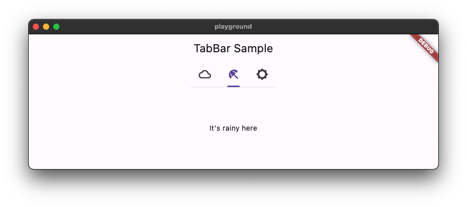
Taha Tesser
2c71881f50
Fix Scrollable TabBar for Material 3 ( #131409 )
...
fixes [Material 3 `TabBar` does not take full width when `isScrollable: true`](https://github.com/flutter/flutter/issues/117722 )
### Description
1. Fixed the divider doesn't stretch to take all the available width in the scrollable tab bar in M3
2. Added `dividerHeight` property.
### Code sample
<details>
<summary>expand to view the code sample</summary>
```dart
import 'package:flutter/material.dart';
/// Flutter code sample for [TabBar].
void main() => runApp(const TabBarApp());
class TabBarApp extends StatelessWidget {
const TabBarApp({super.key});
@override
Widget build(BuildContext context) {
return const MaterialApp(
debugShowCheckedModeBanner: false,
home: TabBarExample(),
);
}
}
class TabBarExample extends StatefulWidget {
const TabBarExample({super.key});
@override
State<TabBarExample> createState() => _TabBarExampleState();
}
class _TabBarExampleState extends State<TabBarExample> {
bool rtl = false;
bool customColors = false;
bool removeDivider = false;
Color dividerColor = Colors.amber;
Color indicatorColor = Colors.red;
@override
Widget build(BuildContext context) {
return DefaultTabController(
initialIndex: 1,
length: 3,
child: Directionality(
textDirection: rtl ? TextDirection.rtl : TextDirection.ltr,
child: Scaffold(
appBar: AppBar(
title: const Text('TabBar Sample'),
actions: <Widget>[
IconButton.filledTonal(
tooltip: 'Switch direction',
icon: const Icon(Icons.swap_horiz),
onPressed: () {
setState(() {
rtl = !rtl;
});
},
),
IconButton.filledTonal(
tooltip: 'Use custom colors',
icon: const Icon(Icons.color_lens),
onPressed: () {
setState(() {
customColors = !customColors;
});
},
),
IconButton.filledTonal(
tooltip: 'Show/hide divider',
icon: const Icon(Icons.remove_rounded),
onPressed: () {
setState(() {
removeDivider = !removeDivider;
});
},
),
],
),
body: Column(
children: <Widget>[
const Spacer(),
const Text('Scrollable - TabAlignment.start'),
TabBar(
isScrollable: true,
tabAlignment: TabAlignment.start,
dividerColor: customColors ? dividerColor : null,
indicatorColor: customColors ? indicatorColor : null,
dividerHeight: removeDivider ? 0 : null,
tabs: const <Widget>[
Tab(
icon: Icon(Icons.cloud_outlined),
),
Tab(
icon: Icon(Icons.beach_access_sharp),
),
Tab(
icon: Icon(Icons.brightness_5_sharp),
),
],
),
const Text('Scrollable - TabAlignment.startOffset'),
TabBar(
isScrollable: true,
tabAlignment: TabAlignment.startOffset,
dividerColor: customColors ? dividerColor : null,
indicatorColor: customColors ? indicatorColor : null,
dividerHeight: removeDivider ? 0 : null,
tabs: const <Widget>[
Tab(
icon: Icon(Icons.cloud_outlined),
),
Tab(
icon: Icon(Icons.beach_access_sharp),
),
Tab(
icon: Icon(Icons.brightness_5_sharp),
),
],
),
const Text('Scrollable - TabAlignment.center'),
TabBar(
isScrollable: true,
tabAlignment: TabAlignment.center,
dividerColor: customColors ? dividerColor : null,
indicatorColor: customColors ? indicatorColor : null,
dividerHeight: removeDivider ? 0 : null,
tabs: const <Widget>[
Tab(
icon: Icon(Icons.cloud_outlined),
),
Tab(
icon: Icon(Icons.beach_access_sharp),
),
Tab(
icon: Icon(Icons.brightness_5_sharp),
),
],
),
const Spacer(),
const Text('Non-scrollable - TabAlignment.fill'),
TabBar(
tabAlignment: TabAlignment.fill,
dividerColor: customColors ? dividerColor : null,
indicatorColor: customColors ? indicatorColor : null,
dividerHeight: removeDivider ? 0 : null,
tabs: const <Widget>[
Tab(
icon: Icon(Icons.cloud_outlined),
),
Tab(
icon: Icon(Icons.beach_access_sharp),
),
Tab(
icon: Icon(Icons.brightness_5_sharp),
),
],
),
const Text('Non-scrollable - TabAlignment.center'),
TabBar(
tabAlignment: TabAlignment.center,
dividerColor: customColors ? dividerColor : null,
indicatorColor: customColors ? indicatorColor : null,
dividerHeight: removeDivider ? 0 : null,
tabs: const <Widget>[
Tab(
icon: Icon(Icons.cloud_outlined),
),
Tab(
icon: Icon(Icons.beach_access_sharp),
),
Tab(
icon: Icon(Icons.brightness_5_sharp),
),
],
),
const Spacer(),
const Text('Secondary - TabAlignment.fill'),
TabBar.secondary(
tabAlignment: TabAlignment.fill,
dividerColor: customColors ? dividerColor : null,
indicatorColor: customColors ? indicatorColor : null,
dividerHeight: removeDivider ? 0 : null,
tabs: const <Widget>[
Tab(
icon: Icon(Icons.cloud_outlined),
),
Tab(
icon: Icon(Icons.beach_access_sharp),
),
Tab(
icon: Icon(Icons.brightness_5_sharp),
),
],
),
const Text('Secondary - TabAlignment.center'),
TabBar.secondary(
tabAlignment: TabAlignment.center,
dividerColor: customColors ? dividerColor : null,
indicatorColor: customColors ? indicatorColor : null,
dividerHeight: removeDivider ? 0 : null,
tabs: const <Widget>[
Tab(
icon: Icon(Icons.cloud_outlined),
),
Tab(
icon: Icon(Icons.beach_access_sharp),
),
Tab(
icon: Icon(Icons.brightness_5_sharp),
),
],
),
const Spacer(),
],
),
),
),
);
}
}
```
</details>
### Before

### After

This also contains regression test for https://github.com/flutter/flutter/pull/125974#discussion_r1239089151
```dart
// This is a regression test for https://github.com/flutter/flutter/pull/125974#discussion_r1239089151 .
testWidgets('Divider can be constrained', (WidgetTester tester) async {
```

2023-08-02 00:48:06 +00:00
Polina Cherkasova
35213ceabd
Upgrade Flutter libraries. ( #131700 )
2023-08-01 12:59:47 -07:00
Taha Tesser
7d89617a92
Fix TimePicker defaults for hourMinuteTextStyle and dayPeriodTextColor for Material 3 ( #131253 )
...
fixes [`TimePicker` color and visual issues](https://github.com/flutter/flutter/issues/127035 )
## Description
- fixes default text style for `TimePicker`s `hourMinuteTextStyle` and added a todo for https://github.com/flutter/flutter/issues/131247
- fixes correct default color not being accessed for `dayPeriodTextColor`
- Updates tests
### Code sample
<details>
<summary>expand to view the code sample</summary>
```dart
import 'package:flutter/material.dart';
void main() => runApp(const MyApp());
class MyApp extends StatelessWidget {
const MyApp({super.key});
@override
Widget build(BuildContext context) {
return MaterialApp(
debugShowCheckedModeBanner: false,
theme: ThemeData(useMaterial3: true),
home: const Example(),
);
}
}
class Example extends StatelessWidget {
const Example({super.key});
@override
Widget build(BuildContext context) {
return Scaffold(
appBar: AppBar(
title: const Text('Sample'),
),
body: Center(
child: ElevatedButton(
onPressed: () {
showTimePicker(
context: context,
orientation: Orientation.portrait,
initialEntryMode: TimePickerEntryMode.input,
initialTime: TimeOfDay.now(),
builder: (BuildContext context, Widget? child) {
return MediaQuery(
data: MediaQuery.of(context)
.copyWith(alwaysUse24HourFormat: true),
child: child!,
);
},
);
},
child: const Text('Open Time Picker'),
),
),
);
}
}
```
</details>
### Before

### After

2023-07-28 14:11:23 +00:00
Jason Simmons
8a84437989
Manual roll to engine commit 9b14c382 using Dart SDK version 3.2.x ( #131371 )
...
Dart SDK 3.2.x requires a new version of the dart_internal package.
2023-07-27 17:33:07 +00:00
Taha Tesser
5554b0eeb3
Fix M3 TimePicker dial background uses incorrect color ( #131045 )
...
fixes [Material3: TimePicker clock dial use wrong spec color and its web spec has a mistake](https://github.com/flutter/flutter/issues/118657 )
### Description
This PR fixes the default color used for the Material 3 dial background.
### Code sample
<details>
<summary>expand to view the code sample</summary>
```dart
import 'package:flutter/material.dart';
void main() => runApp(const MyApp());
class MyApp extends StatelessWidget {
const MyApp({super.key});
@override
Widget build(BuildContext context) {
final ThemeData theme = ThemeData(useMaterial3: true);
return MaterialApp(
debugShowCheckedModeBanner: false,
// theme: theme,
theme: theme.copyWith(
colorScheme: theme.colorScheme.copyWith(
surfaceVariant: const Color(0xffffbf00),
),
),
home: const Example(),
);
}
}
class Example extends StatelessWidget {
const Example({super.key});
@override
Widget build(BuildContext context) {
return Scaffold(
appBar: AppBar(
title: const Text('Sample'),
),
body: Center(
child: ElevatedButton(
onPressed: () {
showTimePicker(
context: context,
initialTime: TimeOfDay.now(),
);
},
child: const Text('Open Time Picker'),
),
),
);
}
}
```
</details>
### Default dial background color
| Before | After |
| --------------- | --------------- |
| <img src="https://github.com/flutter/flutter/assets/48603081/59514586-60c6-489f-b024-f659a26fa1e7 " /> | <img src="https://github.com/flutter/flutter/assets/48603081/75c3c360-df2b-47c8-8187-136ff6d963b6 " /> |
### Custom color scheme
| Before | After |
| --------------- | --------------- |
| <img src="https://github.com/flutter/flutter/assets/48603081/666dd2fc-7ee2-4268-9af0-923019adfccd " /> | <img src="https://github.com/flutter/flutter/assets/48603081/f32dc39e-a43f-4a63-a6e4-9df479b723ed " /> |
2023-07-24 18:30:23 +00:00
Pierre-Louis
0919fb86f1
Improve handling of certain icons in RTL ( #130979 )
...
Fixes https://github.com/flutter/flutter/issues/130978

## Pre-launch Checklist

- [x] I read the [Contributor Guide] and followed the process outlined
there for submitting PRs.
- [x] I read the [Tree Hygiene] wiki page, which explains my
responsibilities.
- [x] I read and followed the [Flutter Style Guide], including [Features
we expect every widget to implement].
- [x] I signed the [CLA].
- [x] I listed at least one issue that this PR fixes in the description
above.
- [x] I updated/added relevant documentation (doc comments with `///`).
- [x] I added new tests to check the change I am making, or this PR is
[test-exempt].
- [x] All existing and new tests are passing.

If you need help, consider asking for advice on the #hackers-new channel
on [Discord].

<!-- Links -->
[Contributor Guide]:
https://github.com/flutter/flutter/wiki/Tree-hygiene#overview
[Tree Hygiene]: https://github.com/flutter/flutter/wiki/Tree-hygiene
[test-exempt]:
https://github.com/flutter/flutter/wiki/Tree-hygiene#tests
[Flutter Style Guide]:
https://github.com/flutter/flutter/wiki/Style-guide-for-Flutter-repo
[Features we expect every widget to implement]:
https://github.com/flutter/flutter/wiki/Style-guide-for-Flutter-repo#features-we-expect-every-widget-to-implement
[CLA]: https://cla.developers.google.com/
[flutter/tests]: https://github.com/flutter/tests
[breaking change policy]:
https://github.com/flutter/flutter/wiki/Tree-hygiene#handling-breaking-changes
[Discord]: https://github.com/flutter/flutter/wiki/Chat
2023-07-21 19:07:39 +02:00
Pierre-Louis
0830a362d5
Add support for M3 motion ( #129942 )
...
## Description

This adds support for M3 easing and duration tokens.

This PR includes these changes:
* Generation of duration and easing constants, in `Durations` and
`Easing`, respectively (`Curves` is already taken in the `animation`
library)
* Add 3 Dart fixes

Once this is merged, I'll migrate packages/plugins/customers and then
uncomment the deprecation notices for the 3 M2 curves, all of which have
1:1 replacements.

## Related Issues
 - Fixes https://github.com/flutter/flutter/issues/116525

## Tests
 - Added Dart fix tests

## Pre-launch Checklist

- [x] I read the [Contributor Guide] and followed the process outlined
there for submitting PRs.
- [x] I read the [Tree Hygiene] wiki page, which explains my
responsibilities.
- [x] I read and followed the [Flutter Style Guide], including [Features
we expect every widget to implement].
- [x] I signed the [CLA].
- [x] I listed at least one issue that this PR fixes in the description
above.
- [x] I updated/added relevant documentation (doc comments with `///`).
- [x] I added new tests to check the change I am making, or this PR is
[test-exempt].
- [x] All existing and new tests are passing.

If you need help, consider asking for advice on the #hackers-new channel
on [Discord].

<!-- Links -->
[Contributor Guide]:
https://github.com/flutter/flutter/wiki/Tree-hygiene#overview
[Tree Hygiene]: https://github.com/flutter/flutter/wiki/Tree-hygiene
[test-exempt]:
https://github.com/flutter/flutter/wiki/Tree-hygiene#tests
[Flutter Style Guide]:
https://github.com/flutter/flutter/wiki/Style-guide-for-Flutter-repo
[Features we expect every widget to implement]:
https://github.com/flutter/flutter/wiki/Style-guide-for-Flutter-repo#features-we-expect-every-widget-to-implement
[CLA]: https://cla.developers.google.com/
[flutter/tests]: https://github.com/flutter/tests
[breaking change policy]:
https://github.com/flutter/flutter/wiki/Tree-hygiene#handling-breaking-changes
[Discord]: https://github.com/flutter/flutter/wiki/Chat
2023-07-19 22:07:59 +02:00
flutter-pub-roller-bot
edcaa335d1
Roll pub packages ( #130821 )
...
This PR was generated by `flutter update-packages --force-upgrade`.
2023-07-18 21:55:17 +00:00
LongCatIsLooong
b2e22d3558
Replaces textScaleFactor with TextScaler ( #128522 )
...
Deprecate `textScaleFactor` in favor of `textScaler`, in preparation for Android 14 [Non-linear font scaling to 200%](https://developer.android.com/about/versions/14/features#non-linear-font-scaling ). The `TextScaler` class can be moved to `dart:ui` in the future, if we decide to use the Android platform API or AndroidX to get the scaling curve instead of hard coding the curve in the framework.
I haven't put the Flutter version in the deprecation message so the analyzer checks are failing. Will do so after I finish the migration guide.
**Why `TextScaler.textScaleFactor`**
The author of a `TextScaler` subclass should provide a fallback `textScaleFactor`. By making `TextScaler` also contain the `textScaleFactor` information it also makes it easier to migrate: if a widget overrides `MediaQueryData.textScaler` in the tree, for unmigrated widgets in the subtree it would also have to override `MediaQueryData.textScaleFactor`, and that makes it difficult to remove `MediaQueryData.textScaleFactor` in the future.
## A full list of affected APIs in this PR
Deprecated: The method/getter/setter/argument is annotated with a `@Deprecated()` annotation in this PR, and the caller should replace it with `textScaler` instead. Unless otherwise specified there will be a Flutter fix available to help with migration but it's still recommended to migrate case-by-case.
**Replaced**: The method this `textScaleFactor` argument belongs to is rarely called directly by user code and is not overridden by any of the registered custom tests, so the argument is directly replaced by `TextScaler`.
**To Be Deprecated**: The method/getter/setter/argument can't be deprecated in this PR because a registered customer test depends on it and a Flutter fix isn't available (or the test was run without applying flutter fixes first). This method/getter/setter/argument will be deprecated in a followup PR once the registered test is migrated.
### `Painting` Library
| Affected API | State of `textScaleFactor` | Comment |
| --- | --- | --- |
| `InlineSpan.build({ double textScaleFactor = 1.0 })` argument | **Replaced** | |
| `TextStyle.getParagraphStyle({ double TextScaleFactor = 1.0 })` argument | **Replaced** | |
| `TextStyle.getTextStyle({ double TextScaleFactor = 1.0 })` argument| Deprecated | Can't replace: c47fd38dca/super_editor/lib/src/infrastructure/super_textfield/desktop/desktop_textfield.dart (L1903-L1905)cd7b93532e/packages/flutter_markdown/test/text_scale_factor_test.dart (LL39C21-L39C35)cd7b93532e/packages/flutter_markdown/lib/src/_functions_io.dart (L68-L70)cd7b93532e/packages/flutter_markdown/lib/src/builder.dart (L829-L843)914d120da1/packages/rfw/lib/src/flutter/core_widgets.dart (L647)https://github.com/dart-lang/sdk/issues/52664 |
| `Text.rich({ double? TextScaleFactor = 1.0 })` constructor argument | **To Be Deprecated** | The default constructor has an argument that can't be deprecated right away. No Flutter Fix because of https://github.com/dart-lang/sdk/issues/52664 |
| `Text.textScaleFactor` getter | **To Be Deprecated** | A constructor argument can't be deprecated right away |
| `EditableText({ double? TextScaleFactor = 1.0 })` constructor argument | Deprecated | No Flutter Fix because of https://github.com/dart-lang/sdk/issues/52664 |
| `EditableText.textScaleFactor` getter | Deprecated | |
### `Material` Library
| Affected API | State of `textScaleFactor` | Comment |
| --- | --- | --- |
| `SelectableText({ double? TextScaleFactor = 1.0 })` constructor argument | **To Be Deprecated** | cd7b93532e/packages/flutter_markdown/lib/src/builder.dart (L829-L843)https://github.com/dart-lang/sdk/issues/52664 |
| `SelectableText.rich({ double? TextScaleFactor = 1.0 })` constructor argument | **To Be Deprecated** | The default constructor has an argument that can't be deprecated right away. No Flutter Fix because of https://github.com/dart-lang/sdk/issues/52664 |
| `SelectableText.textScaleFactor` getter | **To Be Deprecated** | A constructor argument can't be deprecated right away |
A lot of material widgets (`Slider`, `RangeSlider`, `TimePicker`, and different types of buttons) also change their layout based on `textScaleFactor`. These need to be handled in a case-by-case fashion and will be migrated in follow-up PRs.
2023-07-17 17:56:07 +00:00
Alexander Aprelev
3b8f6c4020
Upgrade framework pub dependencies, roll engine with rolled dart sdk ( #130163 )
...
Manual roll is needed because incoming dart sdk requires updated version
vm_snapshot_analysis (>=0.7.4).
5ae09b8b4f...7c83ea3e85#43457 )" (#43472 )
9ef3e8d533 Roll Skia from 5eba922297bb to 93c92f97f5ab (2 revisions) (#43471 )
```
Remove implementation of SuitePlatform from the test as well. Remove use
of fake cwd from SuitePlatform as it can't be properly faked.
2023-07-07 13:55:35 -07:00
Michael Goderbauer
55b6f049a6
Enable unreachable_from_main lint - it is stable now!!1 ( #129854 )
...
PLUS: clean-up of all the unreachable stuff.
2023-07-06 00:09:01 +00:00
Taha Tesser
7cef966147
Fix NavigationDrawer selected item has wrong icon color ( #129625 )
...
fixes [NavigationDrawer selected item has wrong icon color [Material3 spec]](https://github.com/flutter/flutter/issues/129572 )
### Description
This PR fixes a mistake in the `NavigationDrawer` defaults, where generated token value returns a `null`.
This issue can be detected when you want to customize the selected icon color for `NavigationDrawerDestination` using a custom color scheme.
### Code sample
<details>
<summary>expanded to view the code sample</summary>
```dart
import 'package:flutter/material.dart';
void main() => runApp(const MyApp());
class MyApp extends StatelessWidget {
const MyApp({super.key});
@override
Widget build(BuildContext context) {
return MaterialApp(
debugShowCheckedModeBanner: false,
themeMode: ThemeMode.light,
theme: ThemeData(
colorScheme: ColorScheme.fromSeed(seedColor: Colors.blue).copyWith(
onSecondaryContainer: Colors.red,
),
useMaterial3: true,
),
home: const Example(),
);
}
}
class Example extends StatelessWidget {
const Example({super.key});
@override
Widget build(BuildContext context) {
return Scaffold(
appBar: AppBar(
title: const Text('NavigationDrawer Sample'),
),
drawer: const NavigationDrawer(
children: <Widget>[
NavigationDrawerDestination(
icon: Icon(Icons.favorite_outline_rounded),
label: Text('Favorite'),
selectedIcon: Icon(Icons.favorite_rounded),
),
NavigationDrawerDestination(
icon: Icon(Icons.favorite_outline_rounded),
label: Text('Favorite'),
),
],
),
);
}
}
```
</details>
### Before
<img width="1053" alt="Screenshot 2023-06-27 at 13 24 38" src="https://github.com/flutter/flutter/assets/48603081/18c13a73-688f-4586-bb60-bddef45d173f ">
### After
<img width="1053" alt="Screenshot 2023-06-27 at 13 24 25" src="https://github.com/flutter/flutter/assets/48603081/8a1427c6-517f-424a-b0bd-24bad7c5fbb0 ">
2023-06-30 08:58:14 +00:00
Kate Lovett
087377ea2f
Revert "Fix Material 3 Scrollable TabBar" ( #129383 )
...
Reverts flutter/flutter#125974
2023-06-22 22:34:06 +00:00
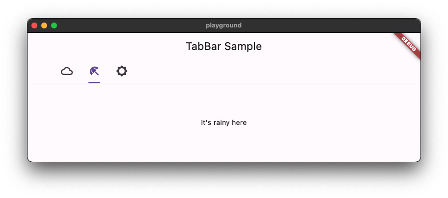
Taha Tesser
32fde139bc
Fix Material 3 Scrollable TabBar ( #125974 )
...
fix https://github.com/flutter/flutter/issues/117722
### Description
1. Fix the divider doesn't stretch to take all the available width in the scrollable tab bar in M3
2. Add `dividerHeight` property.
3. Update the default tab alignment for the scrollable tab bar to match the specs (this is backward compatible for M2 with the new `tabAlignment` property).
### Bug (default tab alignment)

### Fix (default tab alignment)

### Code sample
<details>
<summary>code sample</summary>
```dart
import 'package:flutter/material.dart';
/// Flutter code sample for [TabBar].
void main() => runApp(const TabBarApp());
class TabBarApp extends StatelessWidget {
const TabBarApp({super.key});
@override
Widget build(BuildContext context) {
return MaterialApp(
theme: ThemeData(
// tabBarTheme: const TabBarTheme(tabAlignment: TabAlignment.start),
useMaterial3: true,
),
home: const TabBarExample(),
);
}
}
class TabBarExample extends StatefulWidget {
const TabBarExample({super.key});
@override
State<TabBarExample> createState() => _TabBarExampleState();
}
class _TabBarExampleState extends State<TabBarExample> {
bool rtl = false;
@override
Widget build(BuildContext context) {
return DefaultTabController(
initialIndex: 1,
length: 3,
child: Directionality(
textDirection: rtl ? TextDirection.rtl : TextDirection.ltr,
child: Scaffold(
appBar: AppBar(
title: const Text('TabBar Sample'),
),
body: const Column(
children: <Widget>[
Text('Scrollable-TabAlignment.start'),
TabBar(
isScrollable: true,
tabAlignment: TabAlignment.start,
tabs: <Widget>[
Tab(
icon: Icon(Icons.cloud_outlined),
),
Tab(
icon: Icon(Icons.beach_access_sharp),
),
Tab(
icon: Icon(Icons.brightness_5_sharp),
),
],
),
Text('Scrollable-TabAlignment.startOffset'),
TabBar(
isScrollable: true,
tabAlignment: TabAlignment.startOffset,
tabs: <Widget>[
Tab(
icon: Icon(Icons.cloud_outlined),
),
Tab(
icon: Icon(Icons.beach_access_sharp),
),
Tab(
icon: Icon(Icons.brightness_5_sharp),
),
],
),
Text('Scrollable-TabAlignment.center'),
TabBar(
isScrollable: true,
tabAlignment: TabAlignment.center,
tabs: <Widget>[
Tab(
icon: Icon(Icons.cloud_outlined),
),
Tab(
icon: Icon(Icons.beach_access_sharp),
),
Tab(
icon: Icon(Icons.brightness_5_sharp),
),
],
),
Spacer(),
Text('Non-scrollable-TabAlignment.fill'),
TabBar(
tabAlignment: TabAlignment.fill,
tabs: <Widget>[
Tab(
icon: Icon(Icons.cloud_outlined),
),
Tab(
icon: Icon(Icons.beach_access_sharp),
),
Tab(
icon: Icon(Icons.brightness_5_sharp),
),
],
),
Text('Non-scrollable-TabAlignment.center'),
TabBar(
tabAlignment: TabAlignment.center,
tabs: <Widget>[
Tab(
icon: Icon(Icons.cloud_outlined),
),
Tab(
icon: Icon(Icons.beach_access_sharp),
),
Tab(
icon: Icon(Icons.brightness_5_sharp),
),
],
),
Spacer(),
],
),
floatingActionButton: FloatingActionButton.extended(
onPressed: () {
setState(() {
rtl = !rtl;
});
},
label: const Text('Switch Direction'),
icon: const Icon(Icons.swap_horiz),
),
),
),
);
}
}
```
</details>

2023-06-22 17:30:46 +00:00
Taha Tesser
467c970bfb
Introduce MaterialState color property for chips ( #128584 )
...
fixes https://github.com/flutter/flutter/issues/115827
fixes https://github.com/flutter/flutter/issues/101325
### Description
1. This PR adds a new MaterialState `color` property to all the chips (this makes it possible to customize chips in all states from the M3 specs).
2. Updated defaults to use the new MaterialState `color` property.
3. Updated and added new tests to all the chip test classes.
<details>
<summary>code sample</summary>
```dart
import 'package:flutter/material.dart';
const Color disabledColor = Colors.black26;
const Color backgroundColor = Colors.cyan;
final Color disabledSelectedColor = Colors.red.shade100;
const Color selectedColor = Colors.amber;
final MaterialStateProperty<Color> color =
MaterialStateProperty.resolveWith((Set<MaterialState> states) {
if (states.contains(MaterialState.disabled) &&
states.contains(MaterialState.selected)) {
return disabledSelectedColor;
}
if (states.contains(MaterialState.disabled)) {
return disabledColor;
}
if (states.contains(MaterialState.selected)) {
return selectedColor;
}
return backgroundColor;
});
void main() => runApp(const MyApp());
class MyApp extends StatelessWidget {
const MyApp({super.key});
@override
Widget build(BuildContext context) {
return MaterialApp(
debugShowCheckedModeBanner: false,
theme: ThemeData(
useMaterial3: true,
// chipTheme: ChipThemeData(color: color),
),
home: const Example(),
);
}
}
class Example extends StatefulWidget {
const Example({super.key});
@override
State<Example> createState() => _ExampleState();
}
class _ExampleState extends State<Example> {
bool enabled = false;
bool selected = true;
@override
Widget build(BuildContext context) {
const Widget verticalSpace = SizedBox(height: 20);
return Scaffold(
body: Center(
child: Column(
children: <Widget>[
const SizedBox(height: 25),
Row(
mainAxisAlignment: MainAxisAlignment.spaceEvenly,
children: <Widget>[
const Card(
elevation: 0.0,
color: disabledColor,
child: Padding(
padding: EdgeInsets.all(8.0),
child: Text('disabledColor'),
),
),
const Card(
elevation: 0.0,
color: backgroundColor,
child: Padding(
padding: EdgeInsets.all(8.0),
child: Text('backgroundColor'),
),
),
Card(
elevation: 0.0,
color: disabledSelectedColor,
child: const Padding(
padding: EdgeInsets.all(8.0),
child: Text('disabledSelectedColor'),
),
),
const Card(
elevation: 0.0,
color: selectedColor,
child: Padding(
padding: EdgeInsets.all(8.0),
child: Text('selectedColor'),
),
),
],
),
const Spacer(),
Row(
mainAxisAlignment: MainAxisAlignment.spaceEvenly,
children: <Widget>[
Column(
mainAxisSize: MainAxisSize.min,
mainAxisAlignment: MainAxisAlignment.center,
children: <Widget>[
RawChip(
selected: selected,
selectedColor: selectedColor,
color: color,
label: const Text('RawChip'),
isEnabled: enabled,
onSelected: enabled ? (bool value) {} : null,
),
verticalSpace,
InputChip(
isEnabled: enabled,
selected: selected,
selectedColor: selectedColor,
color: color,
label: const Text('InputChip'),
onSelected: enabled ? (bool value) {} : null,
),
],
),
Column(
mainAxisSize: MainAxisSize.min,
children: <Widget>[
FilterChip(
selected: selected,
selectedColor: selectedColor,
color: color,
label: const Text('FilterChip'),
onSelected: enabled ? (bool value) {} : null,
),
verticalSpace,
FilterChip.elevated(
selected: selected,
selectedColor: selectedColor,
color: color,
label: const Text('FilterChip.elevated'),
onSelected: enabled ? (bool value) {} : null,
),
],
),
Column(
mainAxisSize: MainAxisSize.min,
children: <Widget>[
ChoiceChip(
selected: selected,
selectedColor: selectedColor,
color: color,
label: const Text('ChoiceChip'),
onSelected: enabled ? (bool value) {} : null,
),
verticalSpace,
ChoiceChip.elevated(
selected: selected,
selectedColor: selectedColor,
color: color,
label: const Text('ChoiceChip.elevated'),
onSelected: enabled ? (bool value) {} : null,
),
],
),
],
),
const Spacer(),
Row(
children: <Widget>[
Flexible(
child: SwitchListTile(
title: const Text('Enabled'),
value: enabled,
onChanged: (bool value) {
setState(() => enabled = value);
},
),
),
Flexible(
child: SwitchListTile(
title: const Text('Selected'),
value: selected,
onChanged: (bool value) {
setState(() => selected = value);
},
),
),
],
)
],
),
),
);
}
}
```
</details>
### Before (not possible to customize disabled and selected chips)

### After (using disabled and selected chips using the new MaterialState `color` property)

2023-06-19 22:03:26 +00:00
Mouad Debbar
a162d7546a
flutter update-packages --force-upgrade ( #128908 )
...
- Bumps `vm_service` from `11.6.0` to `11.7.1`
- Bumps `web` from `0.1.3-beta` to `0.1.4-beta` and adds it everywhere.
- Moves `js` from `dependencies` to `dev_dependencies`
2023-06-15 18:17:09 +00:00
Taha Tesser
ca5aa2329a
Update ListTile text defaults to use ColorScheme ( #128581 )
...
fixes https://github.com/flutter/flutter/issues/128569
<details>
<summary>code sample</summary>
```dart
import 'package:flutter/material.dart';
void main() {
runApp(const ListTileApp());
}
class ListTileApp extends StatelessWidget {
const ListTileApp({super.key});
@override
Widget build(BuildContext context) {
return MaterialApp(
title: 'Flutter Demo',
theme: ThemeData(
useMaterial3: true,
colorScheme: ColorScheme.fromSeed(seedColor: Colors.red).copyWith(
onSurface: Colors.yellow,
onSurfaceVariant: Colors.green,
),
),
home: const Scaffold(
body: Center(
child: ListTile(
title: Text('title'),
subtitle: Text('subtitle'),
),
),
),
);
}
}
```
</details>
# Description
M3 ListTile couldn't be customized using `ColorScheme` colors.
- This PR updates the list tile text defaults to `ColorScheme` text color tokens.
- Improved the `ListTile` template to use the token group.
- Update docs and tests.
```dart
colorScheme: ColorScheme.fromSeed(seedColor: Colors.red).copyWith(
onSurface: Colors.yellow,
onSurfaceVariant: Colors.green,
),
```
### Before

### After

2023-06-12 14:52:06 +00:00
Pierre-Louis
66cda5917d
Improve defaults generation with logging, stats, and token validation ( #128244 )
...
## Description
This improves defaults generation with logging, stats, and token validation.
This PR includes these changes:
* introduce `TokenLogger`, with a verbose mode
* prints versions and tokens usage to the console
* outputs `generated/used_tokens.csv`, a list of all used tokens, for use by Google
* find token files in `data` automatically
* hide tokens `Map`
* tokens can be obtained using existing resolvers (e.g. `color`, `shape`), or directly through `getToken`.
* tokens can be checked for existence with `tokenAvailable`
* remove version from template, since the tokens are aggregated and multiple versions are possible (as is the case currently), it does not make sense to attribute a single version
* improve documentation
## Related Issues
- Fixes https://github.com/flutter/flutter/issues/122602
## Tests
- Added tests for `TokenLogger`
- Regenerated tokens, no-op except version removal
## Future work
A future PR should replace or remove the following invalid tokens usages
<img width="578" alt="image" src="https://github.com/flutter/flutter/assets/6655696/b6f9e5a7-523f-4f72-94f9-1b0bf4cc9f00 ">
2023-06-09 11:28:18 +00:00
Jackson Gardner
7c15a26eab
Reland "Migrate benchmarks to package:web" ( #128266 )
...
This attempts to reland https://github.com/flutter/flutter/pull/126848
This was reverted because it made some unexpected changes to our perf measurements. After landing https://github.com/flutter/flutter/pull/127900 , we have much less noise in our benchmarks, so I'd like to reland this and see if there is still a significant measurement difference.
2023-06-08 22:25:40 +00:00
LongCatIsLooong
73e1f23426
Remove textScaleFactor dependent logic from AppBar ( #128112 )
...
I am trying to remove `textScaleFactor`-dependent logic from the framework since it's likely going to be deprecated, hopefully the original logic isn't from the material spec.
I stole the sample code from https://github.com/flutter/flutter/pull/125038 and here are the screenshots (`textScaleFactor = 3.0`).
Internal Tests: **no relevant test failures**
| Medium | Large |
| --------------- | --------------- |
|  |  |
2023-06-06 20:47:40 +00:00
Taha Tesser
513ff44bce
Add FilterChip.elevated, ChoiceChip.elevated, & ActionChip.elevated variants ( #128049 )
2023-06-01 16:29:28 -07:00
Christopher Fujino
0763d61f56
[flutter_tools] manually roll pub deps ( #127447 )
...
Fixes https://github.com/flutter/flutter/issues/127226
2023-05-30 23:34:52 +00:00