* Start work on update

* Finish initial re-draft

* Sneak in tweaks to anomaly guides

* Tweaks to both guide and deploy instructions

* Add meta description

* Fixes for Odysseas
145 lines
9.2 KiB
Markdown
145 lines
9.2 KiB
Markdown
<!--
|
|
title: "Monitor and visualize anomalies with Netdata (part 2)"
|
|
description: "Using unsupervised anomaly detection and machine learning, get notified "
|
|
image: /img/seo/guides/monitor/visualize-monitor-anomalies.png
|
|
author: "Joel Hans"
|
|
author_title: "Editorial Director, Technical & Educational Resources"
|
|
author_img: "/img/authors/joel-hans.jpg"
|
|
custom_edit_url: https://github.com/netdata/netdata/edit/master/docs/guides/monitor/visualize-monitor-anomalies.md
|
|
-->
|
|
|
|
# Monitor and visualize anomalies with Netdata (part 2)
|
|
|
|
Welcome to part 2 of our series of guides on using _unsupervised anomaly detection_ to detect issues with your systems,
|
|
containers, and applications using the open-source Netdata Agent. For an introduction to detecting anomalies and
|
|
monitoring associated metrics, see [part 1](/docs/guides/monitor/anomaly-detection.md), which covers prerequisites and
|
|
configuration basics.
|
|
|
|
With anomaly detection in the Netdata Agent set up, you will now want to visualize and monitor which charts have
|
|
anomalous data, when, and where to look next.
|
|
|
|
> 💡 In certain cases, the anomalies collector doesn't start immediately after restarting the Netdata Agent. If this
|
|
> happens, you won't see the dashboard section or the relevant [charts](#visualize-anomalies-in-charts) right away. Wait
|
|
> a minute or two, refresh, and look again. If the anomalies charts and alarms are still not present, investigate the
|
|
> error log with `less /var/log/netdata/error.log | grep anomalies`.
|
|
|
|
## Test anomaly detection
|
|
|
|
Time to see the Netdata Agent's unsupervised anomaly detection in action. To trigger anomalies on the Nginx web server,
|
|
use `ab`, otherwise known as [Apache Bench](https://httpd.apache.org/docs/2.4/programs/ab.html). Despite its name, it
|
|
works just as well with Nginx web servers. Install it on Ubuntu/Debian systems with `sudo apt install apache2-utils`.
|
|
|
|
> 💡 If you haven't followed the guide's example of using Nginx, an easy way to test anomaly detection on your node is
|
|
> to use the `stress-ng` command, which is available on most Linux distributions. Run `stress-ng --cpu 0` to create CPU
|
|
> stress or `stress-ng --vm 0` for RAM stress. Each test will cause some "collateral damage," in that you may see CPU
|
|
> utilization rise when running the RAM test, and vice versa.
|
|
|
|
The following test creates a minimum of 10,000,000 requests for Nginx to handle, with a maximum of 10 at any given time,
|
|
with a run time of 60 seconds. If your system can handle those 10,000,000 in less than 60 seconds, `ab` will keep
|
|
sending requests until the timer runs out.
|
|
|
|
```bash
|
|
ab -k -c 10 -t 60 -n 10000000 http://127.0.0.1/
|
|
```
|
|
|
|
Let's see how Netdata detects this anomalous behavior and propagates information to you through preconfigured alarms and
|
|
dashboards that automatically organize anomaly detection metrics into meaningful charts to help you begin root cause
|
|
analysis (RCA).
|
|
|
|
## Monitor anomalies with alarms
|
|
|
|
The anomalies collector creates two "classes" of alarms for each chart captured by the `charts_regex` setting. All these
|
|
alarms are preconfigured based on your [configuration in
|
|
`anomalies.conf`](/docs/guides/monitor/anomaly-detection.md#configure-the-anomalies-collector). With the `charts_regex`
|
|
and `charts_to_exclude` settings from [part 1](/docs/guides/monitor/anomaly-detection.md) of this guide series, the
|
|
Netdata Agent creates 32 alarms driven by unsupervised anomaly detection.
|
|
|
|
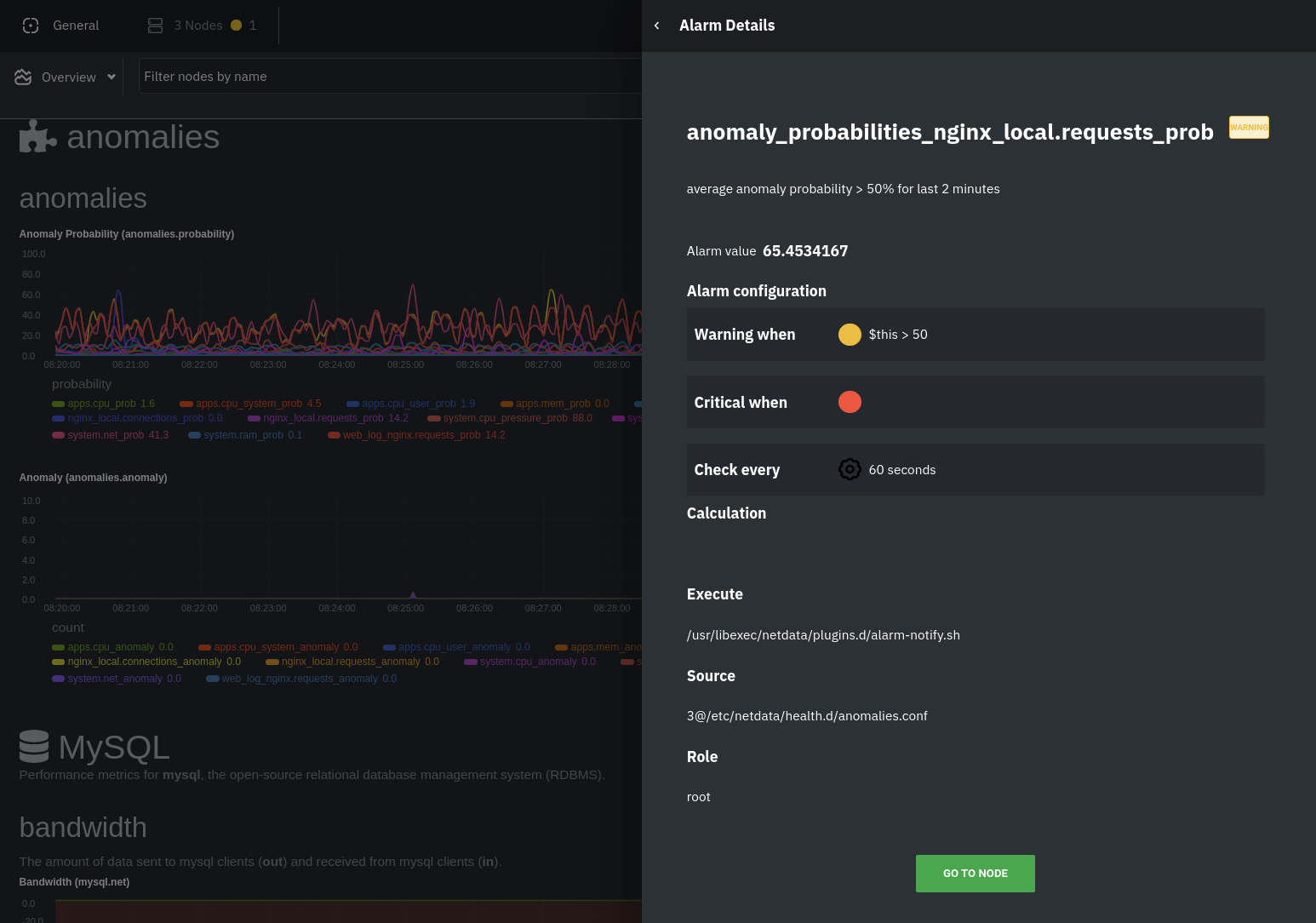
The first class triggers warning alarms when the average anomaly probability for a given chart has stayed above 50% for
|
|
at least the last two minutes.
|
|
|
|
|
|
|
|
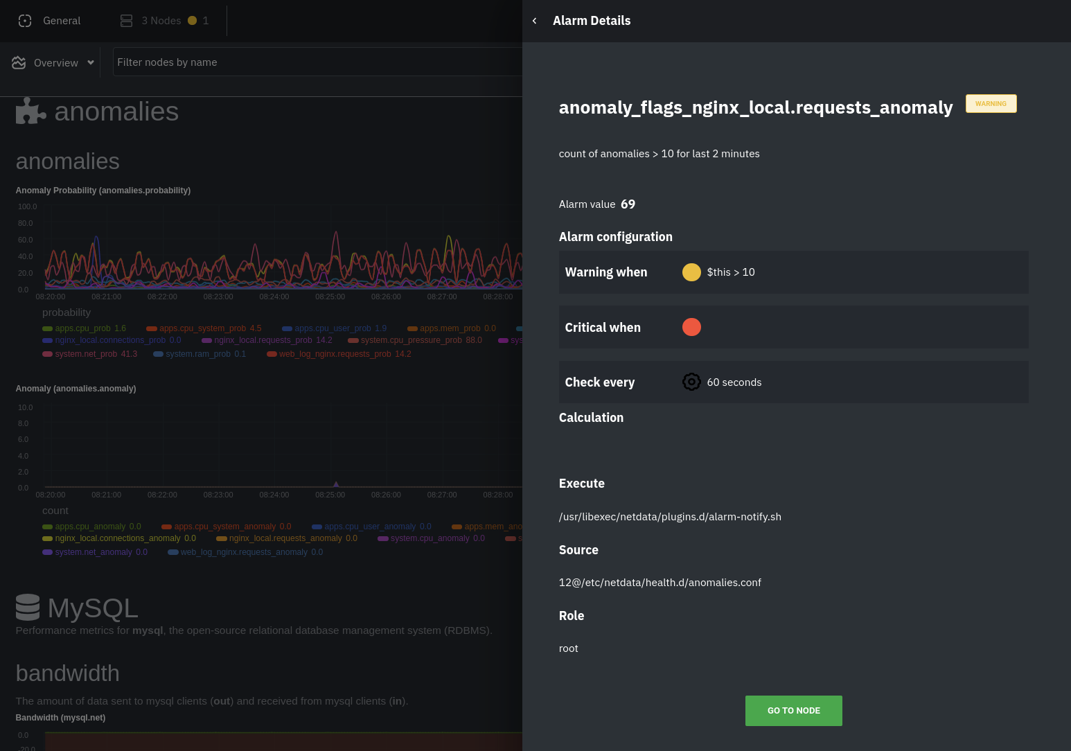
The second class triggers warning alarms when the number of anomalies in the last two minutes hits 10 or higher.
|
|
|
|
|
|
|
|
If you see either of these alarms in Netdata Cloud, the local Agent dashboard, or on your preferred notification
|
|
platform, it's a safe bet that the node's current metrics have deviated from normal. That doesn't necessarily mean
|
|
there's a full-blown incident, depending on what application/service you're using anomaly detection on, but it's worth
|
|
further investigation.
|
|
|
|
As you use the anomalies collector, you may find that the default settings provide too many or too few genuine alarms.
|
|
In this case, [configure the alarm](/docs/monitor/configure-alarms.md) with `sudo ./edit-config
|
|
health.d/anomalies.conf`. Take a look at the `lookup` line syntax in the [health
|
|
reference](/health/REFERENCE.md#alarm-line-lookup) to understand how the anomalies collector automatically creates
|
|
alarms for any dimension on the `anomalies_local.probability` and `anomalies_local.anomaly` charts.
|
|
|
|
## Visualize anomalies in charts
|
|
|
|
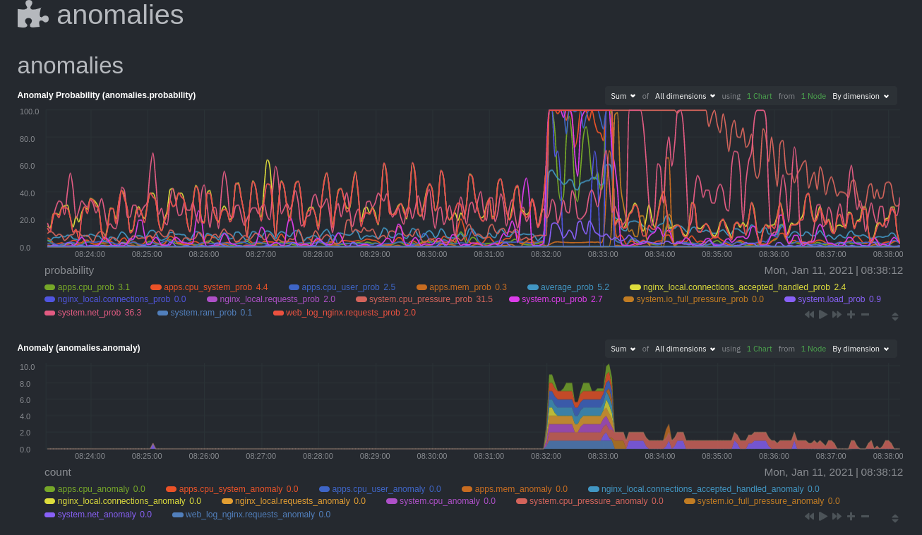
In either [Netdata Cloud](https://app.netdata.cloud) or the local Agent dashboard at `http://NODE:19999`, click on the
|
|
**Anomalies** [section](/web/gui/README.md#sections) to see the pair of anomaly detection charts, which are
|
|
preconfigured to visualize per-second anomaly metrics based on your [configuration in
|
|
`anomalies.conf`](/docs/guides/monitor/anomaly-detection.md#configure-the-anomalies-collector).
|
|
|
|
These charts have the contexts `anomalies.probability` and `anomalies.anomaly`. Together, these charts
|
|
create meaningful visualizations for immediately recognizing not only that something is going wrong on your node, but
|
|
give context as to where to look next.
|
|
|
|
The `anomalies_local.probability` chart shows the probability that the latest observed data is anomalous, based on the
|
|
trained model. The `anomalies_local.anomaly` chart visualizes 0→1 predictions based on whether the latest observed
|
|
data is anomalous based on the trained model. Both charts share the same dimensions, which you configured via
|
|
`charts_regex` and `charts_to_exclude` in [part 1](/docs/guides/monitor/anomaly-detection.md).
|
|
|
|
In other words, the `probability` chart shows the amplitude of the anomaly, whereas the `anomaly` chart provides quick
|
|
yes/no context.
|
|
|
|
|
|
|
|
Before `08:32:00`, both charts show little in the way of verified anomalies. Based on the metrics the anomalies
|
|
collector has trained on, a certain percentage of anomaly probability score is normal, as seen in the
|
|
`web_log_nginx_requests_prob` dimension and a few others. What you're looking for is large deviations from the "noise"
|
|
in the `anomalies.probability` chart, or any increments to the `anomalies.anomaly` chart.
|
|
|
|
Unsurprisingly, the stress test that began at `08:32:00` caused significant changes to these charts. The three
|
|
dimensions that immediately shot to 100% anomaly probability, and remained there during the test, were
|
|
`web_log_nginx.requests_prob`, `nginx_local.connections_accepted_handled_prob`, and `system.cpu_pressure_prob`.
|
|
|
|
## Build an anomaly detection dashboard
|
|
|
|
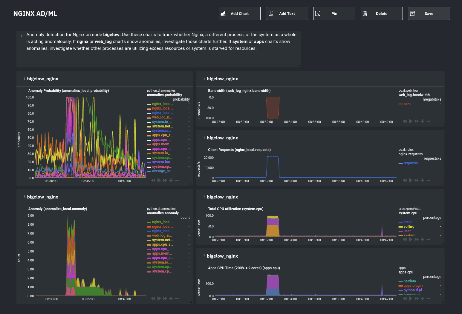
[Netdata Cloud](https://app.netdata.cloud) features a drag-and-drop [dashboard
|
|
editor](/docs/visualize/create-dashboards.md) that helps you create entirely new dashboards with charts targeted for
|
|
your specific applications.
|
|
|
|
For example, here's a dashboard designed for visualizing anomalies present in an Nginx web server, including
|
|
documentation about why the dashboard exists and where to look next based on what you're seeing:
|
|
|
|
|
|
|
|
Use the anomaly charts for instant visual identification of potential anomalies, and then Nginx-specific charts, in the
|
|
right column, to validate whether the probability and anomaly counters are showing a valid incident worth further
|
|
investigation using [Metric Correlations](https://learn.netdata.cloud/docs/cloud/insights/metric-correlations) to narrow
|
|
the dashboard into only the charts relevant to what you're seeing from the anomalies collector.
|
|
|
|
## What's next?
|
|
|
|
Between this guide and [part 1](/docs/guides/monitor/anomaly-detection.md), which covered setup and configuration, you
|
|
now have a fundamental understanding of how unsupervised anomaly detection in Netdata works, from root cause to alarms
|
|
to preconfigured or custom dashboards.
|
|
|
|
We'd love to hear your feedback on the anomalies collector. Hop over to the [community
|
|
forum](https://community.netdata.cloud/t/anomalies-collector-feedback-megathread/767), and let us know if you're already getting value from
|
|
unsupervised anomaly detection, or would like to see something added to it. You might even post a custom configuration
|
|
that works well for monitoring some other popular application, like MySQL, PostgreSQL, Redis, or anything else we
|
|
[support through collectors](/collectors/COLLECTORS.md).
|
|
|
|
### Related reference documentation
|
|
|
|
- [Netdata Agent · Anomalies collector](/collectors/python.d.plugin/anomalies/README.md)
|
|
- [Netdata Cloud · Build new dashboards](https://learn.netdata.cloud/docs/cloud/visualize/dashboards)
|
|
|
|
[](<>)
|